react-native-progress-steps
A simple and fully customizable React Native component that implements a progress stepper UI.
- Each steps content is displayed inside of a customizable ScrollView.
- Fully customizable buttons are displayed at the bottom of the component to move between steps.
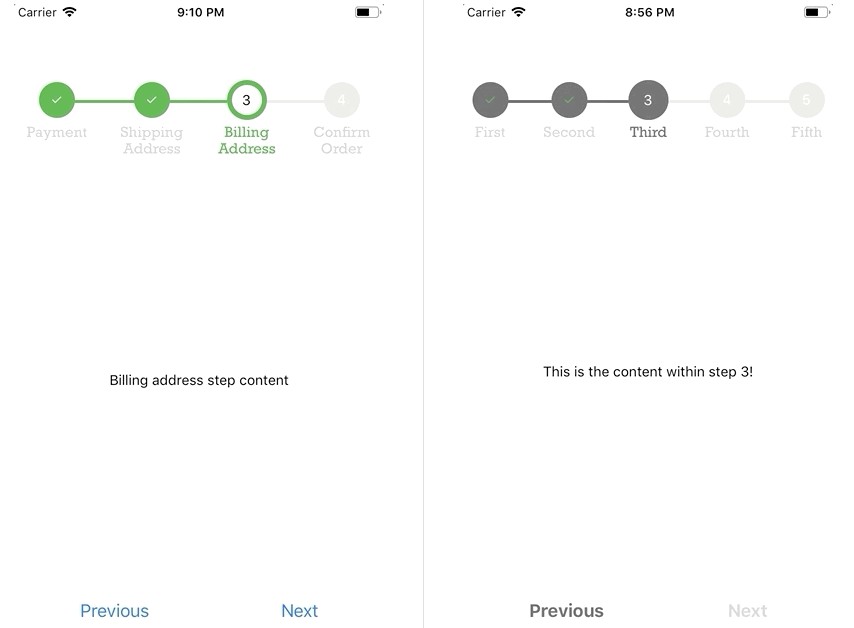
| Example One | Example Two |
|---|---|
 examples/ExampleOne.js examples/ExampleOne.js |
 examples/ExampleTwo.js examples/ExampleTwo.js |
Installation
If using yarn:
yarn add react-native-progress-steps
If using npm:
npm i react-native-progress-steps
Usage
import { ProgressSteps, ProgressStep } from 'react-native-progress-steps';
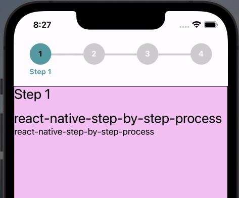
Simply place a <ProgressStep /> tag for each desired step within the <ProgressSteps /> wrapper.
<View style={{flex: 1}}>
    <ProgressSteps>
        <ProgressStep label="First Step">
            <View style={{ alignItems: 'center' }}>
                <Text>This is the content within step 1!</Text>
            </View>
        </ProgressStep>
        <ProgressStep label="Second Step">
            <View style={{ alignItems: 'center' }}>
                <Text>This is the content within step 2!</Text>
            </View>
        </ProgressStep>
        <ProgressStep label="Third Step">
            <View style={{ alignItems: 'center' }}>
                <Text>This is the content within step 3!</Text>
            </View>
        </ProgressStep>
    </ProgressSteps>
</View>
Button Styling Usage
Button container and text are fully customizable using the nextBtnStyle, nextBtnTextStyle, previousBtnStyle, and previousBtnTextStyle props.
Example usage to change a buttons text color:
const buttonTextStyle = {
    color: '#393939'
};

return (
    <View style={{flex: 1}}>
        <ProgressSteps>
            <ProgressStep label="First Step" nextBtnTextStyle={buttonTextStyle} previousBtnTextStyle={buttonTextStyle}>
                <View style={{ alignItems: 'center' }}>
                    <Text>This is the content within step 1!</Text>
                </View>
            </ProgressStep>
            <ProgressStep label="Second Step" nextBtnTextStyle={buttonTextStyle} previousBtnTextStyle={buttonTextStyle}>
                <View style={{ alignItems: 'center' }}>
                    <Text>This is the content within step 2!</Text>
                </View>
            </ProgressStep>
        </ProgressSteps>
    </View>
)
Documentation
Progress Steps Component
| Name | Description | Default | Type |
|---|---|---|---|
| borderWidth | Width of the progress bar between steps | 6 | Number |
| borderStyle | Type of border for the progress bar | solid | String |
| activeStepIconBorderColor | Outside border color for the active step | #4bb543 | String |
| progressBarColor | Color of the default progress bar | #ebebe4 | String |
| completedProgressBarColor | Color of the completed progress bar | #4bb543 | String |
| activeStepIconColor | Color of the active step icon | transparent | String |
| completedStepIconColor | Color of the completed step icon | #4bb543 | String |
| disabledStepIconColor | Color of the disabled step icon | #ebebe4 | String |
| labelFontFamily | Font family for the step icon label | rockwell | String |
| labelColor | Color of the default label | lightgray | String |
| activeLabelColor | Color of the active label | #4bb543 | String |
| activeStepNumColor | Color of the active step number | black | String |
| completedStepNumColor | Color of the completed step number | black | String |
| disabledStepNumColor | Color of the disabled step number | white | String |
| completedCheckColor | Color of the completed step checkmark | white | String |
Progress Step Component
| Name | Description | Default | Type |
|---|---|---|---|
| label | Title of the current step to be displayed | null | String |
| onNext | Function called when the next step button is pressed | null | Func |
| onPrevious | Function called when the previous step button is pressed | null | Func |
| onSubmit | Function called when the submit step button is pressed | null | Func |
| nextBtnText | Text to display inside the next button | Next | String |
| previousBtnText | Text to display inside the previous button | Previous | String |
| finishBtnText | Text to display inside the button on the last step | Submit | String |
| nextBtnStyle | Style object to provide to the next/finish buttons | { textAlign: 'center', padding: 8 } | Object |
| nextBtnTextStyle | Style object to provide to the next/finish button text | { color: '#007aff', fontSize: 18 } | Object |
| nextBtnDisabled | Value to disable/enable next button | false | Boolean |
| previousBtnStyle | Style object to provide to the previous button | { textAlign: 'center', padding: 8 } | Object |
| previousBtnTextStyle | Style object to provide to the previous button text | { color: '#007aff', fontSize: 18 } | Object |
| previousBtnDisabled | Value to disable/enable previous button | false | Boolean |
| centerContainer | Value that decides whether to center content inside ScrollView container | false | Boolean |