react-native-super-alert
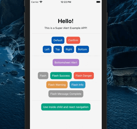
React Native Super Alert is a component where you can use various types of alerts and notifications without having to import the library on all screens..
Installation
npm i react-native-super-alert --save
or
yarn add react-native-super-alert
Load the library in Root file of your application (e.g. app.js)
import SuperAlert from "react-native-super-alert";

export default function App() {
    return (
            <View>
                <AppContainer />
                <SuperAlert /> {/* <--- Load Super Alert here */}
            </View>
        );
    }
}
NOTE: This component will replace the default (alert) action from React Native
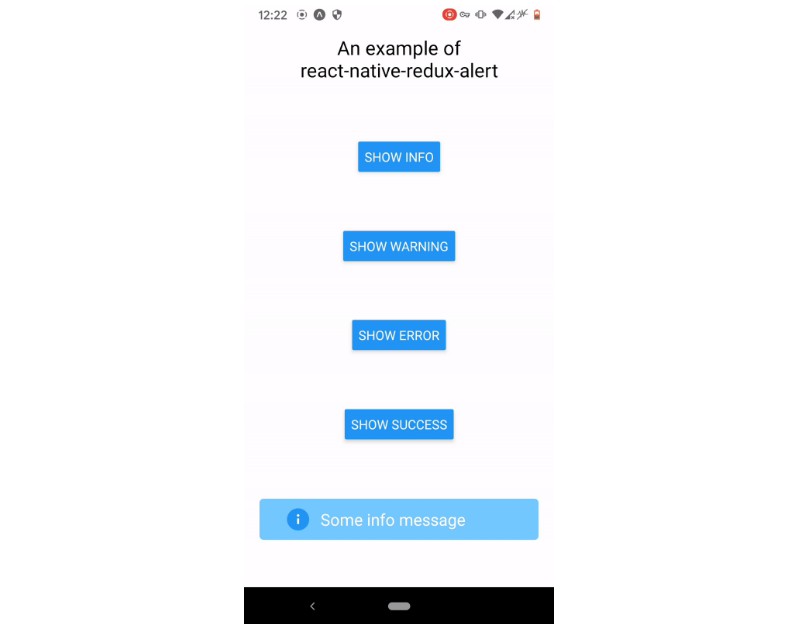
Usage
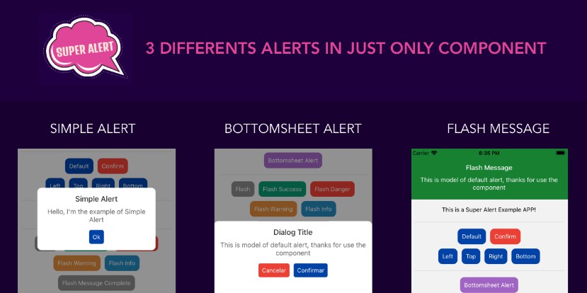
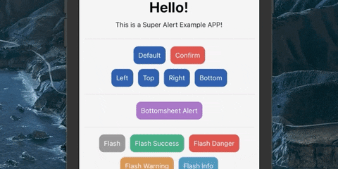
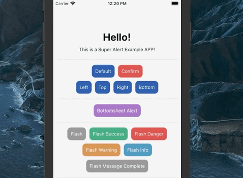
Default alert
After import Super alert in Root of application, you can call the component using the code bellow

// alert('Title of alert', 'Message of alert', { Object props })
Example for default alert without confirm
    alert(
        'Hello!!', // This is a title
        "This is a Super Alert" // This is a alert message
    )
Loading alert from the corners of screen
    alert(
        'Hello!!', // This is a title
        "This is a Super Alert", // This is a alert message
        {
            position: 'top' // top, bottom, left or right,
        }
    )
| Prop | Type | Description | Default |
|---|---|---|---|
| position (Optional) | string | Using alert in corners (Top, Bottom, Left, Right) | '' |
Using confirm and cancel action
Example
    alert(
        'Hello!!', // This is a title
        "This is a Super Alert", // This is a alert message
        {
            textConfirm: 'Confirm', // Label of button confirm
            textCancel: 'Cancel', // Label of button cancel
            onConfirm: () => confirmClick(), // Call your confirm function
            onCancel: () => cancelClick() // Call your cancel function
        }
    )
Then create the functions to confirm and cancel action
  confirmClick = () => {
    console.log('Confirm Action')
  }

  cancelClick = () => {
    console.log('Cancel Action')
  }
Note: You can use the confirm params in all alert types
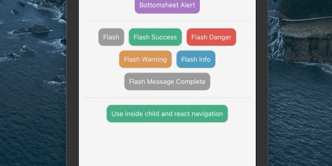
Other types
BottomSheet
    alert(
        'Hello!!', // This is a title
        "This is a Super Alert", // This is a alert message
        {
            type: 'bottomsheet'
        }
    )
Props of BottomSheet
| Prop | Type | Description | Default |
|---|---|---|---|
| bottomSheetHeight (Optional) | number | Alert BottomSheet height | 180 |
Flash Message
    alert(
        'Title',
        'This is model of default alert, thanks for use the component',
        {
            type: 'flashmessage',
            option: 'danger', // danger | warning | info | success
            timeout: 3
        }
    )
Props of Flash Message
| Prop | Type | Description | Default |
|---|---|---|---|
| flashMessageHeight (Optional) | number | Flash Message height | 110 |
| option (Optional) | string | Select the Color Scheme (danger,warning,info or success) | '' |
| timeout (Optional) | number | Total of seconds to close the alert | 5 |
Example with React Navigation Component
Global Props
| Prop | Type | Description | Default |
|---|---|---|---|
| Type (Optional) | string | Select the type of alert (alert,bottomsheet,flashmessage) | 'alert' |
| useNativeDriver (Optional) | boolean | Use native driver | false |
| textConfirm (Optional) | string | Button confirm label | 'OK' |
| textCancel (Optional) | string | Button cancel label | '' |
Customize Alerts
You can customize the alert according to your theme
Place your style object in the customStyle props
<SuperAlert customStyle={customStyle} />
Classes of customization
| Prop | Description |
|---|---|
| container | Customize the container style |
| buttonCancel | Customize the button cancel style |
| buttonConfirm | Customize the button confirm style |
| textButtonCancel | Customize the button cancel label style |
| textButtonConfirm | Customize the button confirm label style |
| title | Customize the title text style |
| message | Customize the message text style |
Example of custom style object
  const customStyle = {
    container: {
      backgroundColor: '#e8e8e8',
      borderRadius: 0,
    },
    buttonCancel: {
      backgroundColor: '#b51919',
      borderRadius: 0,
    },
    buttonConfirm: {
      backgroundColor: '#4490c7',
      borderRadius: 0,
    },
    textButtonCancel: {
        color: '#fff',
        fontWeight: 'bold'
    },
    textButtonConfirm: {
        color: '#fff',
        fontWeight: 'bold'
    },
    title: {
      color: '#003d69',
      fontSize: 15
    },
    message: {
      color: '#4f4f4f',
      fontSize: 12
    }
  }
Example App
You can download example app from Example App this link
Author
By Alan Ribeiro