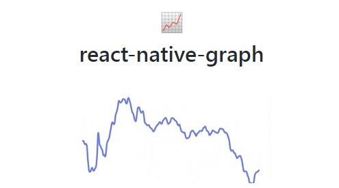
react-native-wagmi-charts
A sweet & simple chart library for React Native that will make us feel like We're All Gonna Make It
Features
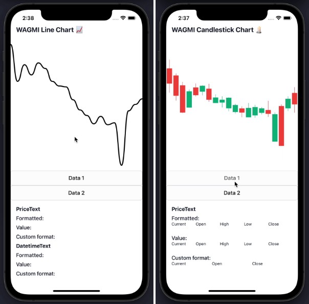
? Line charts & candlestick charts (more to come ?)
? Interactive price & date/time label components
? Built with composability in mind
? Highly customizable APIs
✨ Uses React Native Reanimated 2 under-the-hood
? Slick data transition animations
? Interactive tooltips
Install
To get started with using WAGMI charts in your React Native project, install the react-native-wagmi-charts package.
npm install react-native-wagmi-charts
WAGMI charts also depends on a few libraries, you will also need to install these packages if you don't already have them:
npm install react-native-reanimated react-native-gesture-handler react-native-haptic-feedback
Basic Usage
The library currently comes with 2 types of charts: Line & Candlestick. Below are the most basic usages of them.
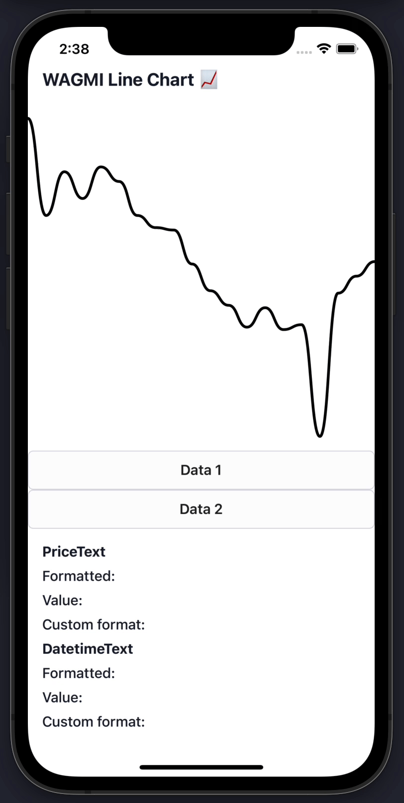
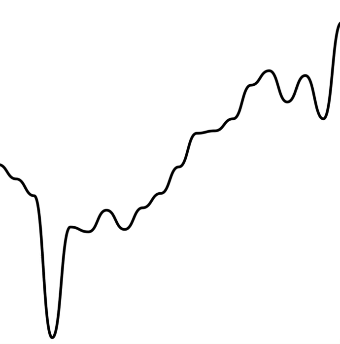
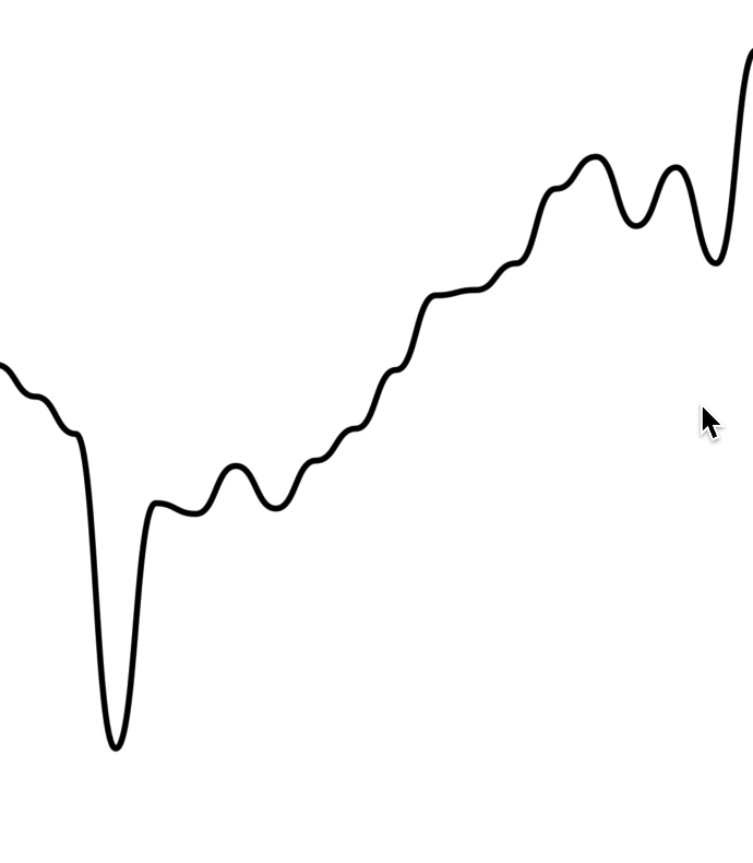
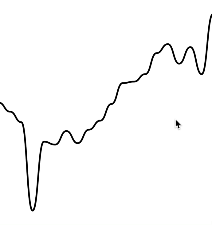
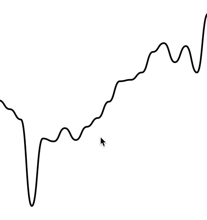
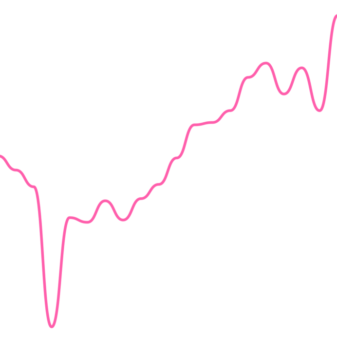
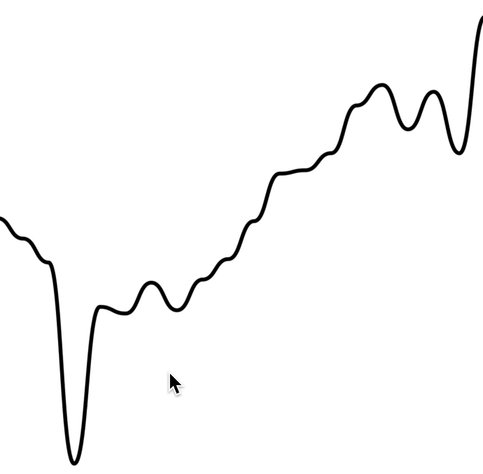
Line chart
To render a simple line chart, you will need to use the LineChart.Provider, LineChart & LineChart.Path components.
The LineChart.Provider component sets up the context of your chart, LineChart composes the chart elements, and the LineChart.Path component renders your data in the form of a line path.
Note: This chart does not include an interactive cursor like in the animated example above. If you want one, check out the "Interactive Cursors" guide
import { LineChart } from 'react-native-wagmi-charts';

const data = [
  {
    timestamp: 1625945400000,
    value: 33575.25
  },
  {
    timestamp: 1625946300000,
    value: 33545.25
  },
  {
    timestamp: 1625947200000,
    value: 33510.25
  },
  {
    timestamp: 1625948100000,
    value: 33215.25
  }
]

function Example() {
  return (
    <LineChart.Provider data={data}>
      <LineChart>
        <LineChart.Path />
      </LineChart>
    </LineChart.Provider>
  )
}
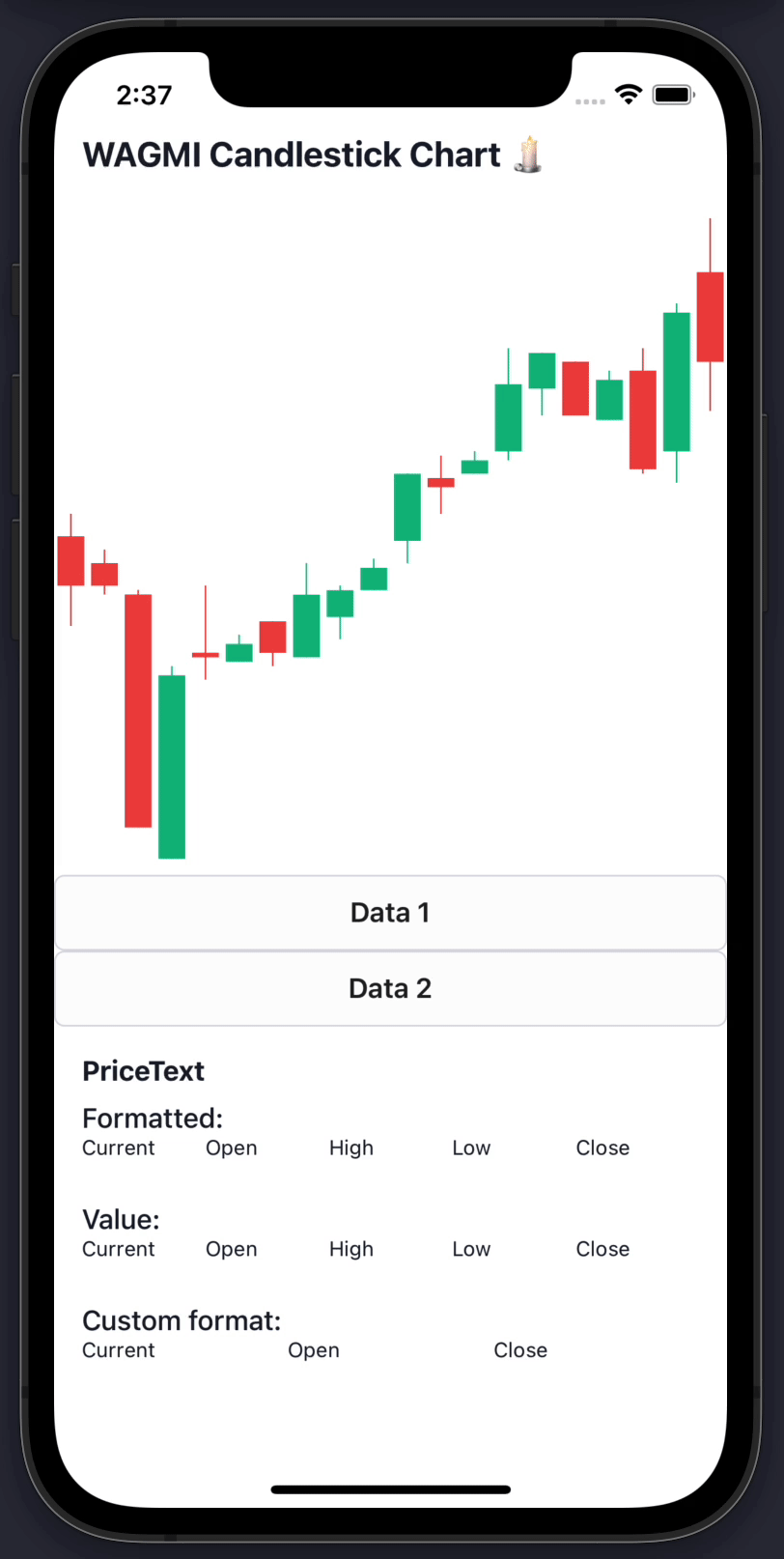
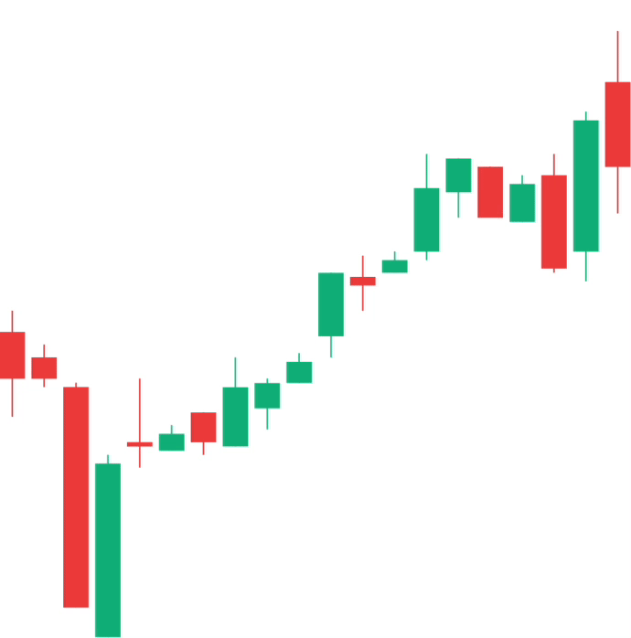
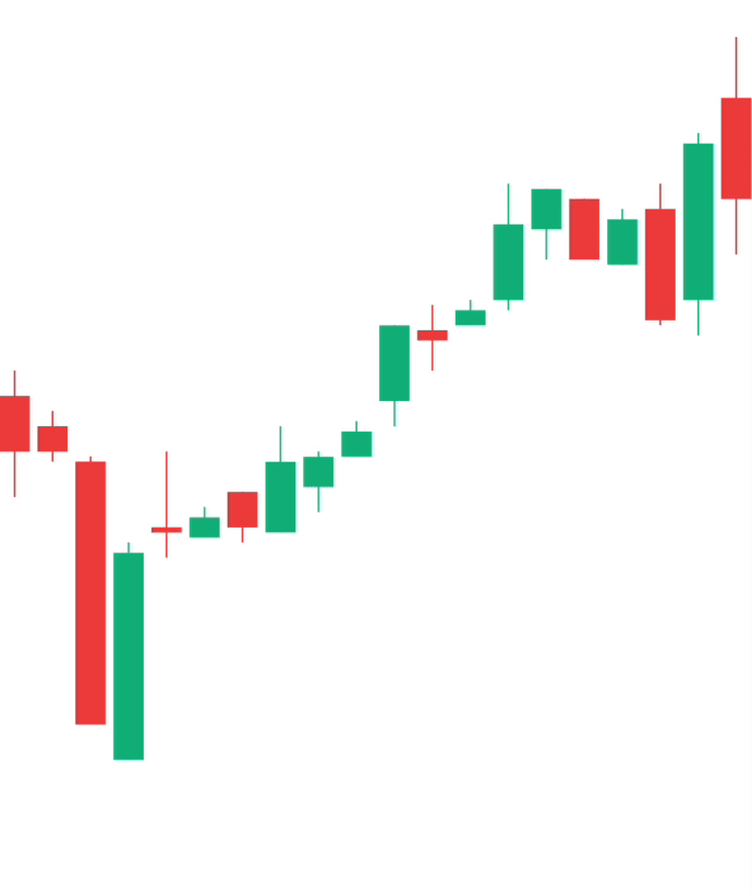
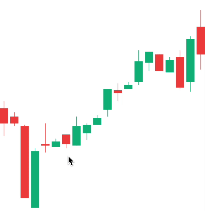
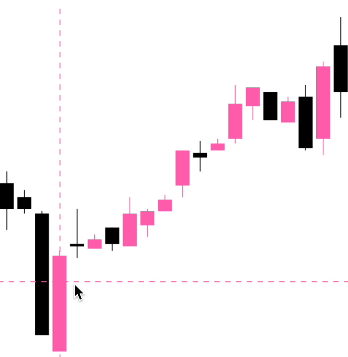
Candlestick chart
To render a simple candlestick chart, you will need to use the CandlestickChart & CandlestickChart.Candles components.
The CandlestickChart.Provider component sets up the context of your chart, CandlestickChart composes the chart elements, and the CandlestickChart.Candles component renders your data in the form of a line path.
Note: This chart does not include an interactive cursor like in the animated example above. If you want one, check out the "Interactive Cursors" guide
import { CandlestickChart } from 'react-native-wagmi-charts';

const data = [
  {
    timestamp: 1625945400000,
    open: 33575.25,
    high: 33600.52,
    low: 33475.12,
    close: 33520.11
  },
  {
    timestamp: 1625946300000,
    open: 33545.25,
    high: 33560.52,
    low: 33510.12,
    close: 33520.11
  },
  {
    timestamp: 1625947200000,
    open: 33510.25,
    high: 33515.52,
    low: 33250.12,
    close: 33250.11
  },
  {
    timestamp: 1625948100000,
    open: 33215.25,
    high: 33430.52,
    low: 33215.12,
    close: 33420.11
  }
]

function Example() {
  return (
    <CandlestickChart.Provider data={data}>
      <CandlestickChart>
        <CandlestickChart.Candles />
      </CandlestickChart>
    </CandlestickChart.Provider>
  )
}
Guides
Below are some guides to help you make your charts suit your brand. Hopefully a combination of the below will enable you to make a great chart! :-)
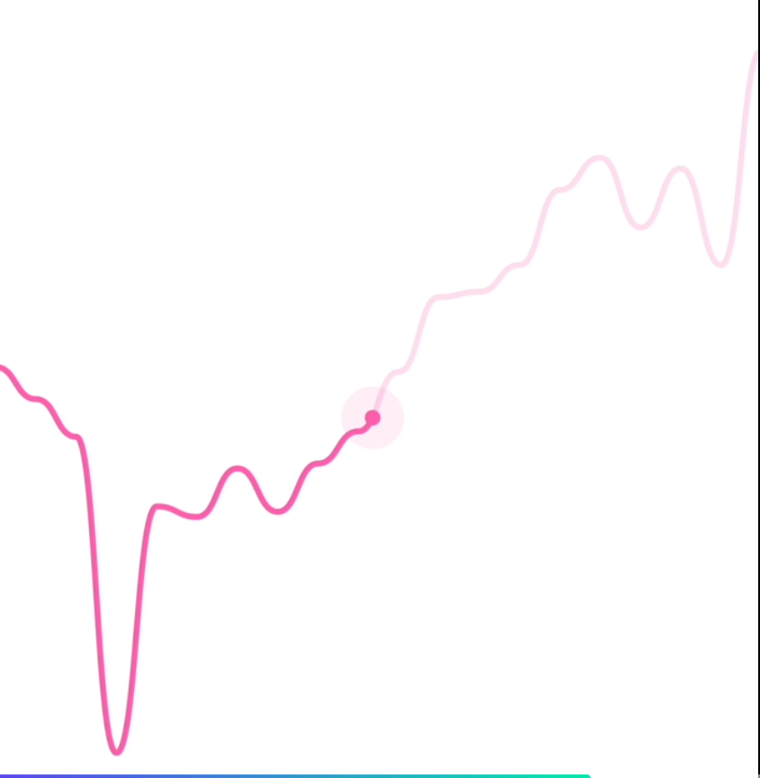
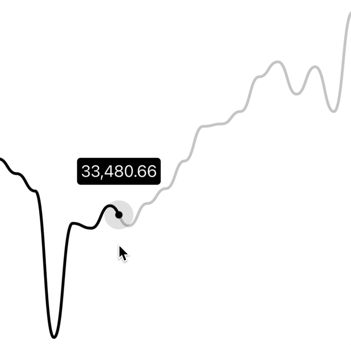
Interactive cursors
Line chart
To render an interactive cursor on your line chart, you can include either the LineChart.CursorCrosshair or LineChart.CursorLine components:
LineChart.CursorCrosshair
<LineChart.Provider data={data}>
  <LineChart>
    <LineChart.Path />
    <LineChart.CursorCrosshair />
  </LineChart>
</LineChart.Provider>
LineChart.CursorLine
<LineChart.Provider data={data}>
  <LineChart>
    <LineChart.Path />
    <LineChart.CursorLine />
  </LineChart>
</LineChart.Provider>

Candlestick chart
To render an interactive cursor on your candlestick chart, you can include the CandlestickChart.Crosshair component:
CandlestickChart.Crosshair
<CandlestickChart.Provider data={data}>
  <CandlestickChart>
    <CandlestickChart.Candles />
    <CandlestickChart.Crosshair />
  </CandlestickChart>
</CandlestickChart.Provider>
Interactive labels
Line chart
To render an interactive label on your line chart as your cursor moves along the graph, you can use the PriceText or DatetimeText components:
Note: These components must be within the
LineChart.Providercomponent.
<LineChart.Provider data={data}>
  <LineChart>
    <LineChart.Path />
    <LineChart.CursorCrosshair />
  </LineChart>
  <LineChart.PriceText />
  <LineChart.DatetimeText />
</LineChart.Provider>
Candlestick chart
To render an interactive label on your candlestick chart, you can use the PriceText or DatetimeText components:
Note: These components must be within the
CandlestickChart.Providercomponent.
<CandlestickChart.Provider data={data}>
  <CandlestickChart>
    <CandlestickChart.Candles />
    <CandlestickChart.Crosshair />
  </CandlestickChart>
  <CandlestickChart.PriceText type="open" />
  <CandlestickChart.PriceText type="high" />
  <CandlestickChart.PriceText type="low" />
  <CandlestickChart.PriceText type="close" />
  <CandlestickChart.DatetimeText />
</LineChart.Provider>
Interactive tooltips
Line charts
To render an interactive tooltip that follows your cursor, you can use the Tooltip component.
<LineChart.Provider data={data}>
  <LineChart>
    <LineChart.Path />
    <LineChart.CursorCrosshair>
      <LineChart.Tooltip />
    </LineChart.CursorCrosshair>
  </LineChart>
</LineChart.Provider>
You can even add another tooltip to show something like date/time:
<LineChart.Provider data={data}>
  <LineChart>
    <LineChart.Path />
    <LineChart.CursorCrosshair>
      <LineChart.Tooltip />
      <LineChart.Tooltip position="bottom">
        <LineChart.DatetimeText />
      </LineChart.Tooltip>
    </LineChart.CursorCrosshair>
  </LineChart>
</LineChart.Provider>
Candlestick charts
To render an interactive tooltip that follows your crosshair, you can use the Tooltip component.
<CandlestickChart.Provider data={data}>
  <CandlestickChart>
    <CandlestickChart.Candles />
    <CandlestickChart.Crosshair>
      <CandlestickChart.Tooltip />
    </CandlestickChart.Crosshair>
  </CandlestickChart>
</CandlestickChart.Provider>
Colors
By default, the charts come with default colors out-of-the-box... But you probably will want to change these to suit your brand.
Line charts
Coloring the path
To customise the color of the line chart path, supply a color prop to LineChart.Path. This can be any valid React Native StyleSheet compatible color.
<LineChart.Provider data={data}>
  <LineChart>
    <LineChart.Path color="hotpink" />
  </LineChart>
</LineChart.Provider>
Coloring the cursor
To customise the color of the line chart cursor, supply a color prop to LineChart.CursorCrosshair. This can be any valid React Native StyleSheet compatible color.
Note: This also works for
LineChart.CursorLine
<LineChart.Provider data={data}>
  <LineChart>
    <LineChart.Path color="hotpink" />
    <LineChart.CursorCrosshair color="hotpink />
  </LineChart>
</LineChart.Provider>
Candlestick charts
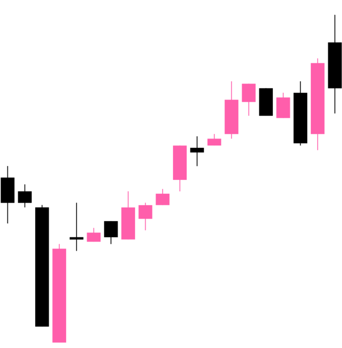
Coloring the candles
To customise the color of the candlestick chart candles, supply a negativeColor and a positiveColor to CandlestickChart.Candles. This can be any valid React Native StyleSheet compatible color.
<CandlestickChart.Provider data={data}>
  <CandlestickChart>
    <CandlestickChart.Candles positiveColor="hotpink" negativeColor="black" />
  </CandlestickChart>
</CandlestickChart.Provider>
Coloring the crosshair
To customise the color of the line chart cursor, supply a color prop to CandlestickChart.Crosshair. This can be any valid React Native StyleSheet compatible color.
<CandlestickChart.Provider data={data}>
  <CandlestickChart>
    <CandlestickChart.Candles positiveColor="hotpink" negativeColor="black" />
    <CandlestickChart.Crosshair color="hotpink" />
  </CandlestickChart>
</CandlestickChart.Provider>
Customizing size
You can modify the width & height of the charts by providing width and height props to LineChart or CandlestickChart. Your chart should adapt to it's size.
<LineChart.Provider data={data}>
  <LineChart width={150} height={150}>
    <LineChart.Path />
  </LineChart>
</LineChart.Provider>
Customizing labels
Price labels
Precision
By default, the price labels have a precision of 2, meaning that the prices will always be to 2 decimal places. However, you can customize this with the precision prop:
<LineChart.PriceText precision={4} />
<CandlestickChart.PriceText precision={4} />
Custom formatting
To customize the formatting of the price text, you can supply a format function in the form of a reanimated worklet:
Note: due to the nature of reanimated worklets, you cannot define functions that run on the React Native JS thread. Read more here
<LineChart.PriceText
  format={({ value }) => {
    'worklet';
    const formattedPrice = yourOwnFormatValueFn(value);
    return `$${formattedPrice} AUD`;
  }}
/>
Datetime labels
Date/time options
Internally, WAGMI charts uses Date.prototype.toLocaleString() to generate the date/time label. You can customise it's options like so:
<LineChart.DatetimeText
  locale="en-AU"
  options={{
    year: 'numeric',
    month: 'numeric',
    day: 'numeric',
    hour: 'numeric',
    minute: 'numeric',
    second: 'numeric',
  }}
/>
Custom formatting
To customize the formatting of the date/time text, you can supply a format function in the form of a reanimated worklet:
Note: due to the nature of reanimated worklets, you cannot define functions that run on the React Native JS thread. Read more here
<LineChart.DatetimeText
  format={({ value }) => {
    'worklet';
    const formattedDate = yourOwnFormatValueFn(value);
    return formattedDate;
  }}
/>
Customizing tooltips
Style
You can customize the style of the tooltip by providing the textStyle prop:
<LineChart.Tooltip
  style={{
    backgroundColor: 'black',
    borderRadius: 4,
    color: 'white',
    fontSize: 18,
    padding: 4,
  }}
/>
Gutter
You can customize the gutters of the tooltip by providing cursorGutter, xGutter or yGutter.
cursorGutter is the gutter between the cursor and the tooltip.
xGutter and yGutter is the gutter on the x & y axis of the chart (the tooltip can't pass the gutter).
<LineChart.Tooltip
  cursorGutter={60}
  xGutter={16}
  yGutter={16}
/>
Component APIs
LineChart.Provider
| Prop | Type | Default | Description |
|---|---|---|---|
data |
Array<{ timestamp: number, value: number }> |
The line chart data as an array of timestamps & values (prices). |
LineChart
| Prop | Type | Default | Description |
|---|---|---|---|
width |
number |
Width of device screen | The width of the chart |
height |
number |
Height of device screen | The height of the chart |
yGutter |
number |
16 |
The gutter of the chart on the Y axis (the chart data will not exceed it's gutter) |
shape |
function |
shape.curveBumpX |
The shape type/curve of the graph. Accepts a curve function from d3-shape |
...props |
ViewProps |
This component also inherits React Native's View props. |
LineChart.Path
| Prop | Type | Default | Description |
|---|---|---|---|
color |
string |
"black" |
Color of the line path |
width |
number |
3 |
Width of the line path |
...props |
PathProps |
This component also inherits React Native SVG's Path props. |
LineChart.CursorCrosshair
| Prop | Type | Default | Description |
|---|---|---|---|
color |
string |
"black" |
Color of the crosshair dot |
size |
number |
8 |
Size of the crosshair dot |
outerSize |
number |
32 |
Size of the outer crosshair dot (faded dot) |
crosshairWrapperProps |
ViewProps |
Props of the wrapper component of the crosshair | |
crosshairProps |
ViewProps |
Props of the crosshair dot | |
crosshairOuterProps |
ViewProps |
Props of the crosshair outer dot |
LineChart.CursorLine
| Prop | Type | Default | Description |
|---|---|---|---|
color |
string |
"gray" |
Color of the cursor line |
lineProps |
LineProps |
Props of the cursor line. Takes React Native SVG's Line props. |
LineChart.Tooltip
| Prop | Type | Default | Description |
|---|---|---|---|
xGutter |
number |
8 |
X axis gutter in which the tooltip will not pass. |
yGutter |
number |
8 |
Y axis gutter in which the tooltip will not pass. |
cursorGutter |
number |
48 |
Gutter (spacing) between the cursor and the tooltip. |
position |
"top" | "bottom" |
"top" |
Position of the tooltip relative to the cursor. |
LineChart.PriceText
| Prop | Type | Default | Description |
|---|---|---|---|
format |
({ value, formatted }) => string |
Custom format function of the price. | |
precision |
number |
2 |
Default precision of the price. |
variant |
"formatted" | "value" |
"formatted" |
Default representation of the price value. |
...props |
TextProps |
Inherits React Native's Text props |
LineChart.DatetimeText
| Prop | Type | Default | Description |
|---|---|---|---|
format |
({ value, formatted }) => string |
Custom format function of the timestamp. | |
locale |
string |
"en-US" |
Locale of the timestamp. |
options |
{} |
Options to pass to toLocaleString(). Available options are here |
|
style |
{} |
Style of the price text | |
variant |
"formatted" | "value" |
"formatted" |
Default representation of the timestamp value. |
CandlestickChart.Provider
| Prop | Type | Default | Description |
|---|---|---|---|
data |
Array<{ timestamp: number, open: number, high: number, low: number, close: number }> |
The candlestick chart data as an array of timestamps & values (prices). |
CandlestickChart
| Prop | Type | Default | Description |
|---|---|---|---|
width |
number |
Width of device screen | The width of the chart |
height |
number |
Height of device screen | The height of the chart |
...props |
ViewProps |
This component also inherits React Native's View props. |
CandlestickChart.Candles
| Prop | Type | Default | Description |
|---|---|---|---|
positiveColor |
string |
#10b981 |
Color of the positive candles |
negativeColor |
string |
#ef4444 |
Color of the negative candles |
rectProps |
RectProps |
Props of the SVG Rectangle. Takes React Native's SVG Rect props. |
|
lineProps |
LineProps |
Props of the SVG Line. Takes React Native's SVG Line props. |
|
renderRect |
({ x: number, y: number, width: number, height: number, fill: string }) => React.ReactNode |
Renders a custom rect component | |
renderLine |
({ x1: number, x2: number, y1: number, y2: number, stroke: string, strokeWidth: number }) => React.ReactNode |
Renders a custom line component | |
...props |
SvgProps |
This component also inherits React Native SVG's Svg props. |
CandlestickChart.Crosshair
| Prop | Type | Default | Description |
|---|---|---|---|
color |
string |
"black" |
Color of the crosshair |
CandlestickChart.Tooltip
| Prop | Type | Default | Description |
|---|---|---|---|
xGutter |
number |
8 |
X axis gutter in which the tooltip will not pass. |
yGutter |
number |
8 |
Y axis gutter in which the tooltip will not pass. |
tooltipTextProps |
PriceTextProps |
Props of the tooltip (price) text. | |
textStyle |
{} |
Style of the tooltip text |
CandlestickChart.PriceText
| Prop | Type | Default | Description |
|---|---|---|---|
format |
({ value, formatted }) => string |
Custom format function of the price. | |
precision |
number |
2 |
Default precision of the price. |
variant |
"formatted" | "value" |
"formatted" |
Default representation of the price value. |
...props |
TextProps |
Inherits React Native's Text props |
CandlestickChart.DatetimeText
| Prop | Type | Default | Description |
|---|---|---|---|
format |
({ value, formatted }) => string |
Custom format function of the timestamp. | |
locale |
string |
"en-US" |
Locale of the timestamp. |
options |
{} |
Options to pass to toLocaleString(). Available options are here |
|
style |
{} |
Style of the price text | |
variant |
"formatted" | "value" |
"formatted" |
Default representation of the timestamp value. |
Hooks
The following hooks are only accessible inside the LineChart.Provider or CandlestickChart.Provider.
LineChart.useChart
The LineChart.useChart hook returns the current state of the chart.
const {
  currentX,
  currentY,
  currentIndex,
  data,
  domain,
  isActive
} = LineChart.useChart();
Reference
Returns
| Variable | Type | Default | Description |
|---|---|---|---|
currentX |
Animated.SharedValue<number> |
Current x position | |
currentY |
Animated.SharedValue<number> |
Current y position | |
currentIndex |
Animated.SharedValue<number> |
Current index of the data | |
data |
Array<{ timestamp: number, value: number }> |
Data of the chart | |
domain |
[number, number] |
Y domain of the chart | |
isActive |
Animated.SharedValue<boolean> |
Is the chart active by gesture? |
LineChart.useDatetime
const {
  value,
  formatted
} = LineChart.useDatetime({
  format,
  locale,
  options
})
Reference
Arguments
| Variable | Type | Default | Description |
|---|---|---|---|
format |
({ value, formatted }) => string |
Custom format function of the timestamp. | |
locale |
string |
"en-US" |
Locale of the timestamp. |
options |
{} |
Options to pass to toLocaleString(). Available options are here |
Returns
| Variable | Type | Default | Description |
|---|---|---|---|
value |
string |
Timestamp value in ms. | |
formatted |
string |
Formatted timestamp value |
LineChart.usePrice
const {
  value,
  formatted
} = LineChart.usePrice({
  format,
  precision
})
Arguments
| Variable | Type | Default | Description |
|---|---|---|---|
format |
({ value, formatted }) => string |
Custom format function of the price. | |
precision |
number |
2 |
Precision of the price value. |
Returns
| Variable | Type | Default | Description |
|---|---|---|---|
value |
string |
Price value | |
formatted |
string |
Formatted price value |
CandlestickChart.useChart
const {
  currentX,
  currentY,
  data,
  domain,
  step
} = CandlestickChart.useChart();
Reference
Returns
| Variable | Type | Default | Description |
|---|---|---|---|
currentX |
Animated.SharedValue<number> |
Current x position | |
currentY |
Animated.SharedValue<number> |
Current y position | |
data |
Array<{ timestamp: number, open: number, high: number, low: number, close: number }> |
Data of the chart | |
domain |
[number, number] |
Y domain of the chart | |
step |
number |
Current index of the data |
CandlestickChart.useCandleData
The useCandleData hook returns the current candle data.
const {
  timestamp,
  open,
  high,
  low,
  close
} = CandlestickChart.useCandleData();
Reference
Returns
| Variable | Type | Default | Description |
|---|---|---|---|
timestamp |
number |
||
open |
number |
||
high |
number |
||
low |
number |
||
close |
number |
CandlestickChart.useDatetime
const {
  value,
  formatted
} = CandlestickChart.useDatetime({
  format,
  locale,
  options
})
Reference
Arguments
| Variable | Type | Default | Description |
|---|---|---|---|
format |
({ value, formatted }) => string |
Custom format function of the timestamp. | |
locale |
string |
"en-US" |
Locale of the timestamp. |
options |
{} |
Options to pass to toLocaleString(). Available options are here |
Returns
| Variable | Type | Default | Description |
|---|---|---|---|
value |
string |
Timestamp value in ms. | |
formatted |
string |
Formatted timestamp value |
CandlestickChart.usePrice
const {
  value,
  formatted
} = CandlestickChart.usePrice({
  format,
  precision
})
Arguments
| Variable | Type | Default | Description |
|---|---|---|---|
format |
({ value, formatted }) => string |
Custom format function of the price. | |
precision |
number |
2 |
Precision of the price value. |
Returns
| Variable | Type | Default | Description |
|---|---|---|---|
value |
string |
Price value | |
formatted |
string |
Formatted price value |