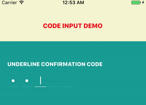
React Native OTP Input
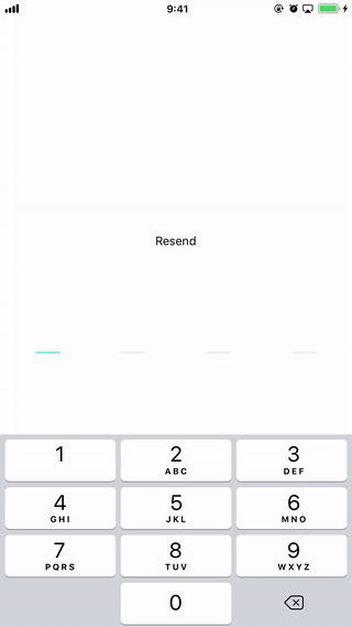
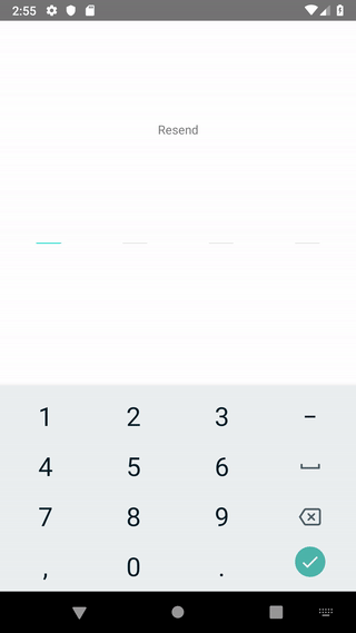
@twotalltotems/react-native-otp-input is a tiny Javascript library which provides an elegant UI for the end user to input one time passcode (OTP). It handles the input suggestion on iOS when the OTP SMS is received. For Android, it will autofill when the user presses the copy button on the SMS notification bar. It also features a carefully crafted flow to handle edge cases for volatile user gestures. We provide default UI, but you can always customize the appearance as you like.
Installation
npm install --save @twotalltotems/react-native-otp-input
or
yarn add @twotalltotems/react-native-otp-input
Dependencies
NOTES:
From version 1.3.10: We use @react-native-community/clipboard to handle the clipboard in this package, So you should install @react-native-community/clipboard
npm install --save @react-native-community/clipboard
or
yarn add @react-native-community/clipboard
Basic Usage
import OTPInputView from '@twotalltotems/react-native-otp-input'

...

<OTPInputView pinCount={4} />
More Advanced Usage
import OTPInputView from '@twotalltotems/react-native-otp-input'

...

<OTPInputView
    style={{width: '80%', height: 200}}
    pinCount={4}
    // code={this.state.code} //You can supply this prop or not. The component will be used as a controlled / uncontrolled component respectively.
    // onCodeChanged = {code => { this.setState({code})}}
    autoFocusOnLoad
    codeInputFieldStyle={styles.underlineStyleBase}
    codeInputHighlightStyle={styles.underlineStyleHighLighted}
    onCodeFilled = {(code => {
        console.log(`Code is ${code}, you are good to go!`)
    })}
/>

const styles = StyleSheet.create({
  borderStyleBase: {
    width: 30,
    height: 45
  },

  borderStyleHighLighted: {
    borderColor: "#03DAC6",
  },

  underlineStyleBase: {
    width: 30,
    height: 45,
    borderWidth: 0,
    borderBottomWidth: 1,
  },

  underlineStyleHighLighted: {
    borderColor: "#03DAC6",
  },
});
Parameters
| Parameter | required | Description |
|---|---|---|
| pinCount | YES | Number of digits in the component |
| code | NO | You can use this library as a controlled / uncontrolled component by supplying this prop or not |
| codeInputFieldStyle | NO | The style of the input field which is NOT focused |
| codeInputHighlightStyle | NO | The style of the input field which is focused |
| autoFocusOnLoad | NO | Auto activate the input and bring up the keyboard when component is loaded |
| onCodeChanged | NO | Callback when the digits are changed |
| onCodeFilled | NO | Callback when the last digit is entered |
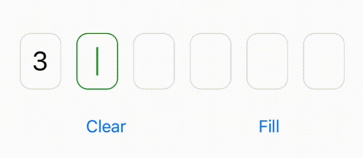
| secureTextEntry | NO | Hide contents of text fields |
| editable | NO | Set editable for inputs |
| keyboardAppearance | NO | Keyboard appearance ('default', 'dark', 'light') |
| keyboardType | NO | Keyboard type |
| clearInputs | NO | Clear inputs after entering code |
| placeholderCharacter | NO | The character/string that will be used as placeholder in the individual code input fields |
| placeholderTextColor | NO | Color of the placeholderCharacter |
Notes
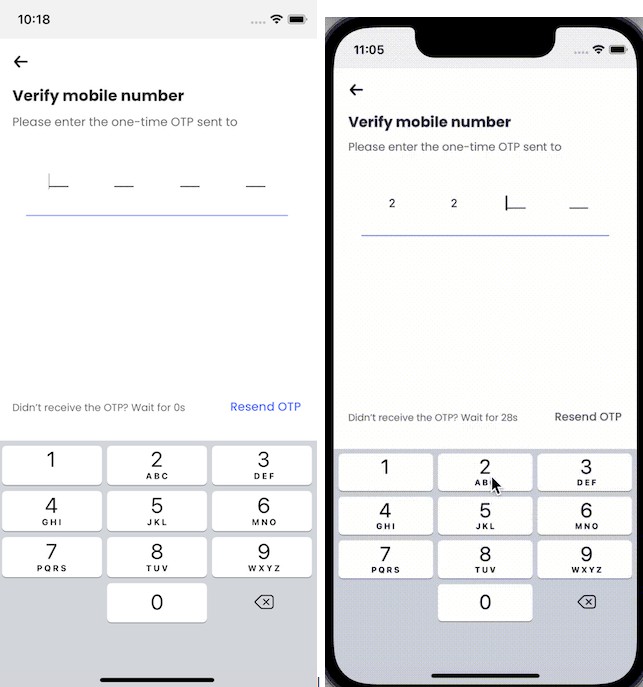
The iOS input suggestion requires React Native 0.58+ and works for iOS 12 and above.
On Android, it will be auto filled when you press the copy code button in the notification bar (see above GIF). It will do so only if the code is sent after the view is loaded. So make sure you request the code AFTER this view is loaded.
If you are interested in Android SMS Retriever API, we would suggest @Faizal's repo React-Native-OTP-Verify. It looks pretty cool and it should be straight-forward to use React-Native-OTP-Verify along with this library.
Roadmap
- [x] Typescript definition file
- [x] Typescript implementation
- [x] Add basic unit tests
- [ ] Add integration tests