toastify-react-native
toastify-react-native allows you to add notifications to your react-native app (ios, android) with ease. No more nonsense!
Features
- Smooth enter/exit animations
- Plain simple and flexible APIs
- Resize itself correctly on device rotation
- Swipeable
- Easy to set up for real, you can make it work in less than 10sec!
- Super easy to customize
- RTL support
- Swipe to close ?
- Can choose swipe direction
- Super easy to use an animation of your choice. Works well with animate.css for example
- Define behavior per toast
- Pause toast by click on the toast ?
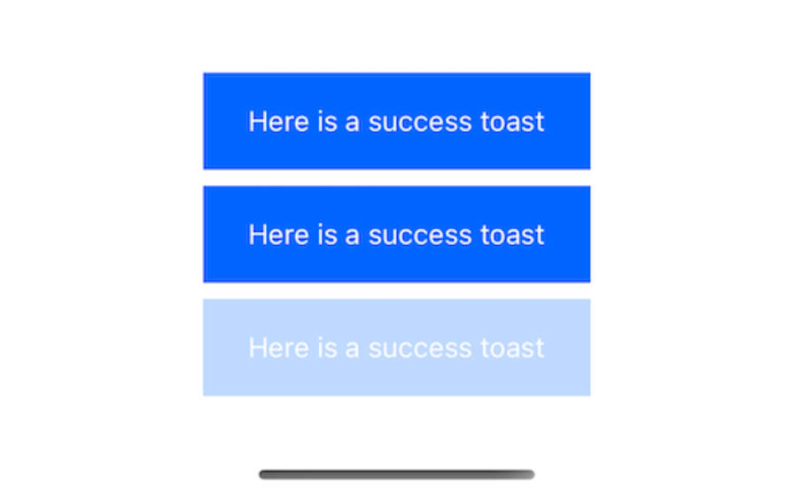
- Fancy progress bar to display the remaining time
- Possibility to update a toast
- You can control the progress bar a la nprogress ?
- You can display multiple toast at the same time
- Dark mode ?
- And much more !
Installation
$ npm install toastify-react-native
The gist
import React, { useState } from 'react';
import { Button } from 'react-native';
import Toast from 'toastify-react-native';

export default function App() {
  const [toastify, setToastify] = useState()

  return (
    <View>
      <Toast ref={(c) => setToastify(c)} />

      <Button onPress={() => toastify.success("Success")} />
    </View>
  );

}
A complete example
import React, { useState } from 'react';
import { StyleSheet, View, TouchableOpacity, Text } from 'react-native';
import Toast from 'toastify-react-native';
export default function App() {
const [toastify, setToastify] = useState()
const [toastify2, setToastify2] = useState()
const [toastify3, setToastify3] = useState()
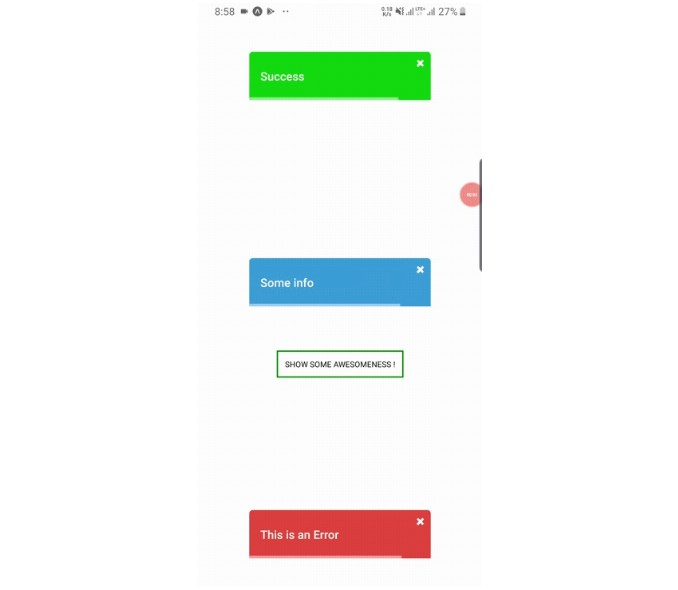
const showToasts = async () => {
toastify.success("Success");
toastify2.info("Some info");
toastify3.error("This is an Error");
}
return (
<View style={styles.container} >
{/* Toasts */}
<Toast ref={(c) => setToastify(c)} />
<Toast position="center" animationStyle="fancy" ref={(c) => setToastify2(c)} />
<Toast position="bottom" animationStyle="rightInOut" ref={(c) => setToastify3(c)} />
{/* Button */}
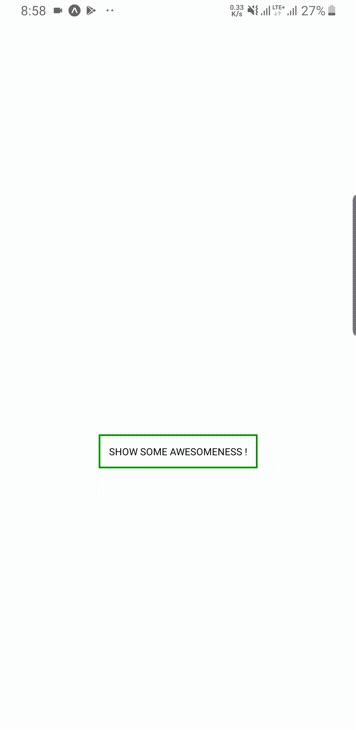
<TouchableOpacity style={{ marginTop: 200, backgroundColor: "white", borderColor: "green", borderWidth: 2, padding: 10 }} onPress={() => showToasts()} >
<Text>
SHOW SOME AWESOMENESS !
</Text>
</TouchableOpacity>
</View>
);
}
const styles = StyleSheet.create({
container: {
flex: 1,
backgroundColor: '#fff',
alignItems: 'center',
justifyContent: 'center',
}
});
For a more complex example take a look at the /example directory.
Available props
| Name | Type | Default | Description |
|---|---|---|---|
| width | number | 256 | Width of toast |
| height | number | 68 | Height of the toast |
| style | any | null | Style applied to the toast |
| position | top, center or bottom | top | Position of toast |
| positionValue | number | 50 | position value of toast |
| duration | number | 3000 | The display time of toast. |
| animationStyle | rightInLeftOut, rightInOut or fancy | rightInLeftOut | The animation style of toast |
| animationIn | string or object | 'slideInRight' | Toast show animation |
| animationOut | string or object | 'slideOutLeft' | Toast hide animation |
| animationInTiming | number | 300 | Timing for the Toast show animation (in ms) |
| animationOutTiming | number | 300 | Timing for the toast hide animation (in ms) |
| backdropTransitionInTiming | number | 300 | The backdrop show timing (in ms) |
| backdropTransitionOutTiming | number | 300 | The backdrop hide timing (in ms) |
| hasBackdrop | bool | false | Render the backdrop |
| backdropColor | string | 'black' | The backdrop background color |
| backdropOpacity | number | 0.5 | The backdrop opacity when the toast is visible |