react-native-buttonex
Minor additions to the standard react-native/Button component to make it perfectly match the native button component on iOS and Android.
This official component by React Native is very close to look of the native buttons we see on iOS and Android. However there are some minor changes needed to really get that perfect look. This module adds some new props to perfectly acheive the various native styles we see on Android and iOS.
How does the native button really look?
This is a great article which shows screenshots - Android VS. iOS: Compare 20 UI Components & Patterns Part 1 and Part 2 - (Original Article in Chineese). It shows the various button components on Android and iOS.
Usage
Installation
npm i react-native-buttonex
Import
import Button from 'react-native-buttonex'
Render
All styles accept the properties of:
disabledloadinglightRipple
Other properties behave differently based on the style. This is explained below.
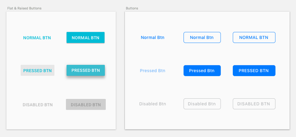
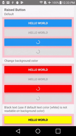
Default Style (Android - Raised Style) (iOS - Text Button Style)
<Button title="Hi" />
- This is an exact copy of the default React Native
- Android Behavior
- Description - A raised button with a solid background color.
- Applicable Properties
color- Changes the color of the background.black- Makes the title label black. Useful if the the default color of white is not readable on background color determined bycolor.animated- While the button is pressed, the button raises up more in elveation. This is the default behavior on Android native button, however in this package it is an option, because this option does not useuseNativeDriver, so it is not the best performance.
- iOS Behavior
- Applicable Properties
color- Changes the color of the title label.bold- Increase font weight of title to 500.
- Applicable Properties
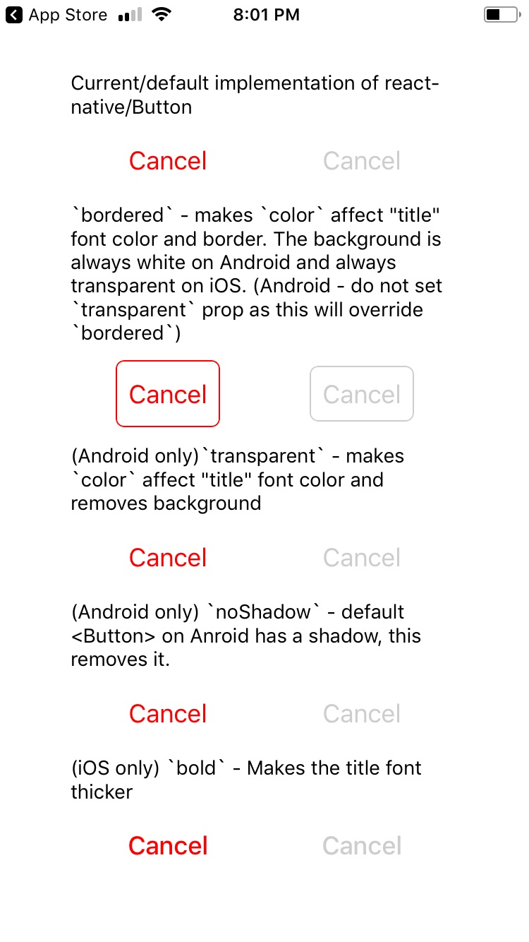
Bordered Style
<Button title="Hi" bordered />
- Android Behavior
- Description - Background color defaults to white.
- Applicable Properties
color- Changes the color of the title label and border.noBackground- Make the background transparent. If this prop is set at same time asblack, this property takes precedence, and a black background will not be applied.black- Makes the background color of the button black.
- iOS Behavior
- Description - Background color is transparent. On press, the title label color goes to white, and the background turns into color set by
color. The animation on press usesuseNativeDriver. - Applicable Properties
color- Changes the color of the title label and border. When button is pressed, this becomes the background color.bold- Increase font weight of title to 500.
- Description - Background color is transparent. On press, the title label color goes to white, and the background turns into color set by
Text Button Style (Android Only)
<Button title="Hi" noBackground />
- Behavior
- Description - A text label button with a transparent background.
- Applicable Properties
color- Changes the color of the title label.
Flat Style (Android Only)
<Button title="Hi" flat />
- Behavior
- Description - Same as "raised style" but without the elevation.
- Applicable Properties
color- Changes the color of the background.black- Makes the title label black. Useful if the the default color of white is not readable on background color determined bycolor.
Properties
| Prop | Type | Default | Required | Description |
|---|---|---|---|---|
| animated | bool | (Android only) Makes the "raised button style" raise even more on press. | ||
| black | bool | (Android only) Changes either the title color, border color, or background color, depending on style. See Usage section above. | ||
| bold | bool | (iOS only) Makes the font weight heavier. | ||
| bordered | bool | Gives the button a border. | ||
| flat | bool | (Android only) Removes the shadow which is there by default on Android. | ||
| lightRipple | bool | (Android only) Use in dark themes. When you want the ripple to be white. Default is rgba(0, 0, 0, 0.12) |
||
| loading | bool | (Android only) Disables onPress handler and shows a spinner. I plan to implement this for iOS soon. I haven't found the style guide for this yet. |
||
| noBackground | bool | (Android only) Gives a transparent background color to the button. | ||
| ...Button.props | All other props of the standard react-native <Button> component. |