React Native Button Toggle Group
An animated button toggle group for React Native.
Install
npm i --save react-native-button-toggle-group
Or
yarn add react-native-button-toggle-group
Usage
import ButtonToggleGroup from 'react-native-button-toggle-group';

// ...

<ButtonToggleGroup
    highlightBackgroundColor={'blue'}
    highlightTextColor={'white'}
    inactiveBackgroundColor={'transparent'}
    inactiveTextColor={'grey'}
    values={['Auto', 'Light', 'Dark']}
    onSelect={val => console.log(val)}
/>
Props
| Property | Type | Description |
|---|---|---|
values |
string[] |
The list of strings to render as options for the button group |
onSelect |
(val: string) => void |
A function that's called whenever one of the values is selected |
highlightBackgroundColor |
string |
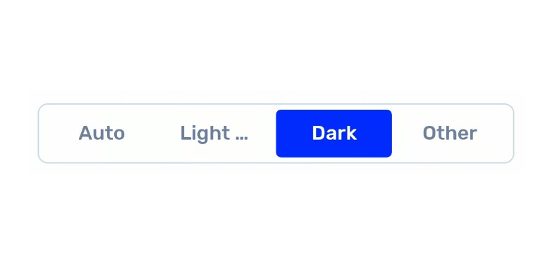
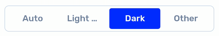
The color that the selected background will be. In the above GIF, it's blue. |
highlightTextColor |
string |
The color that the selected text will be. In the above GIF, it's white. |
inactiveBackgroundColor |
string |
The color that the inactive background will be. In the above GIF, it's white. |
inactiveTextColor |
string |
The color that the inactive text will be. In the above GIF, it's a light blue grey. |
style |
StyleProp | Overwrite styling that can be applied to the container of the button toggle group. In the above GIF, we've added a border, border radius, and some padding. |
textStyle |
StyleProp | Overwrite styling that can be applied to the text of the button toggle group. In the above GIF, we've changed the font family and font size. |