react-native-toast-message
An animated toast message component for React Native that can be called imperatively.
Install
yarn add react-native-toast-message
Usage
// root.jsx
// Add the component your app root
import Toast from 'react-native-toast-message'

const Root = () => {
  return (
    <Toast ref={(ref) => Toast.setRef(ref)} />
  )
}

export default Root
Then use it anywhere in your app like this
import Toast from 'react-native-toast-message'
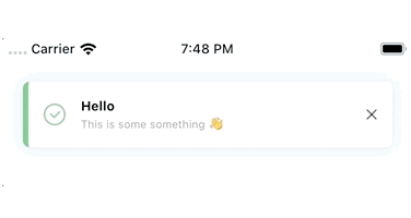
Toast.show({
text1: 'Hello',
text2: 'This is some something ?'
})
API
show(options = {})
When calling the show method, you can use the following options to suit your needs. Everything is optional, unless specified otherwise.
The usage of | below, means that only one of the values show should be used.
If only one value is shown, that's the default.
Toast.show({
  type: 'success | error | info',
  position: 'top | bottom',
  text1: 'Hello',
  text2: 'This is some something ?',
  visibilityTime: 4000,
  autoHide: true,
  topOffset: 30,
  bottomOffset: 40,
  onShow: () => {},
  onHide: () => {}
})
hide(options = {})
Toast.hide({
  onHide: () => {}
})
Customizing the toast types
If you want to add custom types - or overwrite the existing ones - you can add a config prop when rendering the Toast in your app root.
// root.jsx
import Toast from 'react-native-toast-message'

const toastConfig = {
  'success': (internalState) => (
    <View style={{ height: 60, width: '100%', backgroundColor: 'pink' }}>
      <Text>{internalState.text1}</Text>
    </View>
  ),
  'error': () => {},
  'info': () => {},
  'any_custom_type': () => {}
}

const Root = () => {
  return (
    <Toast config={toastConfig} ref={(ref) => Toast.setRef(ref)} />
  )
}

export default Root
Then just use the library as before
Toast.show({ type: 'any_custom_type' })