React Native: Lock Screen
An easy-to-use, customizable and Material Design ready Pattern/Pin Lock view for Android & iOS.
| Pin |
|---|
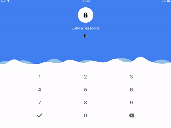 |
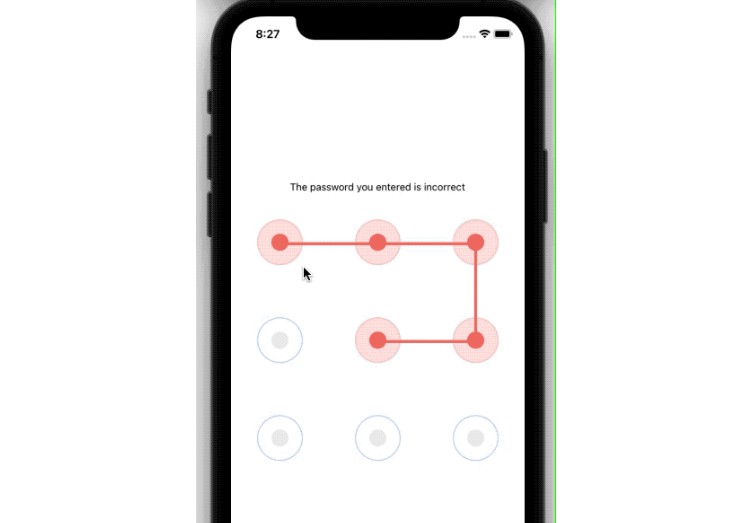
| Pattern |
|---|
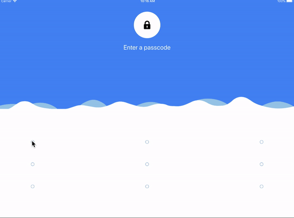 |
| With Background |
|---|
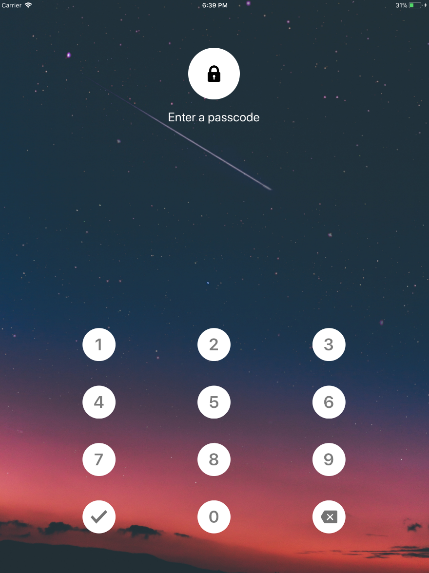 |
Getting started
$ npm install react-native-lock-screen --save
$ react-native link react-native-lock-screen
$ react-native link react-native-svg
- iOS
$ cd ./node_modules/react-native-lock-screen/ios/ && pod install
Usage
import RNLockScreen from 'react-native-lock-screen';

<RNLockScreen type={RNLockScreen.Type.Pin} mode={RNLockScreen.Mode.Capture} onCapture={lock => {
  }} onVerified={() => {

  }}
  lock={'123'}
/>
Props
| Prop | Type | Default | Note |
|---|---|---|---|
type |
number |
Pin - 0 | Specify type of lock (Pin/Pattern) |
mode |
number |
Capture - 0 | Specify mode of lock (Capture/Verify) |
lock |
string |
Specify lock then the mode is Verify | |
onCapture |
func |
Specify onCapture event function, this is invoked once passcode is captured | |
onVerified |
func |
Specify onVerified event function, this is invoked when the passcode is verified | |
backgroundImage |
number : optional |
Specify lock screen background image | |
renderHeaderFragment |
func : optional |
Specify func to customize header fragment | |
renderSeparator |
func : optional |
Specify func to customize separator | |
renderLockFragment |
func : optional |
Specify func to customize lock fragment | |
patternProps |
object : optional |
Specify obj to pass pattern props | |
pinProps |
object : optional |
Specify obj to pass pin props | |
headerFragmentProps |
object : optional |
Specify obj to pass header fragment props | |
lockFragmentProps |
object : optional |
Specify obj to pass lock fragment props | |
defaultState |
object : optional |
Specify obj to pass DEFAULT state props |
|
reenterState |
object : optional |
Specify obj to pass REENTER state props |
|
successState |
object : optional |
Specify obj to pass SUCCESS state props |
|
errorState |
object : optional |
Specify obj to pass error state props |
|
confirmPin |
object : optional |
Specify obj to pass confirm pin state props |
|
deletePin |
object : optional |
Specify obj to pass delete pin state props |
- Default State Props: defaultState
| Prop | Type | Default | Note |
|---|---|---|---|
title |
string |
Enter a passcode | Specify the header fragment title |
titleStyle |
string |
{ fontSize: 24, color: "#FFF" } |
Specify title style |
icon |
string |
lock icon | Specify the header circle icon |
dotProps |
string |
style: { backgroundColor: "#FFF" } |
Specify the Dot component props |
- Reenter State Props: reenterState
| Prop | Type | Default | Note |
|---|---|---|---|
title |
string |
Enter a passcode | Specify the header fragment title |
titleStyle |
string |
{ fontSize: 24, color: "#FFF" } |
Specify title style |
icon |
string |
lock icon | Specify the header circle icon |
dotProps |
string |
style: { backgroundColor: "#FFF" } |
Specify the Dot component props |
- Success State Props: successState
| Prop | Type | Default | Note |
|---|---|---|---|
title |
string |
Enter a passcode | Specify the header fragment title |
titleStyle |
string |
{ fontSize: 24, color: "#FFF" } |
Specify title style |
icon |
string |
lock icon | Specify the header circle icon |
dotProps |
string |
style: { backgroundColor: "#037d50" } |
Specify the Dot component props |
- Error State Props: errorState
| Prop | Type | Default | Note |
|---|---|---|---|
title |
string |
Enter a passcode | Specify the header fragment title |
titleStyle |
string |
{ fontSize: 24, color: "#FFF" } |
Specify title style |
icon |
string |
lock icon | Specify the header circle icon |
dotProps |
string |
style: { backgroundColor: "#be0000" } |
Specify the Dot component props |
- Pin Props
| Prop | Type | Default | Note |
|---|---|---|---|
confirmPin |
string |
Specify text/icon/style of confirm pin | |
deletePin |
string |
Specify text/icon/style of delete pin | |
rippleProps |
string |
Specify props of ripple. Please refer react-native-material-ripple | |
containerStyle |
string |
Specify style of root container | |
textStyle |
string |
Specify style of text displayed | |
suggestionStyle |
string |
Specify style of suggestion displayed | |
alphabetPinSuggestion |
bool |
true |
Enable/Disable alphabet suggestion |
- Confirm/Delete Pin Props
| Prop | Type | Default | Note |
|---|---|---|---|
title |
string |
Specify text of confirm pin | |
icon |
string |
Confirm Icon/Delete Icon | Specify icon of confirm pin |
style |
string |
Specify style of title/icon |