React Native Neat Date Picker
An easy-to-use date picker for react native.

Main Features
? Both Android and iOS devices are supported
? Providing range and single selection modes
? Using mordern Date object to manipulate dates.
? Color customization
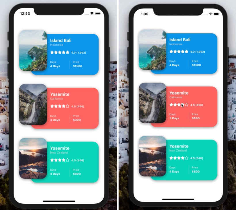
✨ Clean UI
? Chinese / English
Dependencies
How to Start
First install
npm i react-native-neat-date-picker
Then check if you have already got the dependencies in your project.
If no, install them by
npm i react-native-modal
npm i @expo-google-fonts/roboto
Import
import DatePicker from 'react-native-neat-date-picker'
Basic Usage
import React, { useState } from 'react'
import { View, Button } from 'react-native'
import DatePicker from 'react-native-neat-date-picker'
const App = () => {
const [showDatePicker, setShowDatePicker] = useState(false)
const openDatePicker = () => {
setShowDatePicker(true)
}
const onCancel = () => {
// You should close the modal in here
setShowDatePicker(false)
}
const onConfirm = ( date ) => {
// You should close the modal in here
setShowDatePicker(false)
// The parameter 'date' is a Date object so that you can use any Date prototype method.
console.log(date.getDate())
}
return (
<View>
<Button title={'open'} onPress={openDatePicker}/>
<DatePicker
isVisible={showDatePicker}
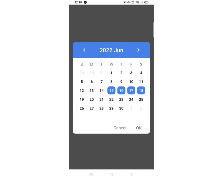
mode={'single'}
onCancel={onCancel}
onConfirm={onConfirm}
/>
<View>
)}
Properties
| Property | Type | Default | Discription |
|---|---|---|---|
isVisible |
Boolean | REQUIRED | Show the date picker modal |
mode |
String | REQUIRED | 'single' for single date selection. 'range' for date range selection. |
onCancel |
Function | ( ) => null | This function will execute when user presses cancel button. |
onConfirm |
Function | ( ) => null | This function will execute when user presses confirm button. See OnConfirm section. |
initialDate |
Date | new Date() | When it is the first time that the user open this date picker, it will show the month which initialDate is in. |
minDate |
Date | - | The earliest date which is allowed to be selected. |
maxDate |
Date | - | The lateset date which is allowed to be selected. |
startDate |
Date | - | Set this prop to a date if you need to set an initial starting date when opening the date picker the first time. Only works with 'range' mode. |
endDate |
Date | - | Similar to startDate but for ending date. |
onBackButtonPress |
Function | onCancel |
Called when the Android back button is pressed. |
onBackdropPress |
Function | onCancel |
Called when the backdrop is pressed. |
chinese |
Boolean | false | Toggle Chinese mode. |
colorOptions |
Object | null | See ColorOptions section. |
OnConfirm
For 'single' mode, this prop passes an argument date.
As for 'range' mode, it passes two arguments start and end
All arguments are just javascript Date objects.
Example:
// single mode
onConfirm={(date)=>{
  console.log(date.getTime())
}

// range mode
onConfirm={(start,end)=>{
  console.log(start.getTime())
  console.log(end.getTime())
}
ColorOptions
The colorOptions prop contains several color settings.
It helps you customize the date picker.
| Option | Type | discription |
|---|---|---|
| backgroundColor | String | The background color of date picker and that of change year modal. |
| headerColor | String | The background color of header. |
| headerTextColor | String | The color of texts and icons in header. |
| changeYearModalColor | string | The color of texts and icons in change year modal. |
| weekDaysColor | string | The text color of week days (like Monday, Tuesday ...) which shown below header. |
| dateTextColor* | string | The text color of all the displayed date when not being selected. |
| selectedDateColor* | string | The text color of all the displayed date when being selected. |
| selectedDateBackgroundColor* | string | The background color of all the displayed date when being selected. |
| confirmButtonColor | string | The text color of the confirm Button. |
* : Only six-digits HEX code colors are allowed because I do something like this behind the scene.
style={{color='{dateTextColor}22'}} // '#rrggbbaa'
Example:
const colorOptions = {
  headerColor:'#9DD9D2',
  backgroundColor:'#FFF8F0'
}
...
<DatePicker
  ...
  colorOptions={colorOptions}
/>
TODOs
- [ ] Add font customization.