React Native Input Spinner
An extensible input number spinner component for react-native.
This component enhance a text input for entering numeric values, with increase and decrease buttons.
Install
npm
npm install react-native-input-spinner --save
Yarn
yarn add react-native-input-spinner
Usage
// Require
include InputSpinner from 'react-native-input-spinner';

// Example
<InputSpinner
	max={10}
	min={2}
	step={2}
	colorMax={"#f04048"}
	colorMin={"#40c5f4"}
	value={this.state.number}
	onChange={(num)=>{console.log(num)}}
Run example
Clone or download repo and after:
cd Example
yarn install # or npm install
expo start
Open Expo Client on your device. Use it to scan the QR code printed by expo start. You may have to wait a minute while your project bundles and loads for the first time.
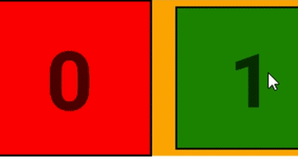
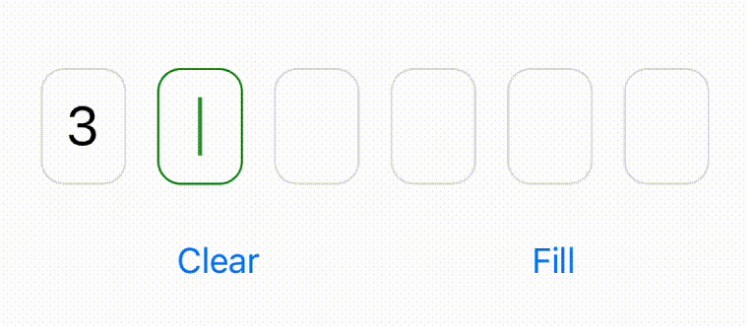
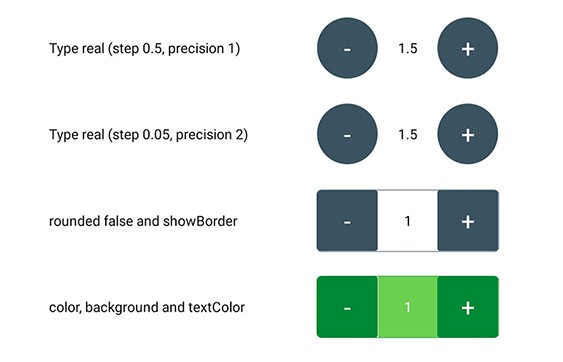
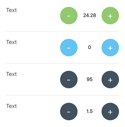
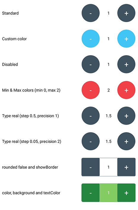
Screenshots
| Default props + Min & Max colors | Not rounded, showBorder, Min & Max colors |
|---|---|
 |
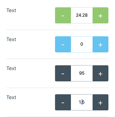 |
Example app
Handlers
| Handler | Description |
|---|---|
| onChange | Get the number of the Spinner |
| onMax | When max is reached get max number permitted |
| onMin | When min is reached get min number permitted |
| onIncrease | When increase button is clicked get value increased |
| onDecrease | When decrease button is clicked get value decreased |
Props
| Property | Description | Type | Default | Note |
|---|---|---|---|---|
| max | Max number permitted | String Number |
0 | |
| min | Min value permitted | String Number |
99 | |
| type | Type of spinner | String | 'int' | Can be real or int |
| precision | Max numbers permitted after comma | Integer | 2 | |
| step | Value to increment or decrement the current spinner value | String Number |
1 | |
| value | Controlled value of the Spinner | String Number |
0 | |
| disabled | Disable the Spinner or not | Boolean | false | |
| editable | Set if input number field is editable or not | Boolean | true |
Props style
| Property | Description | Type | Default | Note |
|---|---|---|---|---|
| style | Container style | Object | Can overwrite width and showBorder |
|
| arrow | Labels on button will be arrows (< and >) instead of plus and minus | Boolean | ||
| width | Custom width of the Spinner | Number | 150 | |
| height | Custom height of the Spinner | Number | 50 | |
| color | Custom color of the Spinner | String | ‘#3e525f' | |
| colorMin | Custom color of the Spinner when reach min value | String | ||
| colorMax | Custom color of the Spinner when reach max value | String | ||
| background | Background color of number button | String | ’transparent' | |
| rounded | Use circular button | Boolean | true | |
| showBorder | Show the border of the Spinner or not | Boolean | false | Use with rounded={false} |
| textColor | Custom number color | String | ‘#000000' | |
| inputStyle | Input Style (Text number at middle) | Object | ||
| fontSize | Custom fontSize of the text input in the Spinner | Number | 14 | |
| buttonFontSize | Custom fontSize of buttons in the Spinner | Number | 14 | |
| buttonTextColor | Custom color of the button in the Spinner | String | 'white' | |
| buttonStyle | Button Style (Plus and Minus buttons) | Object |