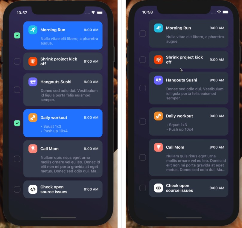
react-native-checkbox-card
Checkbox Card is customizable and animated built-in check state integration for React Native.
Installation
Add the dependency:
npm i react-native-checkbox-card
Peer Dependencies
IMPORTANT! You need install them
"@freakycoder/react-native-bounceable": "^0.2.0",
Usage
Import
import RNCheckboxCard from "react-native-checkbox-card";
Fundamental Usage
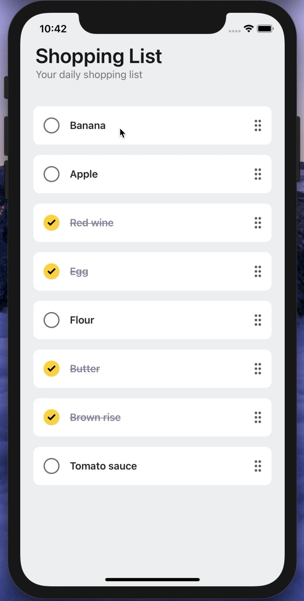
<RNCheckboxCard
  text="Banana"
  onPress={(checked: boolean) => console.log("Checked: ", checked)}
/>
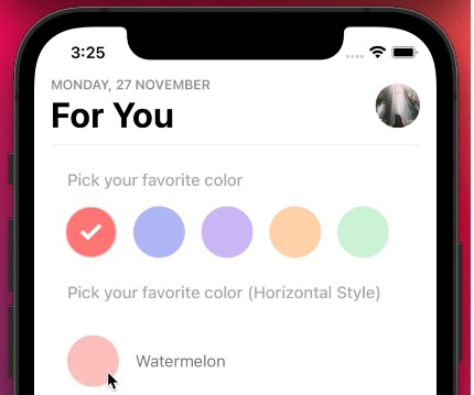
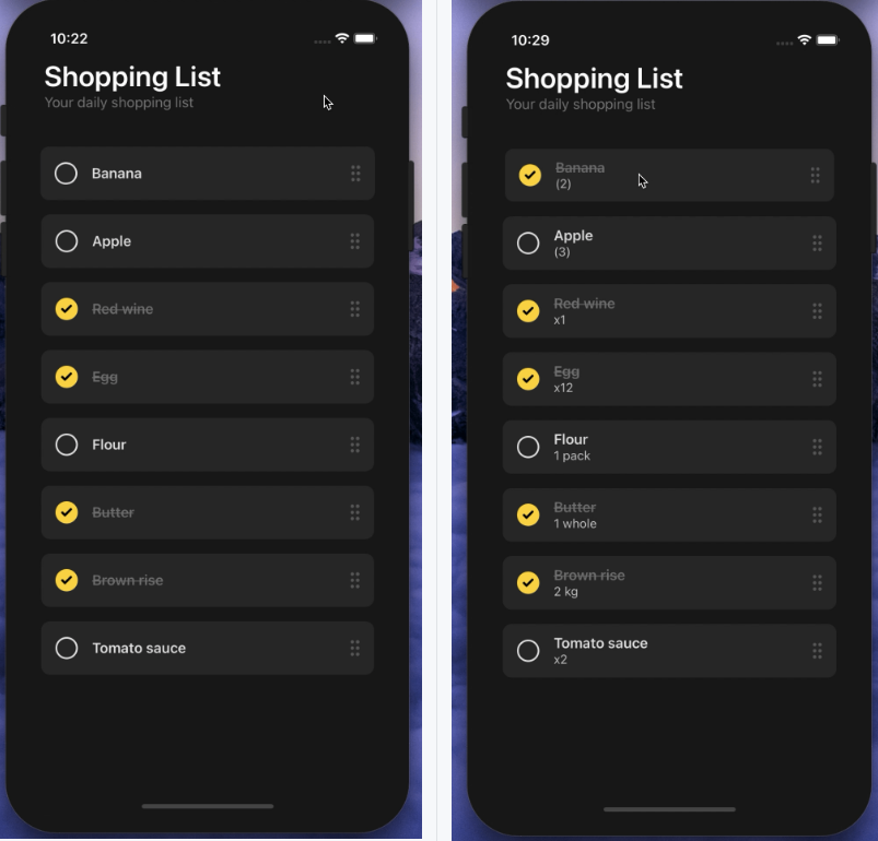
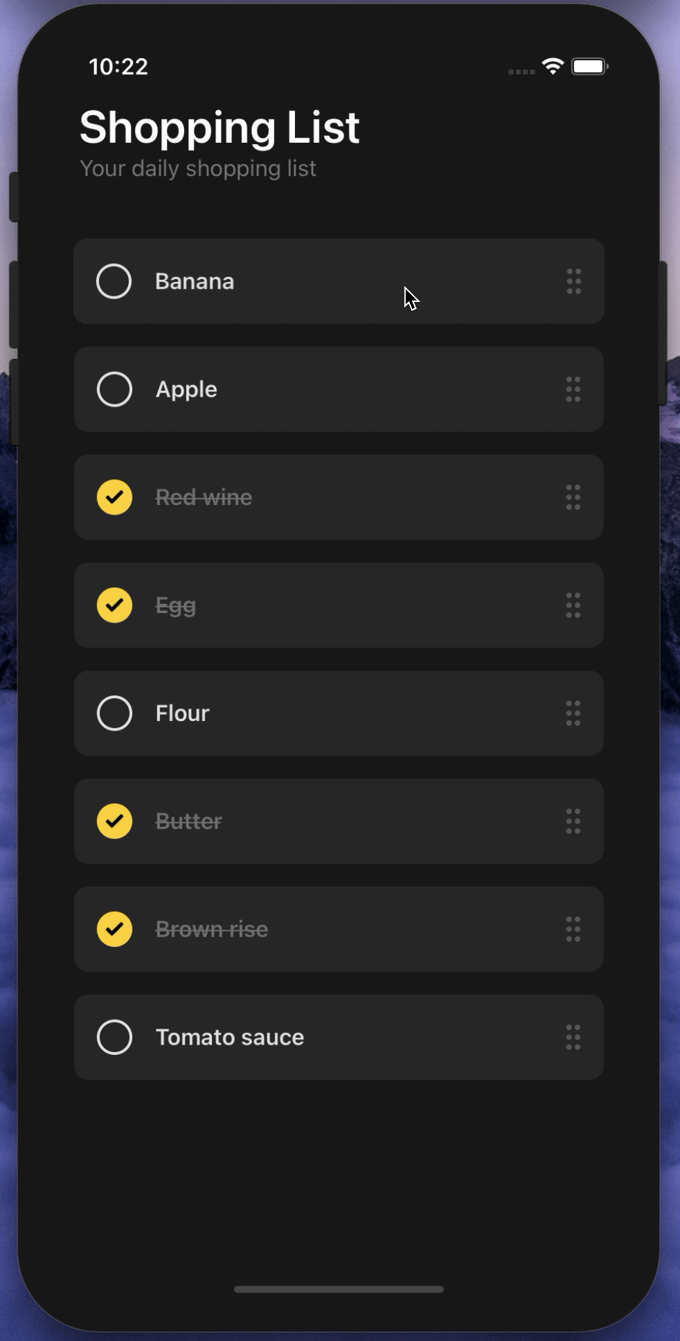
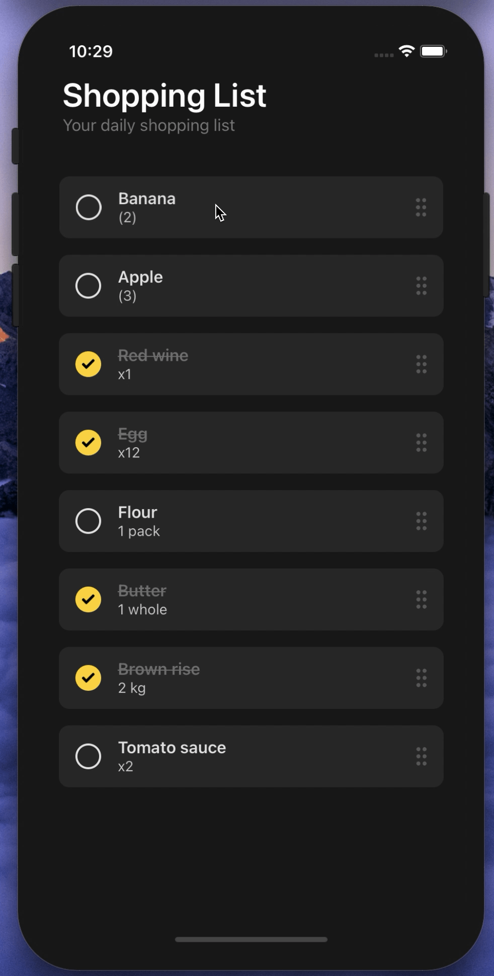
Quantity Prop Usage
<RNCheckboxCard
  darkMode
  text="Banana"
  quantity="x2"
  enableQuantityText
  onPress={(checked: boolean) => console.log("Checked: ", checked)}
/>
Configuration - Props
Fundamental Props
| Property | Type | Default | Description |
|---|---|---|---|
| text | string | undefined | set the main checkbox text |
| onPress | function | default | changes the checkbox's state and returns the changed checked value |
Featured Props
| Property | Type | Default | Description |
|---|---|---|---|
| quantity | string | undefined | set the checkbox's quantity text |
| enableQuantityText | boolean | false | MUST use it for using the quantity prop, it enables the quantity text |
| isChecked | boolean | false | initial checked prop |
| darkMode | boolean | false | activates the dark mode |
Customization & Optional Props
| Property | Type | Default | Description |
|---|---|---|---|
| ImageComponent | component | Image | set your own Image component instead of react native's default one such as: FastImage |
| rightIconComponent | component | default | set your own component instead of right aligned sort icon image component |
| checkIconComponent | component | default | set your own component instead of check icon image component |
| checkImageSource | image | default | set your own image instead of default check icon |
| sortIconImageSource | image | default | set your own image instead of default sort icon |
| textStyle | style | default | add or override the current text style |
| quantityTextStyle | style | default | add or override the current quantity text style |
| width | number | ScreenWidth * 0.9 | change the checkbox card's width |
| height | number | 60 | change the checkbox card's height |
| borderRadius | number | 10 | change the checkbox card's border radius |
| backgroundColor | string | default | change the checkbox card's background color |
| checkedTextColor | string | default | change the checked text color |
| uncheckedTextColor | string | default | change the unchecked text color |
| circleSize | number | 25 | change the circle's size (width/height) |
| circleBorderColor | string | default | change the circle's border color |
| circleBorderRadius | number | 25 | change the circle's border radius |
| circleBackgroundColor | number | default | change the circle's background color |
Author
FreakyCoder, [email protected]