@react-native-community/checkbox
React Native component used to select a single value from a range of values.
Support
| RN version | Checkbox version |
|---|---|
| > 0.60 | 0.3 |
| < 0.60 | 0.2 |
Getting started
yarn add @react-native-community/checkbox
or
npm install @react-native-community/checkbox --save
Mostly automatic installation
From react-native >= 0.60 autolinking will take care of the link, just don't forget to run pod install after adding this pakage
for react-native =< 0.59.X
react-native link @react-native-community/checkbox
Manual installation
Manually link the library on Android
android/settings.gradle
include ':react-native-community-checkbox'
project(':react-native-community-checkbox').projectDir = new File(rootProject.projectDir, '../node_modules/@react-native-community/checkbox/android')
android/app/build.gradle
dependencies {
   ...
   implementation project(':react-native-community-checkbox')
}
android/app/src/main/.../MainApplication.java
On top, where imports are:
import com.reactnativecommunity.checkbox.ReactCheckBoxPackage;
Add the checkbox class to your list of exported packages.
@Override
protected List<ReactPackage> getPackages() {
    return Arrays.asList(
            new MainReactPackage(),
            new ReactCheckBoxPackage()
    );
}
Migrating from the core react-native module
This module was created when the CheckBox was split out from the core of React Native. To migrate to this module you need to follow the installation instructions above and then change you imports from:
import { CheckBox } from 'react-native';
to:
import CheckBox from '@react-native-community/checkbox';
Usage
Example
import CheckBox from '@react-native-community/checkbox';
  <CheckBox
    value={true}
    disabled={false}
  />
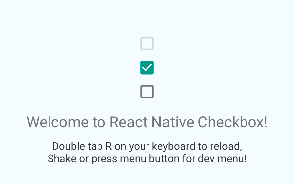
Check out the example project for more examples.
Props
| Prop name | Description |
|---|---|
| disabled | If true the user won't be able to toggle the checkbox. Default value is false. |
| onChange | Invoked on change with the native event. |
| onValueChange | Invoked with the new boolean value when it changes. |
| value | The value of the checkbox. If true the checkbox will be turned on. Default value is false. |
| tintColors | An object with the following shape: { true?: ?ColorValue, false?: ?ColorValue }. The color value for true will be used when the checkbox is checked, and the color value for false will be used when it is off. |
| testID | Used to locate this view in end-to-end tests. |