React Navigation TabBar Collection
Collection of Animated 60 FPS TabBar Component’s based on React Navigation.
Features
- 60 FPS Animated TabBar
- Beautiful TabBar Component’s
- Based on
React Navigationv5 or higher - Easy to use
- Dark Mode Supported
- Many Beautiful TabBar’s will be added into the collection in the future
Installation
This TabBar Collection based on @react-navigation/bottom-tabs and require React Navigation v5 or higher so first thing first you must install @react-navigation/native and @react-navigation/bottom-tabs in your project.
Please always see the React Navigation documentation for complete installation guide
via NPM
npm install react-navigation-tabbar-collection
via Yarn
yarn add react-navigation-tabbar-collection
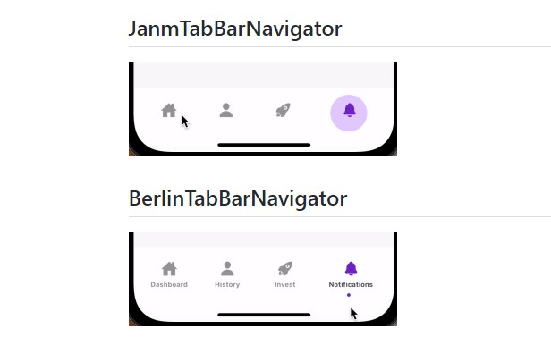
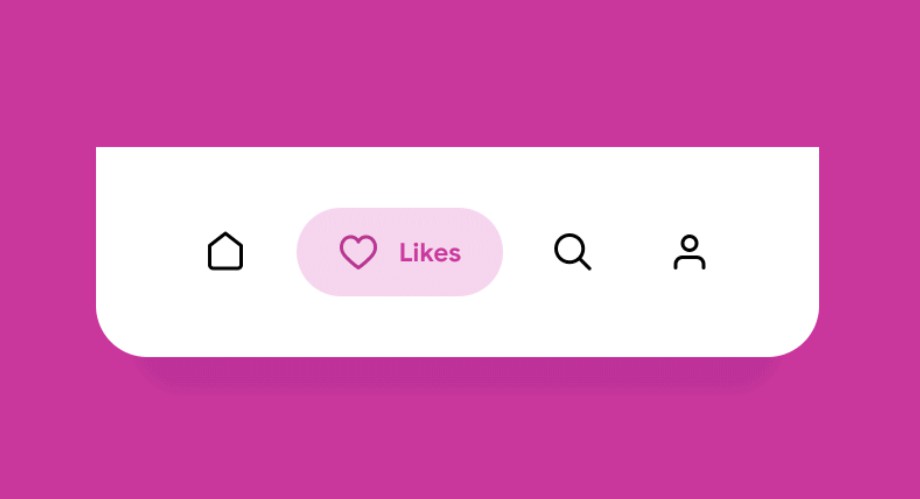
TabBar Collection
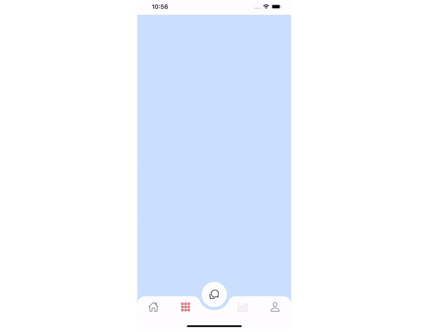
Colorful
This TabBar is inspired by Aurélien Salomon works on Dribbble.
import TabBar from 'react-navigation-tabbar-collection/ColorfulTabBar'
Clean
import TabBar from 'react-navigation-tabbar-collection/CleanTabBar'
Props
| Name | Description | Required | Type | Default | Supported Component |
|---|---|---|---|---|---|
{...props} |
Default Bottom Tab React Navigation Props | YES | All | ||
maxWidth |
TabBar Content Max Width | NO | number | 600 | All |
height |
TabBar Container Height | NO | number | All | |
darkMode |
TabBar Style Mode | NO | boolean | false | All |
colorPalette |
TabBar Color Palette | NO | object | see down here | All |
Default colorPalette value
{
    primary: "#5b37b7",
    secondary: "#6c757d",
    success: "#198754",
    danger: "#c9379d",
    warning: "#e6a919",
    info: "#00bcd4",
    light: "#ffffff",       //Background Color
    dark: "#212529",        //Foreground Color
}
# Background and Foreground Color are Inverted when the darkMode is `true`
Screen Options
Some of this options are from the default React Navigation options or screenOptions and some are new that can be use to configure the TabBar Item.
| Name | Description | Type |
|---|---|---|
title, label or tabBarLabel |
Title string of a tab displayed in the tab bar. | string |
labelStyle or tabBarLabelStyle |
Style object for the tab label. | StyleProp |
icon or tabBarIcon |
A function that given { focused: boolean, color: string } returns a React.Node to display in the tab bar |
({focused: boolean, color: string, size: number}) => void |
color or tabBarActiveTintColor |
Color for the icon and label in the active tab. enum options are from the colorPalette primary, secondary, success, danger,warning,info, light, dark. or just a string of hex |
enum | string |
tabBarTestID |
ID to locate this tab button in tests. | string |
Author
License
MIT
Built With
- Animated (React Native)