react-native-utils-navigation-bar
React Native Navigation Bar.
Getting started
$ yarn add react-native-utils-navigation-bar react-native-svg
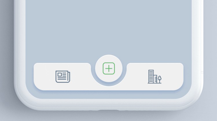
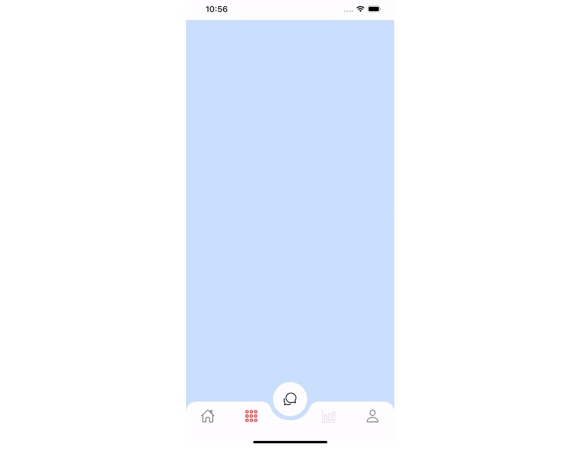
Demo
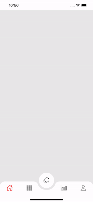
CurvedBottomBar.Navigator
| Props | Params | isRequire | default |
|---|---|---|---|
| type | 'down' or 'up' | Yes | down |
| initialRouteName | String | Yes | |
| renderCircle | () => JSX.Element | Yes | |
| tabBar | () => JSX.Element | Yes | |
| style | ViewStyle | No | |
| width | Number | No | Dimensions width |
| height | Number | No | 65 |
| circleWidth | Number | No | 50 |
| borderTopLeftRight | Boolean | No | false |
| bgColor | String | No | gray |
| strokeWidth | Number | No | 0 |
CurvedBottomBar.Screen
| Props | Params | isRequire | default |
|---|---|---|---|
| name | String | Yes | |
| position | left, right | Yes | |
| component | () => JSX.Element | Yes |
Usage
    import React, { useState } from 'react';
    import { StatusBar, StyleSheet, TouchableOpacity, View } from 'react-native';
    import { CurvedBottomBar } from 'react-native-utils-navigation-bar';
    import Ionicons from 'react-native-vector-icons/Ionicons';

    StatusBar.setBarStyle('dark-content');

    const ThemeScreen = props => {
        const [type, setType] = useState<'down' | 'up'>('down');

        const onClickButton = () => {
            if (type === 'up') {
                setType('down');
                alert('Change type curve down');
            } else {
                setType('up');
                alert('Change type curve up');
            }
        }

        const _renderIcon = (routeName: string, selectTab: string) => {
            let icon = '';

            switch (routeName) {
            case 'title1':
                icon = 'ios-home-outline';
                break;
            case 'title2':
                icon = 'apps-outline';
                break;
            case 'title3':
                icon = 'bar-chart-outline';
                break;
            case 'title4':
                icon = 'person-outline';
                break;
            }

            return (
                <Ionicons name={icon} size={23} color={routeName === selectTab ? '#FF3030' : 'gray'} />
            );
        };

        return (
            <View style={styles.container}>
                <CurvedBottomBar.Navigator
                    style={[type === 'down' && {backgroundColor: '#F5F5F5'}]}
                    type={type}
                    height={60}
                    circleWidth={55}
                    bgColor="white"
                    borderTopLeftRight={true}
                    initialRouteName="title1"
                    renderCircle={() => (
                        <TouchableOpacity
                            style={[type === 'down' ? styles.btnCircle : styles.btnCircleUp]} onPress={onClickButton}
                        >
                            <Ionicons name="chatbubbles-outline" size={23} />
                        </TouchableOpacity>
                    )}
                    tabBar={({ routeName, selectTab, navigation }) => {
                    return (
                        <TouchableOpacity
                            onPress={() => navigation(routeName)}
                            style={{ flex: 1, alignItems: 'center', justifyContent: 'center' }}
                        >
                            {_renderIcon(routeName, selectTab)}
                        </TouchableOpacity>
                    );
                    }}>
                    <CurvedBottomBar.Screen
                        name="title1"
                        position="left"
                        component={() => <View style={{ backgroundColor: '#BFEFFF', flex: 1 }} />}
                    />
                    <CurvedBottomBar.Screen
                        name="title2"
                        component={() => <View style={{ backgroundColor: '#FFEBCD', flex: 1 }} />}
                        position="left"
                    />
                    <CurvedBottomBar.Screen
                        name="title3"
                        component={() => <View style={{ backgroundColor: '#BFEFFF', flex: 1 }} />}
                        position="right"
                    />
                    <CurvedBottomBar.Screen
                        name="title4"
                        component={() => <View style={{ backgroundColor: '#FFEBCD', flex: 1 }} />}
                        position="right"
                    />
                </CurvedBottomBar.Navigator>
            </View>
        );
    };

    export default ThemeScreen;

    const styles = StyleSheet.create({
        container: {
            flex: 1,
        },
        btnCircle: {
            width: 60,
            height: 60,
            borderRadius: 30,
            alignItems: 'center',
            justifyContent: 'center',
            backgroundColor: 'white',
            shadowColor: "#000",
            shadowOffset: {
            width: 0,
            height: 1,
            },
            shadowOpacity: 0.20,
            shadowRadius: 1.41,
            elevation: 1,
            bottom: 28
        },
        btnCircleUp: {
            width: 60,
            height: 60,
            borderRadius: 30,
            alignItems: 'center',
            justifyContent: 'center',
            backgroundColor: '#E8E8E8',
            bottom: 18,
            shadowColor: "#000",
            shadowOffset: {
            width: 0,
            height: 1,
            },
            shadowOpacity: 0.20,
            shadowRadius: 1.41,
            elevation: 1,
        },
        imgCircle: {
            width: 30,
            height: 30,
            tintColor: '#48CEF6'
        },
        img: {
            width: 30,
            height: 30,
        }
    });
GitHub
https://github.com/hoaphantn7604/react-native-utils-navigation-bar