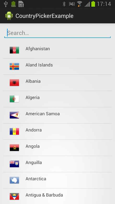
react-native-country-picker-modal
The best Country Picker for React Native.
Installation
$ yarn add react-native-country-picker-modal
Basic Usage
import DeviceInfo from 'react-native-device-info'
import React, {
AppRegistry,
Component,
StyleSheet,
Text,
View,
StatusBarIOS,
PixelRatio
} from 'react-native'
import CountryPicker, {
getAllCountries
} from 'react-native-country-picker-modal'
const NORTH_AMERICA = ['CA', 'MX', 'US']
class Example extends Component {
constructor(props) {
StatusBarIOS.setHidden(true)
super(props)
let userLocaleCountryCode = DeviceInfo.getDeviceCountry()
const userCountryData = getAllCountries()
.filter(country => NORTH_AMERICA.includes(country.cca2))
.filter(country => country.cca2 === userLocaleCountryCode)
.pop()
let callingCode = null
let cca2 = userLocaleCountryCode
if (!cca2 || !userCountryData) {
cca2 = 'US'
callingCode = '1'
} else {
callingCode = userCountryData.callingCode
}
this.state = {
cca2,
callingCode
}
}
render() {
return (
<View style={styles.container}>
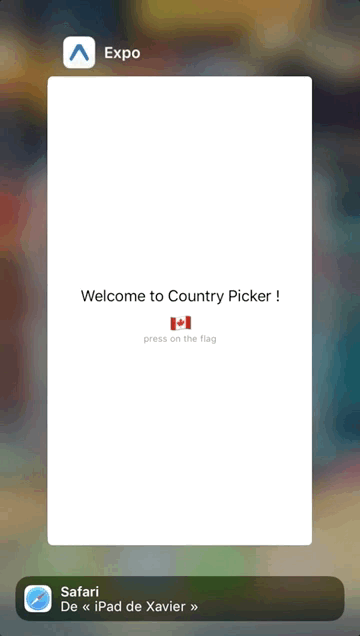
<Text style={styles.welcome}>Welcome to Country Picker !</Text>
<CountryPicker
countryList={NORTH_AMERICA}
onChange={value => {
this.setState({ cca2: value.cca2, callingCode: value.callingCode })
}}
cca2={this.state.cca2}
translation="eng"
/>
<Text style={styles.instructions}>press on the flag</Text>
{this.state.country && (
<Text style={styles.data}>
{JSON.stringify(this.state.country, null, 2)}
</Text>
)}
</View>
)
}
}
const styles = StyleSheet.create({
container: {
flex: 1,
justifyContent: 'center',
alignItems: 'center'
},
welcome: {
fontSize: 20,
textAlign: 'center',
margin: 10
},
instructions: {
fontSize: 12,
textAlign: 'center',
color: '#888',
marginBottom: 5
},
data: {
padding: 15,
marginTop: 10,
backgroundColor: '#ddd',
borderColor: '#888',
borderWidth: 1 / PixelRatio.get(),
color: '#777'
}
})
AppRegistry.registerComponent('example', () => Example)
Props
| Key | Type | Default | Description |
|---|---|---|---|
| cca2 | string | *required | code ISO 3166-1 alpha-2 (ie. FR, US, etc.) |
| translation | string | 'eng' | The language display for the name of the country (deu, fra, hrv, ita, jpn, nld, por, rus, spa, svk, fin, zho, cym) |
| onChange | function | *required | The handler when a country is selected |
| onClose | function | *required | The handler when the close button is clicked |
| countryList | array | See cca2.json | List of custom CCA2 countries to render in the list. Use getAllCountries to filter what you need if you want to pass in a custom list |
| excludeCountries | array | [] | List of custom CCA2 countries you don't want to render |
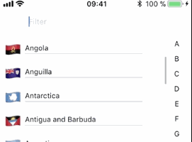
| closeable | bool | false | If true, the CountryPicker will have a close button |
| filterable | bool | false | If true, the CountryPicker will have search bar |
| filterPlaceholder | string | 'Filter' | The search bar placeholder |
| autoFocusFilter | bool | true | Whether or not the search bar should be autofocused |
| styles | object | {} | Override any style specified in the component (see source code) |
| disabled | bool | false | Whether or not the Country Picker onPress is disabled |
| transparent | bool | false | If true, the CountryPicker will render the modal over a transparent background |
| animationType | string | 'none' | The handler that controls how the modal animates |
| closeButtonImage | React.element | default close button Image | Custom close button Image |
| flagType | string | 'emoji' on iOS, 'flat' on Android | If set, overwrites the default OS based flag type. |
| hideAlphabetFilter | bool | false | If set to true, prevents the alphabet filter rendering |
| renderFilter | Function | undefined | If 'filterable={true}' and renderFilter function is provided, render custom filter component.* |
*
renderFilter = ({value, onChange, onClose}) => (
  <CustomFilterComponent
     value={value}
     onChange={onChange}
     onClose={onClose}
   />
)