react-native-modal-filter-picker
Cross-platform modal picker for React Native which supports keyword filtering, custom rendering, etc.
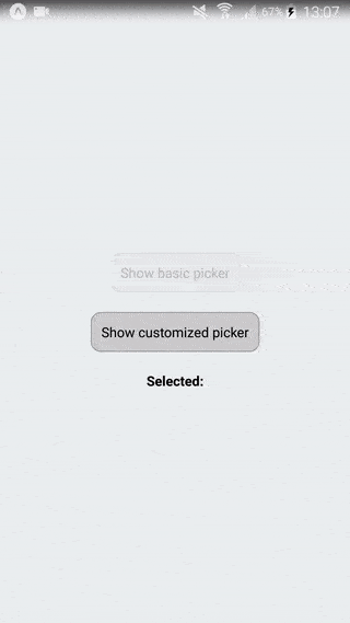
A cross-platform (iOS, Android) modal picker for React Native.
Features:
- Cross-platform (iOS, Android)
- Default styling works well
- Extensively customisable styling and rendering
- Built-in search filter for long lists
- Uses React Native
ListViewfor lazy-loading and high performance - Compatible with React Native 0.40+
- Successfully used in production apps
Installation
Use NPM/Yarn to install package: react-native-modal-filter-picker
Usage
A basic demo:
import { Component, View, Text, TouchableOpacity } from 'react-native'
import ModalFilterPicker from 'react-native-modal-filter-picker'
export default class App extends Component {
constructor (props, ctx) {
super(props, ctx);
this.state = {
visible: false,
picked: null,
};
}
render() {
const { visible, picked } = this.state;
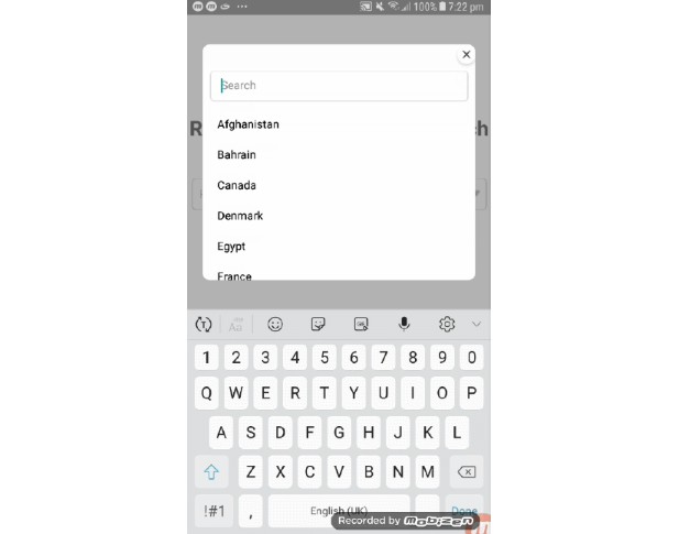
const options = [
{
key: 'kenya',
label: 'Kenya',
},
{
key: 'uganda',
label: 'Uganda',
},
{
key: 'libya',
label: 'Libya',
},
{
key: 'morocco',
label: 'Morocco',
},
{
key: 'estonia',
label: 'Estonia',
},
];
return (
<View style={styles.container}>
<TouchableOpacity style={styles.buttonContainer} onPress={this.onShow}>
<Text>Select country</Text>
</TouchableOpacity>
<Text style={appStyles.label}>Selected:</Text>
<Text>{picked}</Text>
<ModalFilterPicker
visible={visible}
onSelect={this.onSelect}
onCancel={this.onCancel}
options={options}
/>
</View>
);
}
onShow = () => {
this.setState({ visible: true });
}
onSelect = (picked) => {
this.setState({
picked: picked,
visible: false
})
}
onCancel = () => {
this.setState({
visible: false
});
}
}
Options
The following functionality props can be passed to the component:
| Prop name | Type | Default | Description |
|---|---|---|---|
options |
Array of { key, label } |
(required) | The options to display in the list |
onSelect |
function (key) {} |
(required) | Callback for when an option is chosen |
onCancel |
function () {} |
(required) | Callback for when the cancel button is pressed |
placeholderText |
String |
"Filter..." |
Placeholder text for filter input text field |
placeholderTextColor |
String |
"#ccc" |
Color of placeholder text for filter input text field |
androidUnderlineColor |
String |
"rgba(0,0,0,0)" |
Android text underline color of filter input text field |
cancelButtonText |
String |
"Cancel" |
Cancel button text |
title |
String |
null |
Title text which appears above options list |
noResultsText |
String |
"No matches" |
Text to show when there are no results for filter |
visible |
Boolean |
true |
Whether to show modal or not. This allows you to control when the picker is shown and/or hidden. |
showFilter |
Boolean |
true |
Whether to show filter text field field or not |
modal |
Object |
null |
Options to pass to native Modal component |
selectedOption |
String |
null |
The currently selected option, to visually differentiate it from others |
listViewProps |
Object |
null |
Properties to pass to the rendered ListView |
renderOption |
function (option, isSelected) {} |
null |
Custom option renderer |
renderList |
function () {} |
null |
Custom option list renderer |
renderCancelButton |
function () {} |
null |
Custom cancel button renderer |
keyboardShouldPersistTaps |
never/always/handle |
never |
Determines when the keyboard should stay visible after a tap. If never, tapping outside of the focused text input when the keyboard is up dismisses the keyboard. When this happens, children won't receive the tap. If always, the keyboard will not dismiss automatically, and the scroll view will not catch taps, but children of the scroll view can catch taps. If handled, the keyboard will not dismiss automatically when the tap was handled by a children, (or captured by an ancestor). |
autoFocus |
Boolean |
false |
If true, focuses the input on componentDidMount(). |
In addition, the following styling props (each of which must be an Object consisting of styles) can be passed in:
| Prop name | Description |
|---|---|
overlayStyle |
Style for the background modal overlay |
listContainerStyle |
Style for the View wrapping the options list |
filterTextInputContainerStyle |
Style for the View wrapping the filter input text field |
filterTextInputStyle |
Style for the filter input text field |
cancelContainerStyle |
Style for the View wrapping the cancel button |
cancelButtonStyle |
Style for the cancel button button face |
cancelButtonTextStyle |
Style for the cancel button text |
titleTextStyle |
Style for the title text |
optionTextStyle |
Style for the option text |
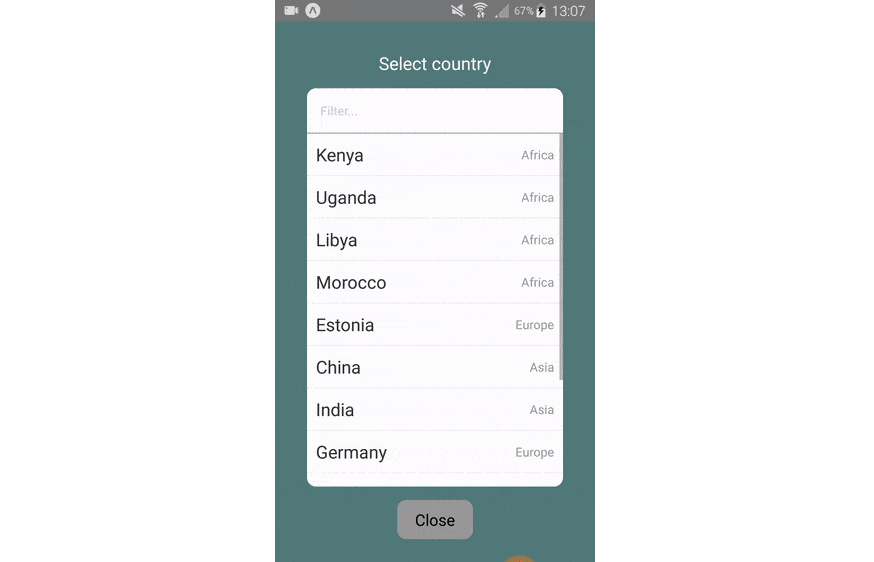
Advanced filtering
By default the filter input field allows you to filter by the option label
that's displayed on the screen.
But you can also attach a searchKey attribute to
each option for the filtering algorithm to use. For example, we can allow the
user to filter by continent as
well as country name, even though we don't display the continent name:
render() {
  const { visible } = this.state;

  const options = [
    {
      key: 'kenya',
      label: 'Kenya',
      searchKey: 'Africa',
    },
    {
      key: 'uganda',
      label: 'Uganda',
      searchKey: 'Africa',
    },
    {
      key: 'libya',
      label: 'Libya',
      searchKey: 'Africa',
    },
    {
      key: 'japan',
      label: 'Japan',
      searchKey: 'Asia',
    },
    {
      key: 'estonia',
      label: 'Estonia',
      searchKey: 'Europe',
    },
  ];

  return (
    <View style={styles.container}>
      <ModalFilterPicker
        onSelect={this.onSelect}
        onCancel={this.onCancel}
        options={options}
      />
    </View>
  );
}
If you run the above example, you will be able to type africa into the filter
input field to see all the countries within Africa.
Note: Filtering is case-insensitive