react-native-woodpicker
Customisable picker and datePicker react-native components for Android and iOS.
Installation
npm install react-native-woodpicker --save
Usage
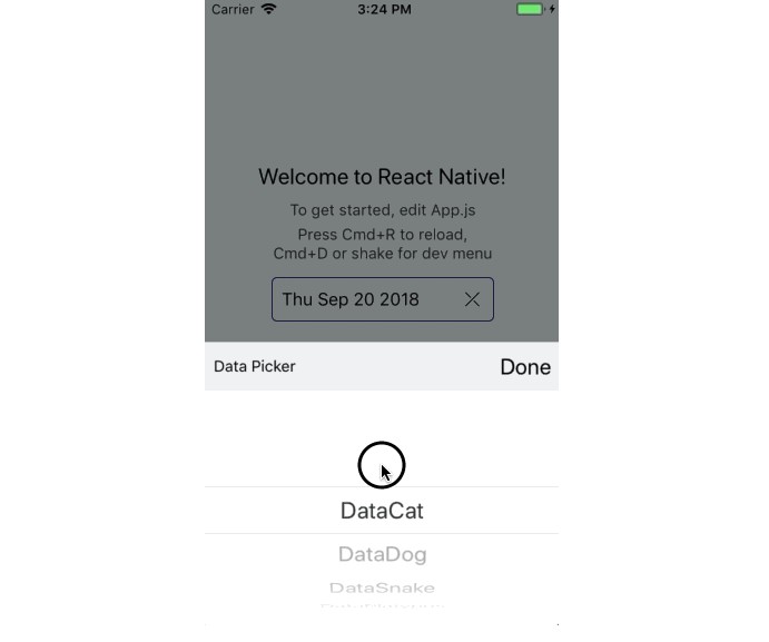
Picker
You can use Picker to pick values/objects.
import { Picker } from 'react-native-woodpicker'

[...]

class ExampleApp extends Component {
  state = {
    pickedData: null
  };

  data = [
    { label: "DataCat", value: 1 },
    { label: "DataDog", value: 2 },
    { label: "DataSnake", value: 3 },
    { label: "DataPlatypus", value: 4 },
    { label: "DataWhale", value: 5 }
  ];

  handlePicker = data => {
    this.setState({ pickedData: data });
  };

  render() {
    return (
      <View>
        <Picker
          onValueChange={this.handlePicker}
          items={this.data}
          title="Data Picker"
          placeholder="Select Data"
          value={this.state.pickedData}
          //androidPickerMode="dropdown"
          //isNullable
        />
      </View>
    );
  }
}
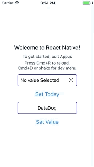
DatePicker
You can use DatePicker to pick Dates.
Unlike the Picker, you need to handle the placeholder.
import { DatePicker } from 'react-native-woodpicker'

[...]

class ExampleApp extends Component {
  state = {
    pickedDate: null
  };

  handlePicker = data => {
    this.setState({ pickedData: data });
  };

  handlePlaceholder = () =>
    this.state.pickedDate
      ? this.state.pickedDate.toDateString()
      : "No value Selected";

  render() {
    return (
      <View>
        <DatePicker
          onDateChange={this.handleDatePicker}
          value={this.state.pickedDate}
          title="Date Picker"
          placeholder={this.handlePlaceholder()}
          //iosPickerMode="date"
          //androidPickerMode="spinner"
          //locale="fr"
          //isNullable
        />
      </View>
    );
  }
}
Props
General
| Name | type | Required | Description |
|---|---|---|---|
| title | string | false | Configure the picker title (not the placeholder) |
| placeholder | string | false | Configure the placeholder when no value is selected |
| style | StyleObj | false | Configure the input style (View) |
| containerStyle | StyleObj | false | Configure the input container style (View) |
| placeholderStyle | StyleObj | false | Configure the placeholder style (Text) |
| disabled | boolean | false | Disable the input |
| isNullable | boolean | false | Picker : Add null value on items, DatePicker: add reset button |
Picker specific
| Name | type | Required | Description |
|---|---|---|---|
| item | { label: string, value: any } | true | Configure the picker title (not the placeholder) |
| onValueChange | (item: { label: string, value: any }) => {} | true | Configure the placeholder when no value is selected |
| items | Array<{ label: string, value: any }> | true | Configure the input style (View) |
| androidPickerMode | "dialog" or "dropdown" | false | Configure the input container style (View) |
DatePicker specific
| Name | type | Required | Description |
|---|---|---|---|
| date | Date | true | Configure the picker title (not the placeholder) |
| onDateChange | (date: ?Date) => {} | true | Configure the placeholder when no value is selected |
| locale | "string" (Locale IDs) | false | Change the iOS picker locale |
| iosPickerMode | "date" or "time" or "datetime" | false | Change the iOS picker interface |
| androidPickerMode | "calendar" or "spinner" or "default" | false | Change the Android picker interface |
| minDate | Date | false | Restrict date selection with a minimum date |
| maxDate | Date | false | Restrict date selection with a minimum date |