rn-checkbox-list
The goal of rn-checkbox-list is to achieve the checkbox list with minimal effort and easy customisation.
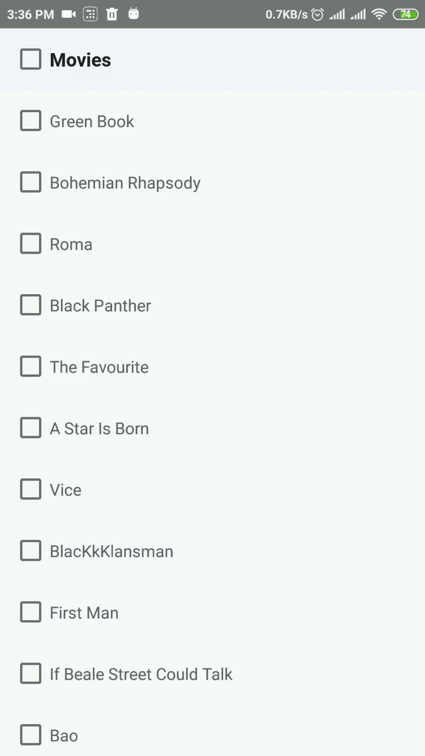
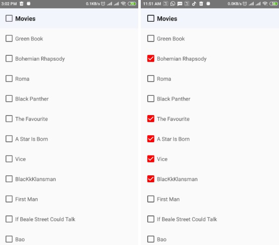
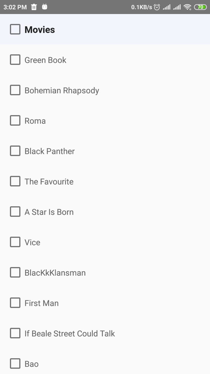
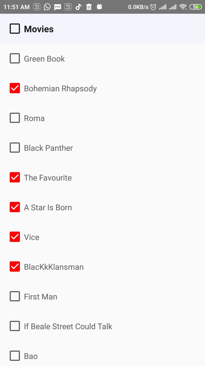
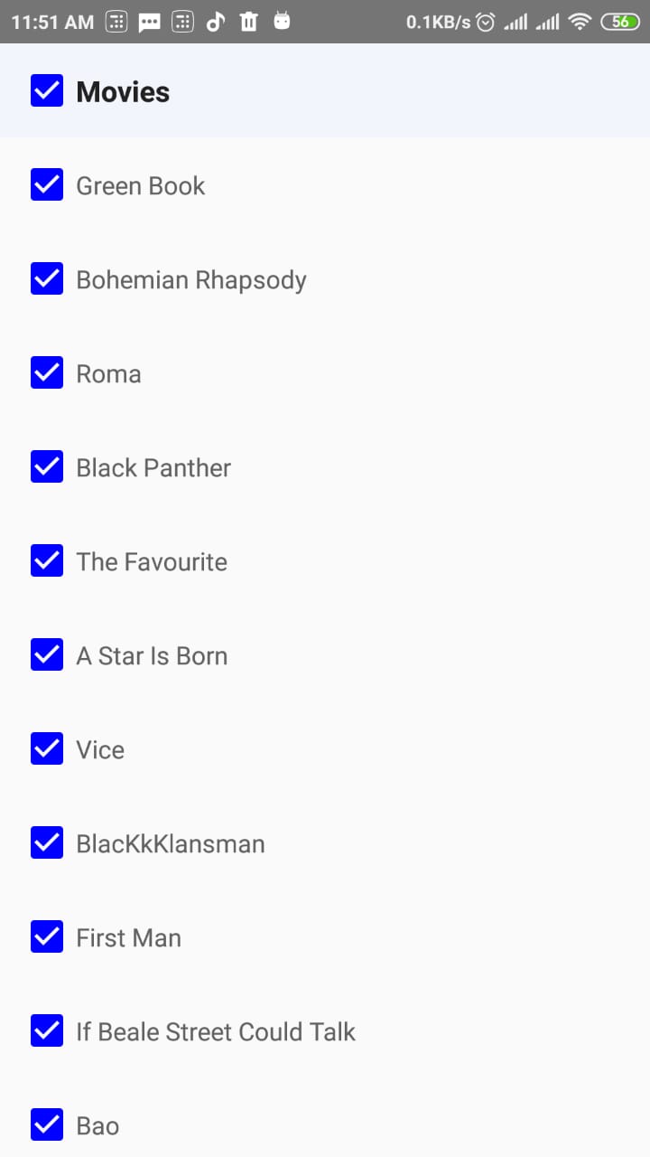
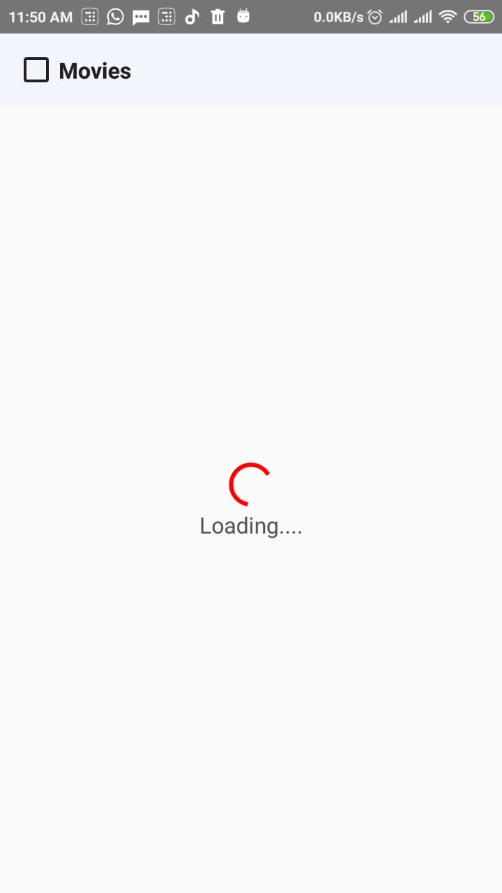
Android screenshots
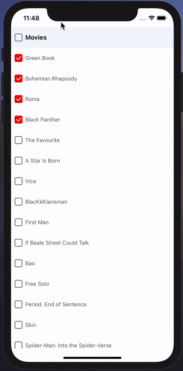
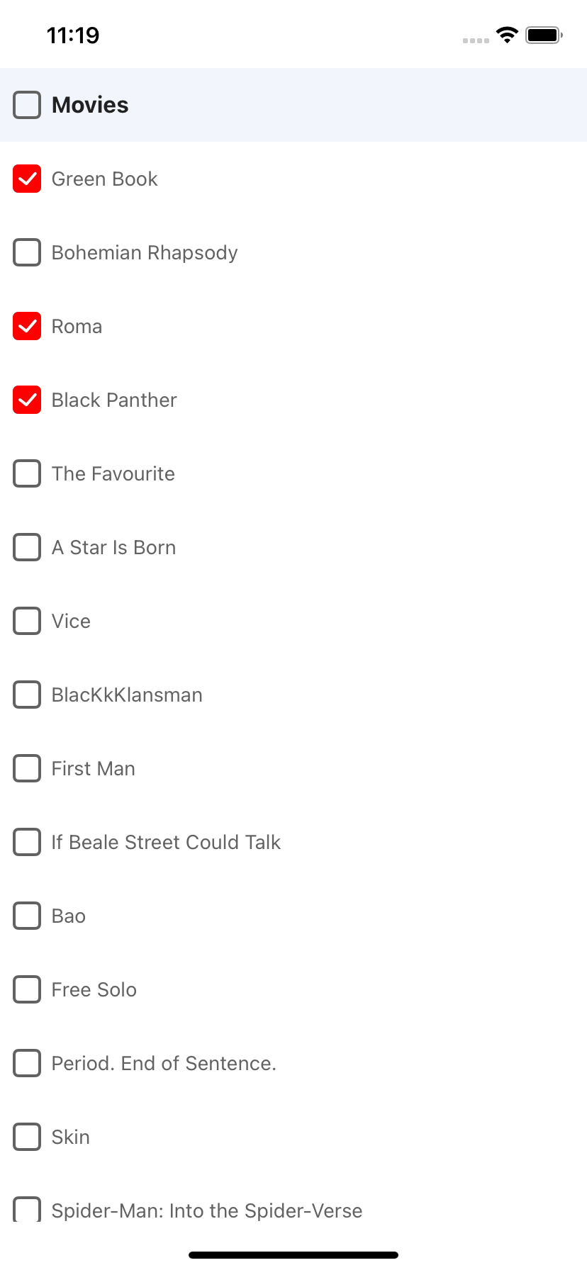
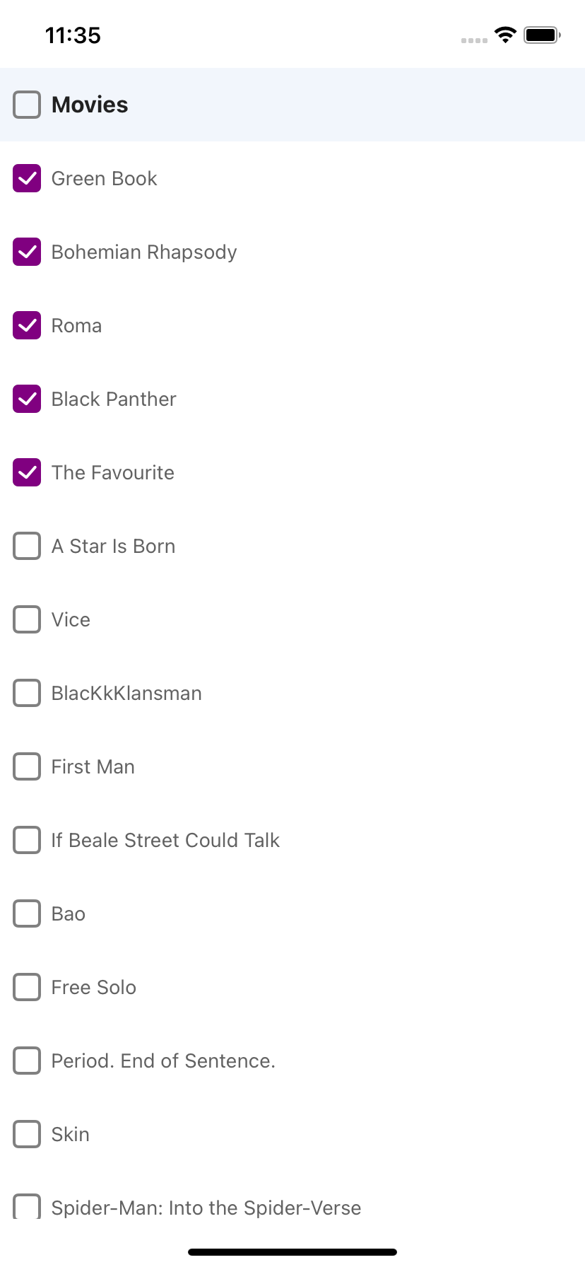
iOS screenshots
Support
| rn-checkbox-list version | Platform |
|---|---|
| > 0.3 | Android, iOS, Windows |
| <=0.2 | Android |
Setup
This library is available on npm, install it with:
npm i rn-checkbox-list
or
yarn add rn-checkbox-list
Usage
- Import rn-checkbox-list:
import CheckboxList from 'rn-checkbox-list';
- Create data with id and name:
[{ id: 1, name: 'Green Book' }, { id: 2, name: 'Bohemian Rhapsody' }];
- Add data to imported component
<CheckboxList headerName="This is header name" listItems={data} />
Sample example
<CheckboxList
  headerName="Movies"
  theme="red"
  listItems={data}
  onChange={({ ids, items }) => console.log('My updated list :: ', ids)}
  listItemStyle={{ borderBottomColor: '#eee', borderBottomWidth: 1 }}
  checkboxProp={{ boxType: 'square' }} // iOS (supported from v0.3.0)
  onLoading={() => <LoaderComponent />}
/>
Check for complete example here.
Available props
| Name | Type | Default | Description |
|---|---|---|---|
| listItems | object array | [] | List of checkboxes |
| selectedListItems | object array | [] | List of selected items(subset of listItems) |
| headerName | string | '' | Shows header with the given name |
| listItemStyle | object | {} | Each check list style |
| checkboxProp | object | {} | Custom checkbox style |
| headerStyle | object | {} | Header check list style |
| onChange | function | null | Fires on each checkbox select or deselect |
| onLoading | function | null | When the list is empty and a loader needs to be shown |
| theme | string | #1A237E | Custom theme color for checkbox |
Improvements
- [x] Importing checkbox through updated react-native package (removing warnings)
- [x] Customisable checkbox colors
- [x] Provide selected items and selected ids
- [x] Support for default selected items
- [x] Support iOS
Pull requests, feedbacks and suggestions are welcome!