React Native Status Color Picker
Customizable color picker for your beautiful react native apps.
Getting Started
There are three components in this package:
- ColorPicker
- FullScreenColorStatus
- StatusColorPicker
import { ColorPicker, FullScreenColorStatus, StatusColorPicker } from 'react-native-status-color-picker';
Each component is independent and explained in Basic Usage section below. Use them as per your requirement.

Installation
npm i react-native-status-color-picker --save
Basic Usage
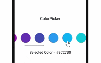
ColorPicker
import React, { Component } from 'react';
import { Text, View, StyleSheet } from 'react-native';

import { ColorPicker } from 'react-native-status-color-picker';

export default class App extends Component {
  state = {
    colors: ["#F44336", "#E91E63", "#9C27B0", "#673AB7", "#3F51B5", "#2196F3", "#03A9F4", "#00BCD4", "#009688", "#4CAF50", "#8BC34A", "#CDDC39", "#FFEB3B", "#FFC107", "#FF9800", "#FF5722", "#795548", "#9E9E9E", "#607D8B"],
    selectedColor: '#F44336',
  };

  onSelect = color => this.setState({ selectedColor: color });

  render() {
    return (
      <View style={styles.container}>

        <ColorPicker
          colors={this.state.colors}
          selectedColor={this.state.selectedColor}
          onSelect={this.onSelect}
        />

        <Text>Selected Color = {this.state.selectedColor}</Text>

      </View>
    );
  }
}

const styles = StyleSheet.create({
  container: {
    flex: 1,
    alignItems: 'center',
    justifyContent: 'center',
  },
});
FullScreenColorStatus
import React, { Component } from 'react';
import { View, StyleSheet } from 'react-native';

import { FullScreenColorStatus } from 'react-native-status-color-picker';

export default class App extends Component {
  state = {
    colors: ["#F44336", "#E91E63", "#9C27B0", "#673AB7", "#3F51B5", "#2196F3", "#03A9F4", "#00BCD4", "#009688", "#4CAF50", "#8BC34A", "#CDDC39", "#FFEB3B", "#FFC107", "#FF9800", "#FF5722", "#795548", "#9E9E9E", "#607D8B"],
    selectedColor: '#F44336',
    text: '',
  };

  onChange = data => {
    this.setState({ selectedColor: data.selectedColor, text: data.text });
  };

  render() {
    return (
      <View style={styles.container}>
          <FullScreenColorStatus
            colors={this.state.colors}
            selectedColor={this.state.selectedColor}
            text={this.state.text}
            onChange={this.onChange}
          />
      </View>
    );
  }
}

const styles = StyleSheet.create({
  container: {
    flex: 1,
  },
});
StatusColorPicker
import React, { Component } from 'react';
import { Text, View, StyleSheet } from 'react-native';
import { MaterialCommunityIcons as Icon } from '@expo/vector-icons';

import { StatusColorPicker } from 'react-native-status-color-picker';

export default class App extends Component {
  state = {
    visible: false,
    colors: ["#F44336", "#E91E63", "#9C27B0", "#673AB7", "#3F51B5", "#2196F3", "#03A9F4", "#00BCD4", "#009688", "#4CAF50", "#8BC34A", "#CDDC39", "#FFEB3B", "#FFC107", "#FF9800", "#FF5722", "#795548", "#9E9E9E", "#607D8B"],
    selectedColor: '#F44336',
    text: '',
  };

  ok = data => {
    this.setState({ selectedColor: data.selectedColor, text: data.text });
    this.close();
  };

  close = () => {
    this.setState({ visible: false });
  };

  render() {
    return (
      <View style={styles.container}>

        <Icon
          name="palette"
          style={{ fontSize: 34, color: this.state.selectedColor }}
          onPress={() => this.setState({ visible: true })}
        />
        <StatusColorPicker
          visible={this.state.visible}
          colors={this.state.colors}
          selectedColor={this.state.selectedColor}
          text={this.state.text}
          onOk={this.ok}
          onCancel={this.close}
        />

        <Text>Selected Color = {this.state.selectedColor}</Text>
        <Text>Text = {this.state.text}</Text>

      </View>
    );
  }
}

const styles = StyleSheet.create({
  container: {
    flex: 1,
    alignItems: 'center',
    justifyContent: 'center',
  },
});
Props
ColorPicker
| Key | Type | Default | Value |
|---|---|---|---|
| color | Array | [] | hex color code |
| selectedColor | String | '' | mention any one color from array of colors |
| onSelect | Function | pass function to execute onSelect of color |
FullScreenColorStatus
| Key | Type | Default | Value |
|---|---|---|---|
| color | Array | [] | hex color code |
| onChange | Function | pass function to execute onChange of selectedColor or text | |
| selectedColor | String | '' | mention any one color from array of colors |
| text | String | '' | any string |
StatusColorPicker
| Key | Type | Default | Value |
|---|---|---|---|
| color | Array | [] | hex color code |
| onCancel | Function | pass function to execute onPress of CANCEL | |
| onOk | Function | pass function to execute onPress of OK | |
| selectedColor | String | '' | mention any one color from array of colors |
| text | String | '' | any string |
| visible | Boolean | false | true/false |