react-native-single-select
Customizable & Easy to Use Single Select Library for React Native.
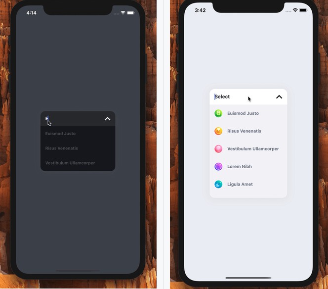
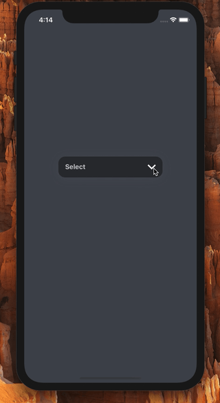
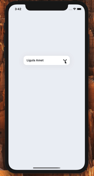
| Dark Theme | Light Theme |
|
|
Installation
Add the dependency:
npm i @freakycoder/react-native-single-select
npx pod-install // After Install the `react-native-spinkit`
Peer Dependency
You need to install this dependency
"react-native-spinkit": "^1.5.1"
Features
- Light Mode ☀️
- Dark Mode ?
- TextInput ?
- Fully Animated Functionality ?
- Built-in Search Filter ?
- Image Feature ?
- Custom Image Component Support ?
- Custom Text Component Support ?
- Many More...
Usage
Import
import RNSingleSelect, {
  ISingleSelectDataType,
} from "@freakycoder/react-native-single-select";
Fundamental Usage
<RNSingleSelect
  data={staticData}
  darkMode
  onSelect={(selectedItem: ISingleSelectDataType) =>
    console.log("SelectedItem: ", selectedItem)
  }
/>
Menu Item Format
You must use this format for generating menu bar item.
const staticData: Array<ISingleSelectDataType> = [
  { id: 0, value: "Euismod Justo" },
  { id: 1, value: "Risus Venenatis" },
  { id: 2, value: "Vestibulum Ullamcorper" },
  { id: 3, value: "Lorem Nibh" },
  { id: 4, value: "Ligula Amet" },
];
OR with ImageSource
const staticData: Array<ISingleSelectDataType> = [
  { id: 0, value: "Euismod Justo", imageSource: require("./assets/..") },
  { id: 1, value: "Risus Venenatis", imageSource: { uri: "...url" } },
  { id: 1, value: "Risus Venenatis", imageSource: null },
];
Also, here is the interface of ISingleSelectDataType:
export interface ISingleSelectDataType {
  id: number;
  value: string;
  imageSource?: any;
  data?: any;
}
Configuration - Props
| Property | Type | Default | Description |
|---|---|---|---|
| onSelect | function | undefined | set the selection function when a menu item is selected |
| data | Array |
undefined | set the menu item data array for generating menu bar items |
| width | number | 250 | change the width of the component |
| height | number | 50 | change the height of the main single select button |
| darkMode | boolean | false | change the theme of the component to dark theme |
| placeholder | string | "Select" | change the placeholder of the single select component |
| imageHeight | number | 25 | change the image source's menu item's image height |
| imageWidth | number | 25 | change the image source's menu item's image width |
| ImageComponent | component | Image | set your own custom Image component instead of default Image one |
| TextComponent | component | Text | set your own custom Text component instead of default Text one |
| buttonContainerStyle | ViewStyle | default | change/override the top of the single select button (the main one) |
| menuBarContainerStyle | ViewStyle | default | change/override the top of the single select bottom menu bar |
| arrowImageStyle | ImageStyle | default | change/override the top of the arrow image's style |
| menuItemTextStyle | TextStyle | default | change/override the top of the each menu bar's item text style |
| disableAbsolute | boolean | false | if you do not want to use the library without absolute to fix bottom menubar's overlaps simply make it true |
| menuBarContainerWidth | number | 250 | change the bottom menu bar's width |
| menuBarContainerHeight | number | 150 | change the bottom menu bar's height |
| disableFilterAnimation | boolean | false | disable the filter animation for huge lists (especially on Android) |
| onTextChange | function | undefined | handle the onTextChange function |
| placeholderTextStyle | style | default | extends or override the default placeholder's text style |
| placeholderTextColor | color | default | change the placeholder's text color |
| spinnerType | string | "ThreeBounce" | change the spinner type |
| spinnerSize | number | 30 | change the spinner size |
| spinnerColor | color | default | change the spinner color |
| initialValue | ISingleSelectDataType | null | change the initial selected item |
| searchEnabled | boolean | true | change search inputs readonly state |
| value | string | undefined | set the text input value |
List of available types for Spinner
- CircleFlip
- Bounce
- Wave
- WanderingCubes
- Pulse
- ChasingDots
- ThreeBounce
- Circle
- 9CubeGrid
- WordPress (IOS only)
- FadingCircle
- FadingCircleAlt
- Arc (IOS only)
- ArcAlt (IOS only)
Future Plans
- [x]
LICENSE - [x]
Search Feature - [x]
Image Feature - [x]
Customizable Image Component - [x]
Customizable Text Component - [x]
Dark Theme / Light Theme Options - [x]
More Customization for Colors - [x]
Built-in Spinner - [ ] Remove the
react-native-spinkitand usereact-native-animated-spinkitinstead - [ ] Customizable Animations
- [ ] Write an article about the lib on Medium
Author
FreakyCoder, [email protected]