React Native Form Select Picker
This is a customized select picker that renders the same way on both android and ios.
What's new?
Version 0.0.5 fixed the bugs below:
- Temporarily fixed breaking changes in React Native 0.60.0 changing from componentWillReceiveProps to UNSAFE_componentWillReceiveProps
- iOS rendering issues
if you already have this package in your project update to the
latest version by running:
npm install --save react-native-form-select-picker@latest
Why react-native-form-select-picker?
The reason why I started this project is because react native default Picker becomes messed up when used on iOS devices
and I wanted somthing that works and renders the same on both iOS and Android.
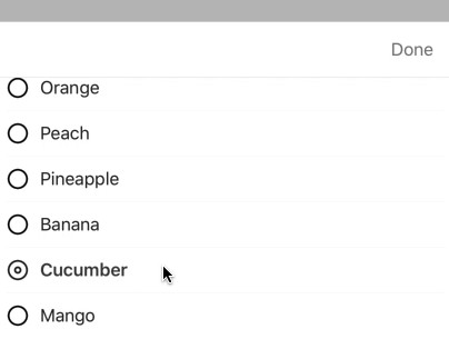
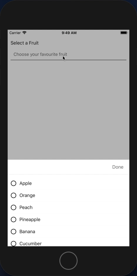
Look and feel
Here is the rendered sample of this package on android/iOS
Installation
To install this package you will have to run the command below using npm
npm install --save react-native-form-select-picker
We dont have an npm link yet. We will update that as soon as we get one.
Usage
This module has been made to conform to the basic react native Picker in order to easily change import
without having to change much on your code-base. We are developer friendly! :D
import React, { Component } from 'react';
import SelectPicker from 'react-native-select-picker'; // Import the package
...

export default class YourClass extends Component {
	...

	render() {
		return (
			...

			<SelectPicker
				onValueChange={(value) => {
					// Do anything you want with the value.
					// For example, save in state.
					this.setState({
						selected: value
					})
				}}
				selected={this.state.selected}
				>
				...
				<SelectPicker.Item label="Apple" value="apple" />
				<SelectPicker.Item label="Banana" value="banana" />
				<SelectPicker.Item label="Orange" value="orange" />
				...
			</SelectPicker>

			...
		)
	}

	...
}
Properties
<SelectPicker> component props
The following properties can go in the <SelectPicker> component (equivalent of <select> in HTML):
| Props | Type | Default | Required | Description |
|---|---|---|---|---|
| onValueChange | function: (value: any, index: number) | N/A | Yes | This is a callback function that is to be used in getting the selected value; You can set a state from here. |
| selected | any | null | Yes | The selected value inserted as a property. Can be used to define default selection. |
| dismissable | boolean | false | No | If dismissable is set as true, the select modal can be closed by clicking outside the modal or pressing the back button (on android) |
| disabled | boolean | false | No | When set to true component will behave like other disabled input components. i.e. click/press will not work. |
| placeholder | string | "" | No | This is the label that is shown when no option has been selected |
| placeholderStyle | StyleSheet | {fontSize: 15, color:'#757575'} |
No | This is the style of the placeholder text. You can customize how the placeholder text looks before an option is being selected |
| onSelectedStyle | StyleSheet | {fontSize: 16, color:'#252525'} |
No | This is the style to apply to the text label upon selection of an option |
| style | StyleSheet | {padding:10} |
No | This it the style of the select box itself. Customize to fit your form. |
| containerStyle | StyleSheet | {backgroundColor:'#FFFFFF'} |
No | This is the style for the modal dropdown select page. |
| doneButtonText | string | "done" |
No | You can change the text being displayed for the confirmation button at the top right corner |
| doneButtonTextStyle | StyleSheet | {textAlign:'center',color: '#1976D2',fontWeight: '600',fontSize:16} |
No | You can change the style of the confirm text to suit your design structure or template |
<SelectPicker.Item> component props
The following properties go into the <SelectPicker.Item> component (equivalent of <option> in HTML):
| Props | Type | Default | Required | Description |
|---|---|---|---|---|
| label | string | "" |
Yes | This is the option label. It replaces the placeholder when an item is selected. |
| value | any | null | Yes | The value of the option is passed in here and it is the value passed to the onValueChange function. |