react-native-header-view
Fully customizable Header View with multiple design options for React Native.
Installation
Add the dependency:
Pure React Native:
npm i @freakycoder/react-native-header-view
Peer Dependencies
IMPORTANT! You need install them.
"react": ">= 16.x",
"react-native": ">= 0.55.x",
"react-native-iphone-x-helper": ">= 1.x.x",
"react-native-dynamic-vector-icons": ">= x.x.x"
Options
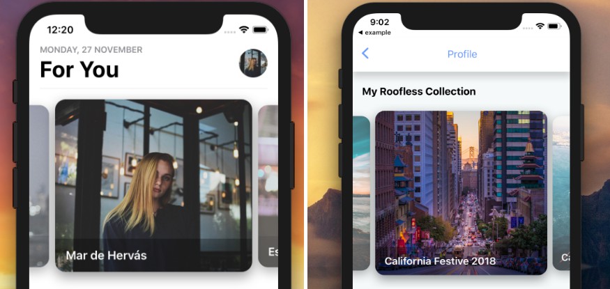
- AppleHeader
- ModernHeader
- ClassicHeader
Usage
Apple Header Usage
<AppleHeader />
Modern Header Usage
<ModernHeader />
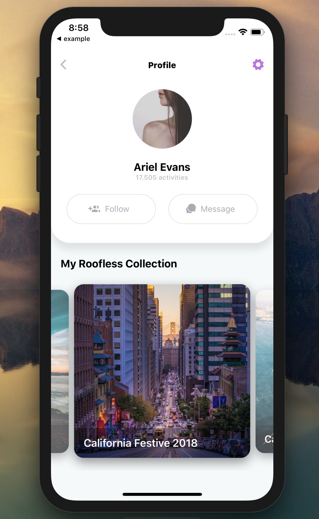
Advanced Usage
<ModernHeader
  text="Profile"
  rightIconType="Ionicons"
  rightIconName="ios-settings"
  rightIconColor={colors.light.primary}
  leftIconOnPress={() => NavigationService.back()}
/>
Classic Header Usage
Basic Usage
<ClassicHeader
  headerTitle="Header"
  rightComponentDisable
  leftComponentOnPress={() => {}}
  hitSlops={
    top: 30,
    bottom: 30,
    left: 30,
    right: 30
  }
/>
Advanced Custom Usage
<ClassicHeader
  headerTitle="Header"
  leftComponent={
    <TouchableOpacity
      onPress={() => {}}>
      <Icon name="ios-arrow-back" type="Ionicons" size={30} color="blue" />
    </TouchableOpacity>
  }
  rightComponent={
    <TouchableOpacity
      onPress={() => {}}>
      <Icon name="github" type="AntDesign" size={30} color="purple" />
    </TouchableOpacity>
  }
/>
Configuration - Props
Apple Header Props
| Property | Type | Default | Description |
|---|---|---|---|
| dateTitle | string | MONDAY, 27 NOVEMBER | set your own string instead of date title |
| largeTitle | string | For You | set your own large title |
| imageSource | image | image | set your own image |
| onPress | function | null | use this to set onPress functionality |
Modern Header Props
| Property | Type | Default | Description |
|---|---|---|---|
| styles | styles | styles | use this to change main style of the header |
| text | string | Header Title | set the header's title |
| textStyle | style | style | set your own style for the header's text |
| left | number | 16 | use this to set left icon's align |
| right | number | 16 | use this to set right icon's align |
| leftIconName | string | ios-arrow-back | change the left icon depends on the React Native Vector Icons |
| leftIconType | string | Ionicons | change the left icon's type |
| leftIconSize | number | 25 | change the left icon's size |
| leftIconColor | color | #bbbabe | change the left icon's color |
| rightIconName | string | heart | change the right icon depends on the React Native Vector Icons |
| rightIconType | string | Entypo | change the right icon's type |
| rightIconSize | number | 25 | change the right icon's size |
| rightIconColor | color | #23c4c1 | change the right icon's color |
| leftIconComponent | component | Icon | use your own component instead of the integrated Icon component |
| rightIconComponent | component | Icon | use your own component instead of the integrated Icon component |
| leftIconOnPress | function | function | set the function for left icon's onPress |
| rightIconOnPress | function | function | set the function for right icon's onPress |
| leftDisable | boolean | false | disable the left icon component |
| rightDisable | boolean | false | disable the right icon component |
Classic Header Props
| Property | Type | Default | Description |
|---|---|---|---|
| styles | styles | styles | use this to change main style of the header |
| height | number | 50 | use this to change the header's height |
| width | number | 100% | use this to change the header's width |
| statusBarHidden | boolean | false | use this to let Header Component itself re-arrange depends on the status bar |
| hitSlops | object | object: 30 | use this to change the header's left and right components' hitSlots |
| bottomStick | boolean | false | stick the header to bottom side |
| headerTitle | string | "" | use this to set header's title |
| backgroundColor | color | #ffffff | use this to change the header's background color |
| leftComponent | component | Icon | set the left component |
| leftComponentStyle | style | style | set the left component's style |
| leftComponentDisable | boolean | false | disable the left component |
| leftComponentOnPress | function | null | set the left component's onPress function |
| rightComponent | component | Icon | set the right component |
| rightComponentStyle | style | style | set the right component's style |
| rightComponentDisable | boolean | false | disable the right component |
| rightComponentOnPress | function | null | set the right component's onPress function |
| centerComponent | component | Icon | set the center component |
| centerComponentStyle | style | style | set the center component's style |