react-native-video-modal
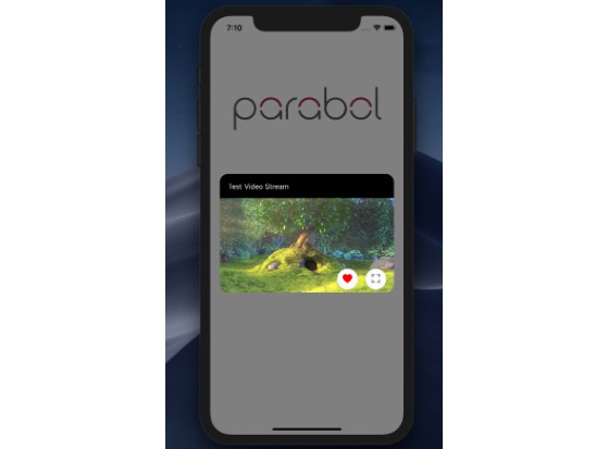
Fully customizable, loading style implemented Video Modal for React Native via Paraboly.
Installation
Add the dependency:
npm i @paraboly/react-native-card
Peer Dependencies
IMPORTANT! You need install them.
"react": ">= 16.x.x",
"react-native": ">= 0.55.x",
"react-native-video": ">= 4.4.1",
"react-native-spinkit": ">= 1.3.0",
"react-native-vector-icons": ">= 6.x.x",
"react-native-material-ripple": ">= 0.8.0",
"@paraboly/react-native-modal-box": ">= 0.0.1",
"react-native-dynamic-vector-icons": ">= x.x.x",
"@freakycoder/react-native-helpers": ">= 0.0.12",
"react-native-floating-action-button": ">= 0.1.14",
"@freakycoder/react-native-custom-text": ">= 0.0.12"
Basic Usage
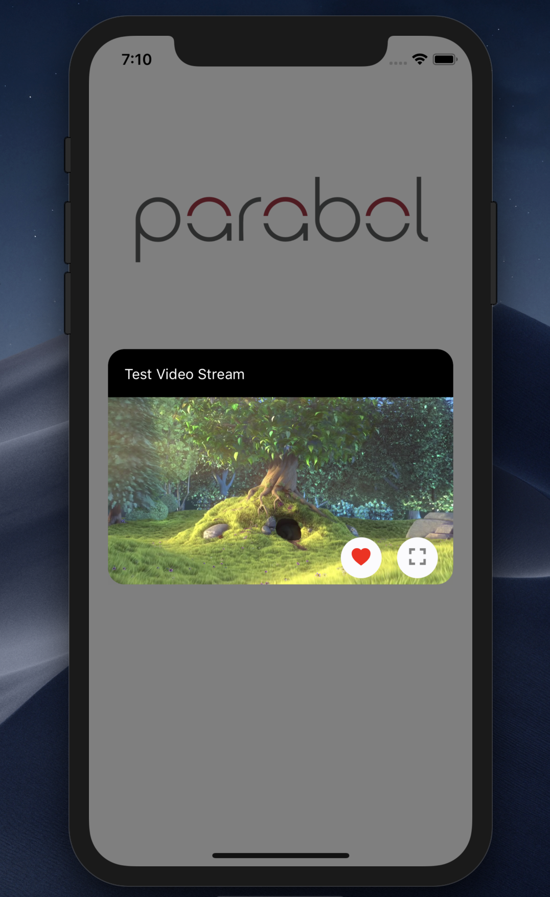
<VideoModal title="Test Video Stream" source={source} />
Example Application
- check the code, and yes! :) all of the images, screenshots are directly taken
from the this example. Of course, you can simply clone the project and run the example on your own environment.
Configuration - Props
| Property | Type | Default | Description |
|---|---|---|---|
| title | string | "" | use this to change the title |
| source | source | uri | use this to set your own source for the Video Modal |
| isOpen | boolean | true | change the automatically open modal |
| easing | easing | Easing.elastic(1) | change the easing animation option |
| refName | string | null | set ref name for the modal |
| onOpened | function | null | set your own logic for the modal onOpen function |
| onClosed | function | null | set your own logic for the modal onClose function |
| backdrop | boolean | true | change the backdrop visibility |
| coverScreen | boolean | false | change it for cover the screen for modal |
| backgroundColor | color | "black" | change the modal's background color |
| textColor | color | "white" | change the title's color |
| fontFamily | FontFamily | default | set your own FontFamily for the title |
| buttonSize | number | 40 | change FAB buttons' size |
| resizeMode | string | "contain" | change the video resize mode |
| modalWidth | number | ScreenWidth * 0.9 | change the modal's width |
| modalHeight | number | 350 | change the modal's height |
| modalBottom | number | 18 | change title's font size |
| shadowColor | color | "#000" | change main video modal's shadow color |
| shadowStyle | style | check the code | set your own shadow style for the main video modal |
| titleStyle | style | { bottom: ScreenHeight * 0.55 } | IMPORANT! it should be style to give it as bottom adjustment |
| heartOnPress | function | null | set your own logic for heart button |
| fullScreenOnPress | function | Open the fullscreen video | set your own logic for fullscreen button |
| disableButtons | boolean | false | disable the buttons |
| buttonContainerStyle | style | check the code | set your own button container style |
| buttonsComponent | component | check the code | set your own button and its logic with your own component |
| videoPlayerStyle | style | check the code | set your own style for the video player |
| heartIconComponent | component | FAB | set your own style for button component instead of heart icon component |
| fullScreenIconComponent | component | FAB | set your own style for button component instead of fullscreen icon component |
| loadingSize | number | 40 | change the loading icon's size |
| loadingType | string | "FadingCircleAlt" | change the type of loading icon |
| loadingColor | color | "white" | change the color of loading icon |
| loadingIsVisible | boolean | business logic (check the code) | if you do not want to use default logic, you can change this prop to implement yours |
List of loading available types
- CircleFlip
- Bounce
- Wave
- WanderingCubes
- Pulse
- ChasingDots
- ThreeBounce
- Circle
- 9CubeGrid
- WordPress (IOS only)
- FadingCircle
- FadingCircleAlt
- Arc (IOS only)
- ArcAlt (IOS only)
