react-native-date-picker
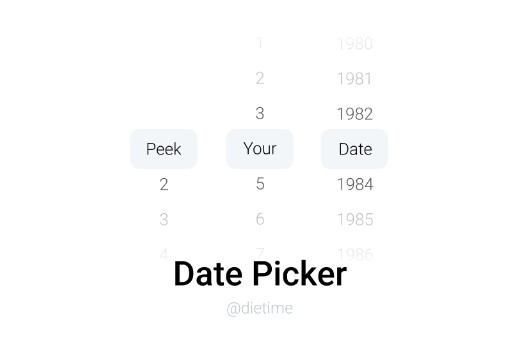
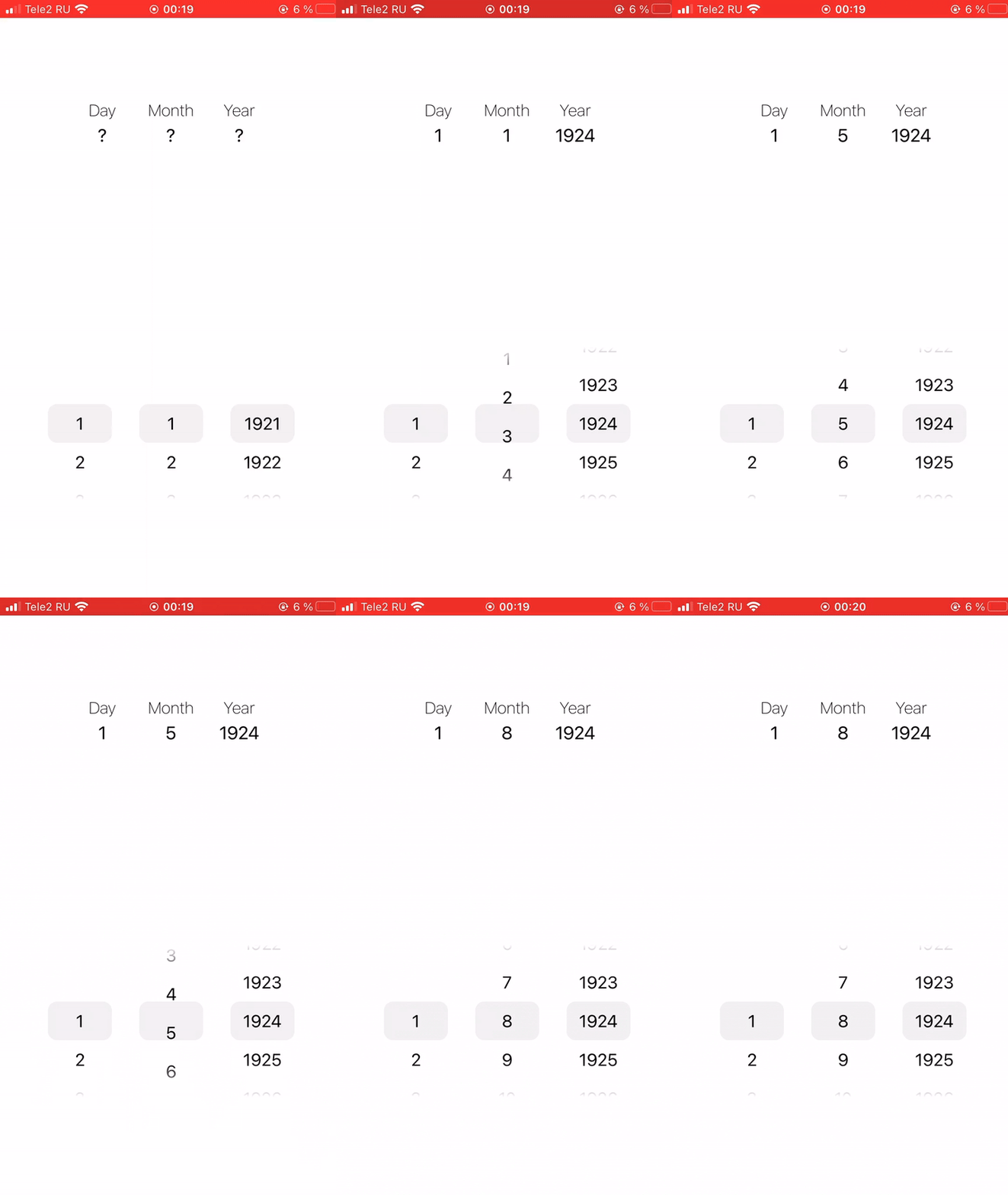
React Native customizable date picker component for iOS and Android. Designed using ScrollView.
? Example
? Installation
-
Add dependencies to the project
yarn add @dietime/react-native-date-picker npm install @dietime/react-native-date-picker --save -
Install additional dependencies
yarn add expo-linear-gradient npm install expo-linear-gradient --save -
Then, import with ...
import DatePicker from '@dietime/react-native-date-picker'; -
If you are not using Expo
You should also follow these additional installation instructions.
?? Usage
- Simple code example
import React, {useState} from "react";
import {Text, View} from "react-native";

import DatePicker from "@dietime/react-native-date-picker";

export default function App() {
    const [date, setDate] = useState();

    return (
        <View>
            <Text>{date ? date.toDateString() : "Select date..."}</Text>
            <DatePicker
                value={date}
                onChange={(value) => setDate(value)}
            />
        </View>
    );
}
? Documentation
| Prop | Required | Type | Description |
|---|---|---|---|
| value | ✅ | Date or null or undefined | Initial date for component |
| onChange | ✅ | (value: Date) : void | Callback on date change event |
| height | ⛔ | number | Custom component height |
| width | ⛔ | number or string | Custom component width such as 100 or '50%' |
| fontSize | ⛔ | number | Custom digits font size |
| textColor | ⛔ | string | Custom digits text color such as hex, rgb or rgba |
| endYear | ⛔ | number | Max year in component, default is current year |
| startYear | ⛔ | number | Min year in component, default is (endYear - 100) |
| markColor | ⛔ | string | Custom middle mark color such as hex, rgb or rgba |
| markHeight | ⛔ | number | Custom height of middle mark |
| markWidth | ⛔ | number or string | Custom width of middle mark such as 100 or '50%' |
| fadeColor | ⛔ | string | Custom color for top and bottom fade effect (only hex colors) |
