React Native Scrollable Tab Header
Custom built to fit a rather specific solution. Scrollable tabs are meant to contain information as pages.
Rather than navigation & container in one, this solution's intent was simply to create a navigation tool.
You could pass child components representing each page where I'm returning null.
See the suggested example below.
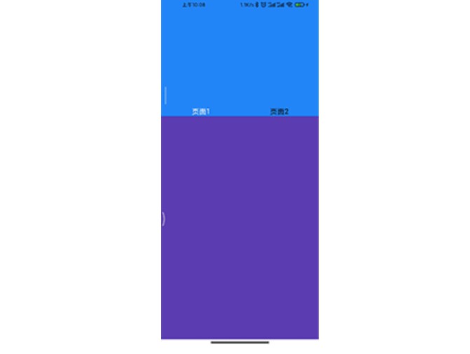
Simple Example
You can change tabs programmatically. Just use goToPage method.
I personally set the page itself through state.
export default class App extends Component {
  render() {
    return <ScrollableTabView
      renderTabBar={() => <DefaultTabBar />}
      ref={(tabView) => { this.tabView = tabView; }}
    >
      <Text tabLabel='Tab #1'>My</Text>
      <Text tabLabel='Tab #2'>favorite</Text>
      <Text tabLabel='Tab #3'>project</Text>
      <TouchableOpacity tabLabel='Back' onPress={() => this.tabView.goToPage(0)}>
        <Text>Lets go back!</Text>
      </TouchableOpacity>
    </ScrollableTabView>;
  }
}
Pull to refresh example
export default class Test extends Component {
  //execute callback in order to stop the refresh animation.
  _onRefresh = (callback) => {
    networkRequest().then(response => callback(response))
  }

   render() {
      return <ScrollableTabView
        refreshControlStyle={{backgroundColor: 'red'}}
        pullToRefresh={this._onRefresh}
      >
        <ScrollView tabLabel="one" >
          <View>
            <Text>One</Text>
          </View>
        </ScrollView>
        <ScrollView tabLabel="two" >
          <View>
            <Text>Two</Text>
          </View>
        </ScrollView>

      </ScrollableTabView>
    }
  }
Suggested Example
Not actually compilable code, just concept snippets
  this.state = {
    pageNumber: 0
  }

  routes = {
    someroute1: {
      routeName: "someroute1",
      title: "My First Route"
    },
    someroute2: {
      routeName: "someroute2",
      title: "My Second Route"
    },
    someroute3: {
      routeName: "someroute3",
      title: "My Third Route"
    },
  }

  <View style={{ flex: 1 }}>
    <ScrollableTabView
        page={this.state.pageNumber}
        onChangeTab={({i, ref}) => {this.handleRouteChange(i, ref.props.tabLabel)}}
        renderTabBar={() => <ScrollableTabBar />}
        ref={(tabView) => { this.tabView = tabView; }}
    >
        <TouchableOpacity key={"home_scrollable"} tabLabel='Home' onPress={() => {
            this.tabView.goToPage(0)
        }}>
            {null}
        </TouchableOpacity>
        {Object.values(routes).map(route => (
            <TouchableOpacity
              key={`${route.routeName}_scrollable`}
              tabLabel={route.title}>
                <Text>{null}</Text>
            </TouchableOpacity>
        ))}
    </ScrollableTabView>
  </View>

  handleRouteChange(index, tabName) {
    if (tabName == "Home") this.goHome()
    else this.setState({ pageNumber: index })
  }
Any time you navigate from one tab to another (via clicking them), you'll trigger onChangeTab which is where you specify your navigation function.
In this simple exmaple, I'm just setting the state with a new pageNumber which is referenced via the page prop of <ScrollableTabView>.
For my requirement, child components are then made available based on this.state.pageNumber, rather than directly rendered via the navigator.
Props
renderTabBar(Function:ReactComponent) - accept 1 argumentpropsand should return a component to use as
the tab bar. The component hasgoToPage,tabs,activeTaband
refadded to the props, and should implementsetAnimationValueto
be able to animate itself along with the tab content. You can manually pass thepropsto the TabBar component.tabBarPosition(String) Defaults to"top"."bottom"to position the tab bar below content."overlayTop"or"overlayBottom"for a semitransparent tab bar that overlays content. Custom tab bars must consume a style prop on their outer element to support this feature:style={this.props.style}.
onChangeTab(Function) - function to call when tab changes, should accept 1 argument which is an Object containing two keys:i: the index of the tab that is selected,ref: the ref of the tab that is selectedonScroll(Function) - function to call when the pages are sliding, should accept 1 argument which is an Float number representing the page position in the slide frame.locked(Bool) - disables horizontal dragging to scroll between tabs, default is false.initialPage(Integer) - the index of the initially selected tab, defaults to 0 === first tab.page(Integer) - set selected tab(can be buggy see #126children(ReactComponents) - each top-level child component should have atabLabelprop that can be used by the tab bar component to render out the labels. The default tab bar expects it to be a string, but you can use anything you want if you make a custom tab bar.tabBarUnderlineStyle(View.propTypes.style) - style of the default tab bar's underline.tabBarBackgroundColor(String) - color of the default tab bar's background, defaults towhitetabBarActiveTextColor(String) - color of the default tab bar's text when active, defaults tonavytabBarInactiveTextColor(String) - color of the default tab bar's text when inactive, defaults toblacktabBarTextStyle(Object) - Additional styles to the tab bar's text. Example:{fontFamily: 'Roboto', fontSize: 15}style(View.propTypes.style) - Container stylecontentStyle(View.propTypes.style) - Content stylecontentProps(Object) - props that are applied to rootScrollView/ViewPagerAndroid. Note that overriding defaults set by the library may break functionality; see the source for details.scrollWithoutAnimation(Bool) - on tab press change tab without animation.prerenderingSiblingsNumber(Integer) - pre-render nearby # sibling,Infinity=== render all the siblings, default to 0 === render current page.pullToRefresh(Function) - function to perform in case of a pull to refresh action. This function required a callback to stop the refresh animation. Follow the example bellowrefreshControlStyle(React style Object) - Style object applied to theRefreshControlReact Component.showsVerticalScrollIndicator(Bool) - Show scroll indicatorshowsHorizontalScrollIndicator(Bool) - Show scroll indicatordisableTabBarOnLayout(Bool) - Used on ScrollableTabBar to disable auto Layout of tabs. Auto-Layout sometimes causes a flickering effect. To disable ==><ScrollableTabBar disableTabBarOnLayout={true}/>