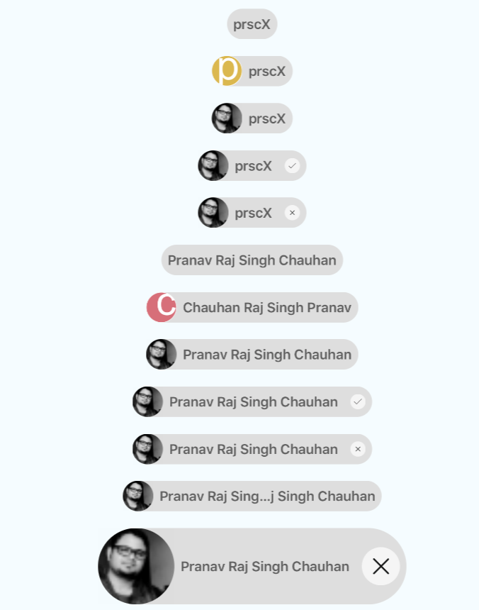
Material Chip View
Material Chips represent complex entities in small blocks, such as a contact. A chip may contain entities such as a photo, text, rules, an icon, or a contact.
Getting started
$ npm install react-native-chip-view --save
Types of Chips
Chips can be used for various types of entities, including free form text, predefined text, rules, or contacts. Chips may also contain icons.
Usage
import { RNChipView } from 'react-native-chip-view'

<RNChipView
  title={'prscX'}
  avatar={false}
/>
Props
| Prop | Type | Default | Note |
|---|---|---|---|
title |
string |
Specify label wants to show. Required | |
titleStyle |
object |
Specify style wants to apply on title | |
onPress |
func |
Specify event handler for on press | |
avatar |
bool, number, component |
- Specify true in case you need avatar. - Specify avatar in case you want custom avatar | |
avatarStyle |
object |
Specify custom avatar style | |
selectable |
bool, number, component |
- Specify true in case you need chip as selection. - Specify selection icon in case you want to pass your own icon | |
selectableStyle |
string |
Specify custom selectable style | |
cancelable |
bool, number, component |
- Specify true in case you need chip as cancelable. - Specify cancelable icon in case you want to pass your own icon | |
cancelableStyle |
string |
Specify custom cancelable style | |
backgroundColor |
string |
#dedede |
Specify chip background color |
maxWidth |
string |
300 |
Specify chip max width |
height |
string |
40 |
Specify chip height |
borderRadius |
string |
40 |
Specify container border radius |
ellipsizeMode |
string |
middle |
Specify text ellipsize mode |