react-native-tiny-toast
A react native toast like component , it works on IOS and Android.
Features
- Support iPhone X, XS, XS Max & XR
- Support both Android and IOS.
- Custom icon and style and so on.
- Use native ActivityIndicator.
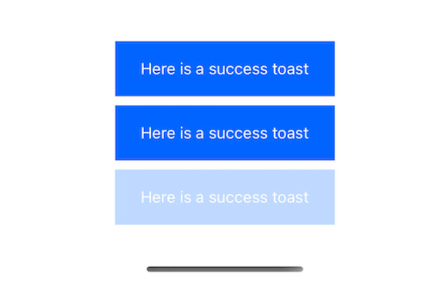
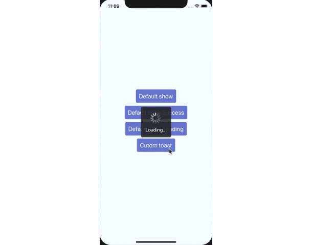
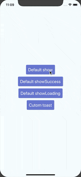
Demo
Install
npm i react-native-tiny-toast --save
or
yarn add react-native-tiny-toast
Getting started
import Toast from 'react-native-tiny-toast'

Toast.show('This is a default toast')

Toast.showSuccess('Pay success')

Toast.show('Custom toast',{
  position: Toast.position.center,
  containerStyle:{},
  textStyle: {},
  imgSource: require('xxx'),
  imgStyle: {},
  mask: true,
  maskStyle:{},
  ...
})

const toast = Toast.showLoading('Loading...')
setTimeout(() => {
  // Recommend
  Toast.hide(toast)
  // or Toast.hide()
  // If you don't pass toast,it will hide the last toast by default.
 }, 3000)
Using a Component
import React, {Component} from 'react-native'
import Toast from 'react-native-tiny-toast'

class Example extends Component {
    state={
      visible: false
    }

    componentDidMount() {
        setTimeout(() => this.setState({
            visible: true
        }), 1000);

        setTimeout(() => this.setState({
            visible: false
        }), 3000);
    };

    render() {
        return
        <Toast
            visible={this.state.visible}
            position={50}
            onHidden={()=>{
              // onHidden
            }}>This is a message
        </Toast>
    }
}
Api
| Name | Default | Type | Description |
|---|---|---|---|
| containerStyle | null | ViewPropTypes.style | Custom container style |
| duration | Toast.durations.SHORT | Number | Toast duration(ms), won't disappear if value is 0 |
| delay | 0 | Number | The delay duration before toast start appearing on screen. |
| animationDuration | 200 | Number | Animation duration |
| visible | false | Boolean | Show toast. (Only for Toast Component) |
| position | Toast.position.bottom | Number | 0 means the middle of the screen.A negative number indicates the distance to the bottom of the screen.A positive number indicates the distance to the top of the screen. |
| animation | true | Boolean | Whether to enable fade animation |
| shadow | false | Boolean | Whether to enable shadow |
| shadowColor | #000 | String | Shadow color(don't support android) |
| showText | true | Boolean | Whether to show text |
| textColor | #fff | String | Text color |
| textStyle | null | Text.propTypes.style | Text style |
| mask | false(true when showLoading) | Boolean | Whether to enable mask |
| maskColor | rgba(0,0,0,0.3) | String | Mask background color |
| maskStyle | null | ViewPropTypes.style | Mask style |
| imgSource | null | Image.source | Image source |
| imgStyle | null | Image.propTypes.style | Image style |
| loading | false(true when showLoading) | Boolean | Whether to show loading |
| indicatorSize | large | String or Number | Set the ActivityIndicator size,Currently only specific values can be set on Android. |
| onHidden | null | Function | Triggered when toast's hide animation end |
| onMaskPress | null | Function | Triggered when the mask is clicked |
| Method | Type | Description |
|---|---|---|
| show(text, options) | Function | Show toast |
| showSuccess(text, options) | Function | Show toast with success icon |
| showLoading(text, options) | Function | Show toast with ActivityIndicator |
| hide(toast) | Function | If you don't pass toast,it will hide the last toast by default. |