react-native-multiple-select
Simple multi-select component for react-native (Select2 for react-native).

Important notice
I've been super busy with work and other projects lately that I really don't have enough time to dedicate to this project. If you would like to maintain this project, you can drop me an email. Thanks.
Installation
$ npm install react-native-multiple-select --save
or use yarn
$ yarn add react-native-multiple-select
Usage
Note: Ensure to add and configure react-native-vector-icons to your project before using this package.
You can clone and try out the sample app.
The snippet below shows how the component can be used
// import component
import React, { Component } from 'react';
import { View } from 'react-native';
import MultiSelect from 'react-native-multiple-select';
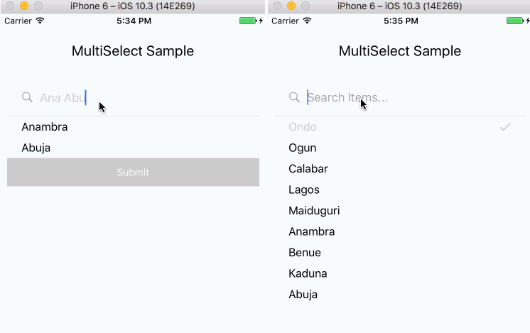
class MultiSelectExample extends Component {
this.state = {
selectedItems = [];
};
this.items = [{
id: '92iijs7yta',
name: 'Ondo',
}, {
id: 'a0s0a8ssbsd',
name: 'Ogun',
}, {
id: '16hbajsabsd',
name: 'Calabar',
}, {
id: 'nahs75a5sg',
name: 'Lagos',
}, {
id: '667atsas',
name: 'Maiduguri',
}, {
id: 'hsyasajs',
name: 'Anambra',
}, {
id: 'djsjudksjd',
name: 'Benue',
}, {
id: 'sdhyaysdj',
name: 'Kaduna',
}, {
id: 'suudydjsjd',
name: 'Abuja',
}];
onSelectedItemsChange = selectedItems => {
this.setState({ selectedItems });
};
render() {
const { selectedItems } = this.state;
return (
<View style={{ flex: 1 }}>
<MultiSelect
hideTags
items={items}
uniqueKey="id"
ref={(component) => { this.multiSelect = component }}
onSelectedItemsChange={this.onSelectedItemsChange}
selectedItems={selectedItems}
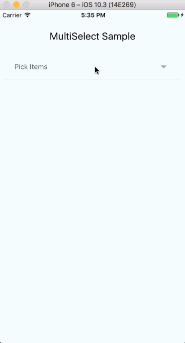
selectText="Pick Items"
searchInputPlaceholderText="Search Items..."
onChangeInput={ (text)=> console.log(text)}
altFontFamily="ProximaNova-Light"
tagRemoveIconColor="#CCC"
tagBorderColor="#CCC"
tagTextColor="#CCC"
selectedItemTextColor="#CCC"
selectedItemIconColor="#CCC"
itemTextColor="#000"
displayKey="name"
searchInputStyle={{ color: '#CCC' }}
submitButtonColor="#CCC"
submitButtonText="Submit"
/>
<View>
{this.multiSelect.getSelectedItemsExt(selectedItems)}
</View>
</View>
);
}
}
The component takes 3 compulsory props - items, uniqueKey and onSelectedItemsChange. Other props are optional. The table below explains more.
Props
| Prop | Required | Purpose |
|---|---|---|
| altFontFamily | No | (String) Font family for searchInputPlaceholderText |
| canAddItems | No | (Boolean) Defaults to "false". This allows a user to add items to the list of items provided. You need to handle adding the new items in the onAddItem function prop. Items may be added with the return key on the native keyboard. |
| displayKey | No | (String) Defaults to "name". This string will be used to select the key to display the objects in the items array |
| fixedHeight | No | (Boolean) Defaults to false. Specifies if select dropdown take height of content or a fixed height with a scrollBar (There is an issue with this behavior when component is nested in a ScrollView in which scroll event will only be dispatched to parent ScrollView and select component won't be scrollable). See this issue for more info. |
| fontFamily | No | (String) Custom font family to be used in component (affects all text except searchInputPlaceholderText described above) |
| fontSize | No | (Number) Font size for selected item name displayed as label for multiselect |
| hideSubmitButton | No | (Boolean) Defaults to false. Hide submit button from dropdown, and rather use arrow-button in search field |
| autoFocusInput | No | (Boolean) Defaults to true. Auto focus on the search input when MultiSelect launches. |
| hideTags | No | (Boolean) Defaults to false. Hide tokenized selected items, in case selected items are to be shown somewhere else in view (check below for more info) |
| itemFontFamily | No | (String) Font family for each non-selected item in multi-select drop-down |
| itemFontSize | No | (Number) Font size used for each item in the multi-select drop-down |
| itemTextColor | No | (String) Text color for each non-selected item in multi-select drop-down |
| items | Yes | (Array, control prop) List of items to display in the multi-select component. JavaScript Array of objects. Each object must contain a name and unique identifier (Check sample above) |
| onAddItem | No | (Function) JavaScript function passed in as an argument. The function is called everythime a new item is added, and receives the entire list of items. Here you should ensure that the new items are added to your provided list of items in addition to any other consequences of new items being added. |
| onChangeInput | No | (Function) JavaScript function passed in as an argument. The function is called everythime TextInput is changed with the value. |
| onSelectedItemsChange | Yes | (Function) JavaScript function passed in as an argument. The function is to be defined with an argument (selectedItems). Triggered when Submit button is clicked (for multi select) or item is clicked (for single select). (Check sample above) |
| searchInputPlaceholderText | No | (String) Placeholder text displayed in multi-select filter input |
| searchInputStyle | No | (Object) Style object for multi-select input element |
| selectText | No | (String) Text displayed in main component |
| selectedItemFontFamily | No | (String) Font family for each selected item in multi-select drop-down |
| selectedItemIconColor | No | (String) Color for selected check icon for each selected item in multi-select drop-down |
| selectedItemTextColor | No | (String) Text color for each selected item in multi-select drop-down |
| single | No | (Boolean) Toggles select component between single option and multi option |
| submitButtonColor | No | (String) Background color for submit button |
| submitButtonText | No | (String) Text displayed on submit button |
| tagBorderColor | No | (String) Border color for each selected item |
| tagRemoveIconColor | No | (String) Color to be used for the remove icon in selected items list |
| tagTextColor | No | (String) Text color for selected items list |
| textColor | No | (String) Color for selected item name displayed as label for multiselect |
| uniqueKey | Yes | (String) Unique identifier that is part of each item's properties. Used internally as means of identifying each item (Check sample below) |
| selectedItems | No | (Array, control prop) List of selected items keys . JavaScript Array of strings, that can be instantiated with the component |
Note
-
Tokenized selected items can be displayed in any other part of the view by adding a
refto theMultiSelectcomponent like soref={(component) => { this.multiSelect = component }}. Then add this to any part of the screen you want the tokens to show up:this.multiSelect.getSelectedItemsExt(selectedItems). TheselectedItemsargument passed into the above mentioned method is the sameselectedItemspassed as the main component selected items prop. (See example above). -
If users shouldn't be able to select any of the items in the dropdown list, set a
disabledkey to true in the item. Such item will be rendered in gray and won't be clickable. -
When using the
singleprop,selectedItemsshould still be passed in as an array of selected items keys. Also, when an item is selected in the single mode, the selected item is returned as an array of string. -
The
itemsprops must be passed as an array of objects with a compulsorynamekey present in each object as the name key is used to display the items in the options component.
Removing all selected items
To use, add ref to MultiSelect component in parent component, then call method against reference. i.e.
<MultiSelect
  ref={c => this._multiSelect = c}
  ...
/>

clearSelectedCategories = () => {
   this._multiSelect.removeAllItems();
};