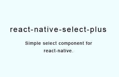
react-native-select-plus
Select component for react-native.
Installation
$ npm install react-native-select-plus --save
or use yarn
$ yarn add react-native-select-plus
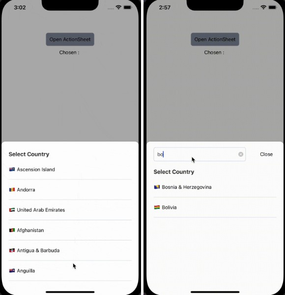
Usage
Note: Ensure to add and configure react-native-vector-icons to your project before using this package.
The snippet below shows how the component can be used
// import component
import React, { Component } from 'react';
import { View } from 'react-native';
import Select from 'react-native-select-plus';

class SelectExample extends Component {

  this.state = {
    value: null
  };

  this.items = [
      { key: 1, section: true, label: "Fruits" },
      { key: 2, label: "Red Apples" },
      { key: 3, label: "Cherries" },
      { key: 4, label: "Cranberries" },
      { key: 5, label: "Pink Grapefruit" },
      { key: 6, label: "Raspberries" },
      { key: 7, section: true, label: "Vegetables" },
      { key: 8, label: "Beets" },
      { key: 9, label: "Red Peppers" },
      { key: 10, label: "Radishes" },
      { key: 11, label: "Radicchio" },
      { key: 12, label: "Red Onions" },
      { key: 13, label: "Red Potatoes" },
      { key: 14, label: "Rhubarb" },
      { key: 15, label: "Tomatoes" }
    ];

  onSelectedItemsChange = (key, value) => {
    this.setState({ value: value });
  };

  render() {
    const { value } = this.state;
    return (
      <View style={{ flex: 1 }}>
        <Select
          data={this.items}
          width={250}
          placeholder="Select a value ..."
          onSelect={this.onSelectedItemsChange.bind(this)}
          data={data}
          search={true}
        />
        <View>
          {this.state.value}
        </View>
      </View>
    );
  }
}

## Props
| Prop Name           | Data Type | Default Values  | Description                                      |
|---------------------|-----------|-----------------|--------------------------------------------------|
| onSelect            | function  | null            | function that executes on selection of an option |
| placeholder         | string    | Select          | Text to show as default text                     |
| searchPlaceholder   | string    | Search          | Text to show as default search text              |
| style               | object    | null            | To style the select box.                         |
| textStyle           | object    | null            | To style the text shown in the box               |
| search              | bool      | true            | Use search in conponent                          |
| initKey             | number    | 0               | Init key for default option                      |
| parentScrollEnable  | function  | null            | Hack for Android nested ScrollView               |
| parentScrollDisable | function  | null            | Hack for Android nested ScrollView               |


The MIT License (MIT). Please see [LICENSE](LICENSE) for more information.