react-native-modal-selector-searchable
A cross-platform (iOS / Android), selector/picker component for React Native that is highly customizable and supports sections.
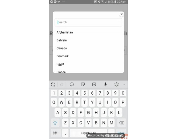
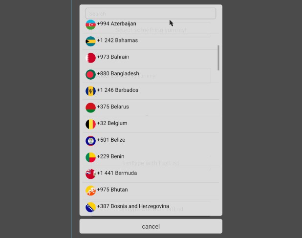
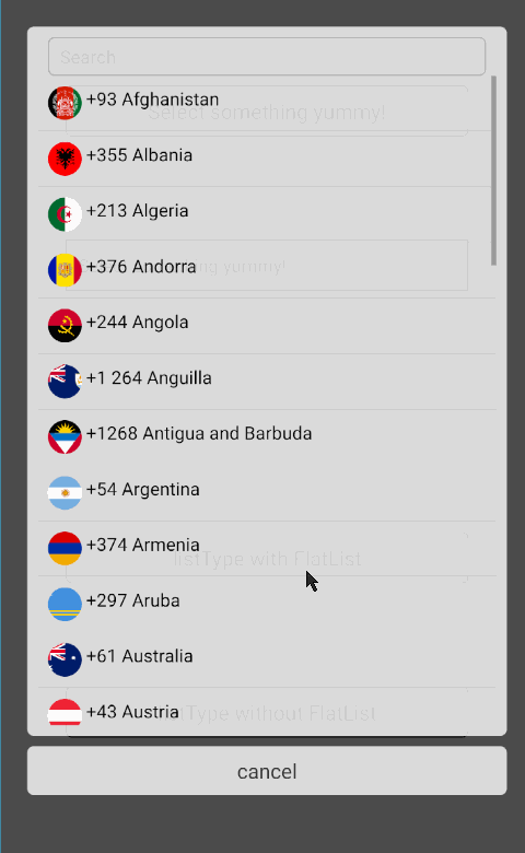
Search functionality has been added to this fork repository
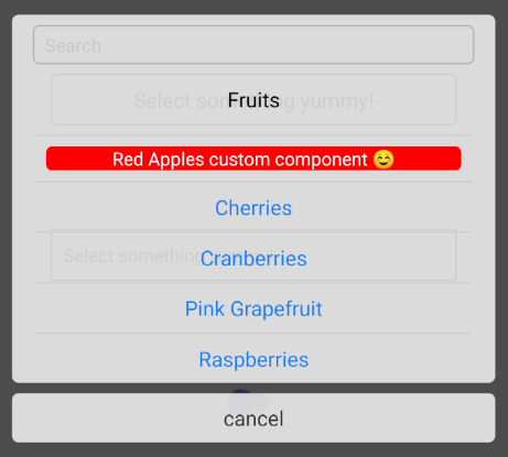
Demo
Install
npm i react-native-modal-selector-searchable --save
Usage
You can either use this component in its default mode, as a wrapper around your existing component or provide a custom component (where you need to control opening of the modal yourself). In default mode a customizable button is rendered.
See SampleApp for an example how to use this component.
import ModalSelector from 'react-native-modal-selector-searchable'

class SampleApp extends Component {

    constructor(props) {
        super(props);

        this.state = {
            textInputValue: ''
        }
    }

    render() {
        let index = 0;
        const data = [
            { key: index++, section: true, label: 'Fruits' },
            { key: index++, label: 'Red Apples' },
            { key: index++, label: 'Cherries' },
            { key: index++, label: 'Cranberries', accessibilityLabel: 'Tap here for cranberries' },
            // etc...
            // Can also add additional custom keys which are passed to the onChange callback
            { key: index++, label: 'Vegetable', customKey: 'Not a fruit' }
        ];

        return (
            <View style={{flex:1, justifyContent:'space-around', padding:50}}>

                // Default mode
                <ModalSelector
                    data={data}
                    initValue="Select something yummy!"
                    onChange={(option)=>{ alert(`${option.label} (${option.key}) nom nom nom`) }} />

                // Wrapper
                <ModalSelector
                    data={data}
                    initValue="Select something yummy!"
                    supportedOrientations={['landscape']}
                    accessible={true}
                    scrollViewAccessibilityLabel={'Scrollable options'}
                    cancelButtonAccessibilityLabel={'Cancel Button'}
                    onChange={(option)=>{ this.setState({textInputValue:option.label})}}>

                    <TextInput
                        style={{borderWidth:1, borderColor:'#ccc', padding:10, height:30}}
                        editable={false}
                        placeholder="Select something yummy!"
                        value={this.state.textInputValue} />

                </ModalSelector>

                // Custom component
                <ModalSelector
                    data={data}
                    ref={selector => { this.selector = selector; }}
                    customSelector={<Switch onValueChange={() => this.selector.open()} />}
                />
            </View>
        );
    }
}
Data Format
The selector accepts a specific format of data:
[{ key: 5, label: 'Red Apples' }]
Optionally provide a component key which overrides the default label text. Optionally provide a unique testID for each item:
[{
  key: 5,
  label: 'Red Apples',
  // The next keys are optional --
  component: <View style={{backgroundColor: 'red'}}><Text style={{color: 'white'}}>Red Apples custom component ☺</Text></View>,
  testID: '5-red-apples'
}]
If your data has a specific format, you can define extractors of data, example:
this.setState({data: [{ id: 5, name: 'Red Apples' }]});

return (
  <ModalSelector
    data={this.state.data}
    keyExtractor= {item => item.id}
    labelExtractor= {item => item.name}
  />
);
API
Props
| Prop | Type | Optional | Default | Description |
|---|---|---|---|---|
data |
array | No | [] | array of objects with a unique key and label to select in the modal. Optional component overrides label text. Optional unique testID for each item. |
search |
bool | Yes | true | Control the search box visibility |
hideSectionOnSearch |
bool | Yes | false | Hide the caption of related matched items |
caseSensitiveSearch |
bool | Yes | false | Sensitive mode on search |
frozenSearch |
bool | Yes | false | Preserve initial modal size on search |
fullHeight |
bool | Yes | false | Keep the modal size to the maximum regardless of the listed items |
onSearchFilterer |
function | Yes | (searchText, data) => filteredData | Custom search filterer function. |
onChange |
function | Yes | () => {} | callback function, when the users has selected an option |
onChangeSearch |
function | Yes | (searchData) => {} | Callback function, when the users has typed in search box |
onModalOpen |
function | Yes | () => {} | callback function, when modal is opening |
onModalClose |
function | Yes | (item) => {} | callback function, when modal is closing. Returns the selected item. |
onCancel |
function | Yes | () => {} | callback function, when clicking the cancel button |
keyExtractor |
function | Yes | (data) => data.key | extract the key from the data item |
labelExtractor |
function | Yes | (data) => data.label | extract the label from the data item |
componentExtractor |
function | Yes | (data) => data.component | extract the component from the data item |
visible |
bool | Yes | false | control open/close state of modal |
closeOnChange |
bool | Yes | true | control if modal closes on select |
initValue |
string | Yes | Select me! |
text that is initially shown on the button |
cancelText |
string | Yes | cancel |
text of the cancel button |
searchText |
string | Yes | search |
text of the search placeholder |
disabled |
bool | Yes | false | true disables opening of the modal |
supportedOrientations |
['portrait', 'landscape'] | Yes | both | orientations the modal supports |
keyboardShouldPersistTaps |
string / bool |
Yes | always |
passed to underlying ScrollView |
listType |
string | Yes | SCROLLVIEW |
scroller type: SCROLLVIEW or FLATLIST |
animationType |
string | Yes | slide |
type of animation to be used to show the modal. Must be one of none, slide or fade. |
style |
object | Yes | style definitions for the root element | |
childrenContainerStyle |
object | Yes | {} | style definitions for the children container view |
touchableStyle |
object | Yes | {} | style definitions for the touchable element |
touchableActiveOpacity |
number | Yes | 0.2 | opacity for the touchable element on touch |
selectStyle |
object | Yes | {} | style definitions for the select element (available in default mode only!). NOTE: Due to breaking changes in React Native, RN < 0.39.0 should pass flex:1 explicitly to selectStyle as a prop. |
selectTextStyle |
object | Yes | {} | style definitions for the select element (available in default mode only!) |
overlayStyle |
object | Yes | { flex: 1, padding: '5%', justifyContent: 'center', backgroundColor: 'rgba(0,0,0,0.7)' } | style definitions for the overlay background element. RN <= 0.41 should override this with pixel value for padding. |
sectionStyle |
object | Yes | {} | style definitions for the section element |
sectionTextStyle |
object | Yes | {} | style definitions for the select text element |
selectedItemTextStyle |
object | Yes | {} | style definitions for the currently selected text element |
optionStyle |
object | Yes | {} | style definitions for the option element |
optionTextStyle |
object | Yes | {} | style definitions for the option text element |
optionContainerStyle |
object | Yes | {} | style definitions for the option container element |
cancelStyle |
object | Yes | {} | style definitions for the cancel element |
cancelTextStyle |
object | Yes | {} | style definitions for the cancel text element |
initValueTextStyle |
object | Yes | {} | style definitions for the initValue text element |
cancelContainerStyle |
object | Yes | {} | style definitions for the cancel container |
searchStyle |
object | Yes | {} | Style definitions for the search view element |
searchTextStyle |
object | Yes | {} | Style definitions for the search text element |
backdropPressToClose |
bool | Yes | false | true makes the modal close when the overlay is pressed |
passThruProps |
object | Yes | {} | props to pass through to the container View and each option TouchableOpacity (e.g. testID for testing) |
selectTextPassThruProps |
object | Yes | {} | props to pass through to the select text component |
optionTextPassThruProps |
object | Yes | {} | props to pass through to the options text components in the modal |
cancelTextPassThruProps |
object | Yes | {} | props to pass through to the cancel text components in the modal |
scrollViewPassThruProps |
object | Yes | {} | props to pass through to the internal ScrollView |
openButtonContainerAccessible |
bool | Yes | false | true enables accessibility for the open button container. Note: if false be sure to define accessibility props directly in the wrapped component. |
listItemAccessible |
bool | Yes | false | true enables accessibility for data items. Note: data items should have an accessibilityLabel property if this is enabled |
cancelButtonAccessible |
bool | Yes | false | true enables accessibility for cancel button. |
scrollViewAccessible |
bool | Yes | false | true enables accessibility for the scroll view. Only enable this if you don't want to interact with individual data items. |
scrollViewAccessibilityLabel |
string | Yes | undefined | Accessibility label for the modal ScrollView |
cancelButtonAccessibilityLabel |
string | Yes | undefined | Accessibility label for the cancel button |
modalOpenerHitSlop |
object | Yes | {} | How far touch can stray away from touchable that opens modal (RN docs) |
customSelector |
node | Yes | undefined | Render a custom node instead of the built-in select box. |
selectedKey |
any | Yes | '' | Key of the item to be initially selected |
enableShortPress |
bool | Yes | true | enables short press. This is regular touch behavior. |
enableLongPress |
bool | Yes | false | enables long press. When true, onModalOpen returns {longPress: true} |
optionsTestIDPrefix |
string | Yes | 'default' |
This prefixes each selectable option's testID prop if no testID keys are provided in props.data array objects. Default for each option's testID: 'default-<optionLabel>' |
Methods
getSelectedItem(): get current selected item, updated by onChange event.
GitHub
https://github.com/hepter/react-native-modal-selector-searchable