react-native-actions-sheet
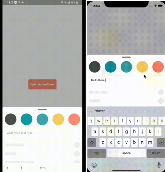
A Cross Platform(Android & iOS) ActionSheet with a flexible api, native performance and zero dependency code for react native. Create anything you want inside ActionSheet.
Features
- Cross Platform (iOS and Android)
- Native Animations & Performance
- Identical Working on Android and iOS
- Control ActionSheet with Gestures
- Raw ActionSheet - You can Add Anything
- Allow ActionSheet to be partially shown when opened
- Support TextInputs
- Cool bounce effect on open.
- Support for Tablets and iPads
- Support Horizontal Layout
- Support for Nested Scrolling or Scrollable Content.
- Virtualization Support
Run Example
To run the example app clone the project
git clone https://github.com/ammarahm-ed/react-native-actions-sheet.git
then run yarn or npm install in the example folder and finally to run the example app:
react-native run-android
Installation Guide
npm install react-native-actions-sheet --save
or if you use yarn:
yarn add react-native-actions-sheet
Usage Example
For complete usage, see the example project.
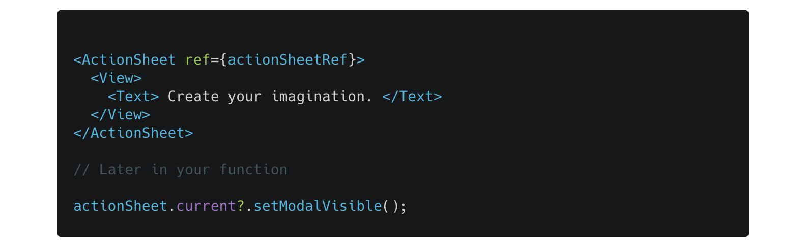
import ActionSheet from "react-native-actions-sheet";
import React, { createRef } from "react";
const actionSheetRef = createRef();
const App = () => {
let actionSheet;
return (
<View
style={{
justifyContent: "center",
flex: 1,
}}
>
<TouchableOpacity
onPress={() => {
actionSheetRef.current?.setModalVisible();
}}
>
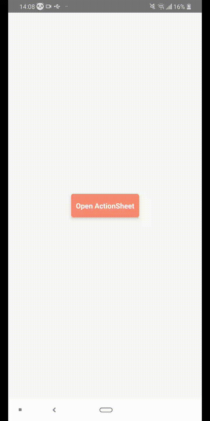
<Text>Open ActionSheet</Text>
</TouchableOpacity>
<ActionSheet ref={actionSheetRef}>
<View>
<Text>YOUR CUSTOM COMPONENT INSIDE THE ACTIONSHEET</Text>
</View>
</ActionSheet>
</View>
);
};
export default App;
Reference
Props
ref
Assigns a ref to ActionSheet component to use methods.
| Type | Required |
|---|---|
| ref | Yes |
initialOffsetFromBottom
Use if you want to show the ActionSheet Partially on Opening. Requires gestureEnabled=true
| Type | Required |
|---|---|
| boolean | no |
Default:1
extraScroll
Normally when the ActionSheet is fully opened, a small portion from the bottom is hidden by default. Use this prop if you want the ActionSheet to hover over the bottom of screen and not hide a little behind it.
| Type | Required |
|---|---|
| number | no |
Default:0
containerStyle
Any custom styles for the container.
| Type | Required |
|---|---|
| Object | no |
delayActionSheetDraw
Delay draw of ActionSheet on open for android.
| Type | Required |
|---|---|
| boolean | no |
Default: false
delayActionSheetDrawTime
Delay draw of ActionSheet on open for android time.
| Type | Required |
|---|---|
| number (ms) | no |
Default: 50
CustomHeaderComponent
Your custom header component. Using this will hide the default indicator.
| Type | Required |
|---|---|
| React.Component | no |
headerAlwaysVisible
Keep the header always visible even when gestures are disabled.
| Type | Required |
|---|---|
| boolean | no |
Default: false
CustomFooterComponent
A footer component if you want to add some info at the bottom.
| Type | Required |
|---|---|
| React.Component | no |
Note: Remember to give footer a fixed height and provide ActionSheet the footerHeight prop with same value. If you have added margins etc, add those values to footerHeight also.
footerHeight
Height of the footer
| Type | Required |
|---|---|
| number | no |
Default: 80
footerStyle
Custom Styles for the footer container.
| Type | Required |
|---|---|
| Object | no |
footerAlwaysVisible
Keep footer visible. Currently when you overdraw, the footer appears, however you can change this by setting this to true.
| Type | Required |
|---|---|
| boolean | no |
Default: false
animated
Animate the opening and closing of ActionSheet.
| Type | Required |
|---|---|
| boolean | no |
Default: true
openAnimationSpeed
Speed of opening animation. Higher means the ActionSheet will open more quickly.
| Type | Required |
|---|---|
| number | no |
Default: 12
closeAnimationDuration
Duration of closing animation.
| Type | Required |
|---|---|
| number | no |
Default: 300
gestureEnabled
Enables gesture control of ActionSheet
| Type | Required |
|---|---|
| boolean | no |
Default: false
closeOnTouchBackdrop
Control closing ActionSheet by touching on backdrop.
| Type | Required |
|---|---|
| boolean | no |
Default: true
bounceOnOpen
Bounces the ActionSheet on open.
| Type | Required |
|---|---|
| boolean | no |
Default: false
bounciness
How much you want the ActionSheet to bounce when it is opened.
| Type | Required |
|---|---|
| number | no |
Default: 8
springOffset
When touch ends and user has not moved farther from the set springOffset, the ActionSheet will return to previous position.
| Type | Required |
|---|---|
| number | no |
Default: 50
elevation
Add elevation to the ActionSheet container.
| Type | Required |
|---|---|
| number | no |
Default: 0
indicatorColor
Color of the gestureEnabled Indicator.
| Type | Required |
|---|---|
| string | no |
Default: "#f0f0f0"
overlayColor
Color of the overlay/backdrop.
| Type | Required |
|---|---|
| string | no |
Default: "black"
defaultOverlayOpacity
Default opacity of the overlay/backdrop.
| Type | Required |
|---|---|
| number 0 - 1 | no |
Default: 0.3
closable
Prevent ActionSheet from closing on gesture or tapping on backdrop. Instead snap it to bottomOffset location
| Type | Required |
|---|---|
| boolean | no |
Default: true
bottomOffset
Snap ActionSheet to this location if closable is set to false. By default it will snap to the location on first open.
| Type | Required |
|---|---|
| number | no |
Default: 0
keyboardShouldPersistTaps
Setting the keyboard persistence of the ScrollView component. Should be one of "never", "always" or "handled"
| Type | Required |
|---|---|
| string | no |
Default: never
statusBarTranslucent
Determine whether the modal should go under the system statusbar.
| Type | Required |
|---|---|
| boolean | no |
Default: true
closeOnPressBack
Will the ActionSheet close on hardwareBackPress event.
| Type | Required |
|---|---|
| boolean | no |
Default: true
onClose
Event called when the ActionSheet closes.
| Type | Required |
|---|---|
| function | no |
onOpen
An event called when the ActionSheet Opens.
| Type | Required |
|---|---|
| function | no |
Methods
Methods require you to set a ref on ActionSheet Component.
setModalVisible
ActionSheet can be opened or closed using its ref.
import ActionSheet from "react-native-actions-sheet";
import React, { createRef } from "react";

const actionSheetRef = createRef();

// First create a ref on your <ActionSheet/> Component.
<ActionSheet ref={actionSheetRef} />;

// then later in your function to open the ActionSheet:

actionSheetRef.current?.setModalVisible();
setModalVisible(visible)
It's also possible to explicitly either show or hide modal.
import ActionSheet from "react-native-actions-sheet";
import React, { createRef } from "react";

const actionSheetRef = createRef();
// First create a ref on your <ActionSheet/> Component.
<ActionSheet ref={actionSheetRef} />;

// then to show modal use
actionSheetRef.current?.setModalVisible(true);

// and later you may want to hide it using
actionSheetRef.current?.setModalVisible(false);
snapToOffset(offset:number)
When the ActionSheet is open, you can progammatically snap it to different offsets.
import ActionSheet from "react-native-actions-sheet";
import React, { createRef } from "react";

const actionSheetRef = createRef();
// First create a ref on your <ActionSheet/> Component.
<ActionSheet ref={actionSheetRef} />;

// snap to this location on screen
actionSheetRef.current?.snapToOffset(200);

actionSheetRef.current?.snapToOffset(150);

actionSheetRef.current?.snapToOffset(300);
Event Listeners
Listen to changes in ActionSheet State.
addHasReachedTopListener
Attach a listener to know when ActionSheet is fully opened and has reached top. Use this if you want to use a ScrollView inside the ActionSheet. Check the example for demonstration on how to use nested ScrollViews inside ActionSheet.
import ActionSheet, {addHasReachedTopListener, removeHasReachedTopListener} from 'react-native-actions-sheet


// In your Component

  const _onHasReachedTop = (hasReached) => {
    // handle the event
  }

  useEffect(() => {
    addHasReachedTopListener(_onHasReachedTop)
    return () => {
        removeHasReachedTopListener(_onHasReachedTop)
    }
  },[])