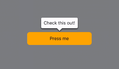
react-native-popable
Popovers, tooltips for React Native.
? Controlled and uncontrolled popovers
✍️ Customizable popover content (text, views)
? Works on web, hover support
?♂️ No-dependency
? Built with Typescript
<Popable content="See profile">
  <Text>@eveningkid</Text>
</Popable>
Usage
npm install react-native-popable
If working with React Native Web, you'll need at least version 0.15.0. It introduced hover events for Pressable which is used internally.
Popable
Add a popover around a given component. Uses Popover internally.
Every property coming from Popover can be used the exact same way that with Popable.
import { Popable } from 'react-native-popable';

export default () => (
  <Popable content="See profile">
    <Text>@morning_cafe</Text>
  </Popable>
);
Popable.children
What should serve as the popover trigger, basically any React element.
<Popable content="See profile">
  <Image
    source={{ uri: ... }}
    style={{ width: 50, height: 50 }}
  />
</Popable>

<Popable content="See profile">
  <Text>@morning_cafe</Text>
</Popable>
content
Popover content: can be a string or any React element (text, views).
If you just want the popover, without all the outside logic that comes from Popable, use Popover instead.
<Popable
  content={
    <View
      style={{
        padding: 10,
        alignItems: 'center',
        justifyContent: 'center',
        backgroundColor: 'white'
      }}
    >
      <Text>Anything :)</Text>
    </View>
  }
>
  <Text>@morning_cafe</Text>
</Popable>

<Popable content="See profile">
  <Text>@morning_cafe</Text>
</Popable>
action
Upon what action should the popover be shown/dismissed: press, longpress or hover (web-only). Defaults to press.
<Popable action="hover" content="See profile">
  <Text>@morning_cafe</Text>
</Popable>
onAction
Callback to monitor the popover visibility state. Called whenever visible changes (even through Popover internal state). Useful for side-effects.
<Popable
  onAction={(visible) => {
    if (visible) {
      Analytics.pressedProfilePopover();
    }
  }}
  content="See profile"
>
  <Text>@morning_cafe</Text>
</Popable>
strictPosition
If the popover should be placed on the opposite side when it doesn't fit at the given position. If a popover is on the left of the screen and its position is left, the position will be turned to right by default. If strictPosition is true, the popover will remain on the left. Defaults to false.
<Popable strictPosition={true} position="left">
  @morning_cafe
</Popable>
style
Style the Popover component using any View style property.
<Popable style={{ opacity: 0.8 }}>@morning_cafe</Popable>
Popover
The UI component in Popable can also be used on its own.
import { Popover } from 'react-native-popable';

export default () => <Popover>@morning_cafe</Popover>;
children
The popover content: will render text if a string is given or the given React elements otherwise.
<Popover>@morning_cafe</Popover>

<Popover>
  <Image
    source={{ uri: ... }}
    style={{ width: 50, height: 50 }}
  />
</Popover>
animated
If the popover should animate when the visible property changes. Defaults to true.
<Popover animated={false}>@morning_cafe</Popover>
animationType
If the popover should bounce a little (spring) or not (timing). Defaults to timing.
<Popover animationType="spring">@morning_cafe</Popover>
backgroundColor
Background color for the popover and the caret.
<Popover backgroundColor="red">@morning_cafe</Popover>
caret
If the little caret (the "half-triangle") should be displayed. Defaults to true.
<Popover caret={false}>@morning_cafe</Popover>
caretPosition
Position for the caret: left, center or right. Defaults to center.
<Popover caretPosition="right">@morning_cafe</Popover>
numberOfLines
Limit the number of lines if children is a string. Corresponds to Text.numberOfLines which clips text with ... if the given text is more than a number of lines.
<Popover numberOfLines={1}>@morning_cafe_got_longer</Popover>
visible
If the popover should be visible. Will animate every value change if animated is true.
const [visible, setVisible] = useState(false);

<Popover visible={visible}>@morning_cafe</Popover>

<Button
  title="Toggle visibility"
  onPress={() => {
    setVisible((isVisible) => !isVisible);
  }}
/>
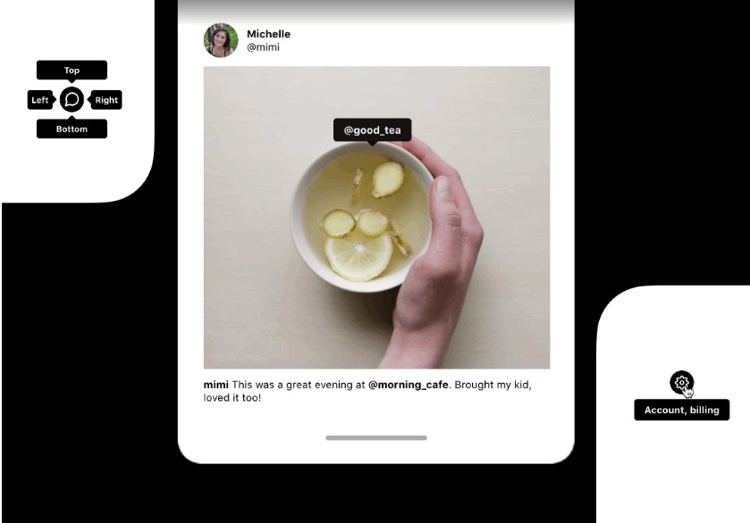
position
Position for the popover: top, right, bottom or left. Changes the caret position. Defaults to top.
<Popover position="right">@morning_cafe</Popover>
ViewProps
Every usual View property is available as well.
<Popover onLayout={...}>@morning_cafe</Popover>