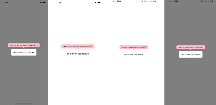
React Native Walkthrough Tooltip
React Native Walkthrough Tooltip is a fullscreen modal that highlights whichever element it wraps.
When not visible, the wrapped element is displayed normally.
Installation
yarn add react-native-walkthrough-tooltip
Example Usage
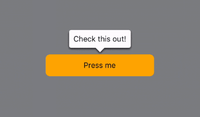
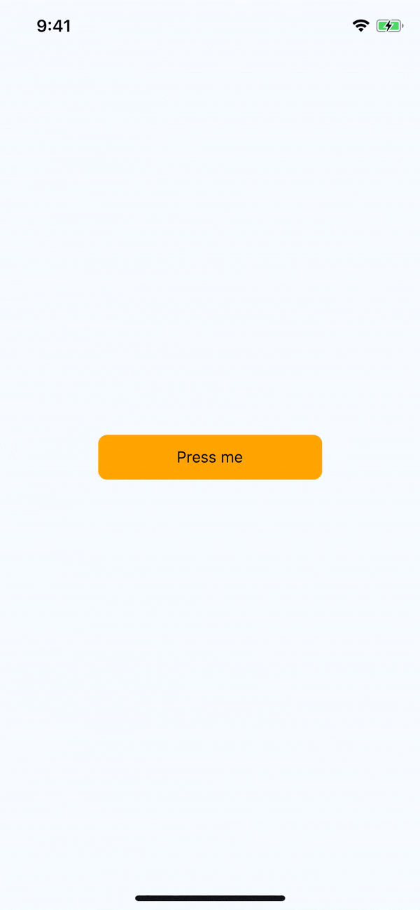
import Tooltip from 'react-native-walkthrough-tooltip';

<Tooltip
  animated
  isVisible={this.state.toolTipVisible}
  content={<Text>Check this out!</Text>}
  placement="top"
  onClose={() => this.setState({ toolTipVisible: false })}
>
  <TouchableHighlight style={styles.touchable}>
    <Text>Press me</Text>
  </TouchableHighlight>
</Tooltip>
How it works
The tooltip wraps an element in place in your React Native rendering. When it initially renders, it measures the location of the element in the window, utilizing React Native's
measureInWindow. When the tooltip is displayed, it renders a copy of the wrapped element positioned absolutely on the screen at the coordinates returned after measuring. This allows you to touch the element in the tooltip modal rendered above your current screen.
Optionally, you can provide the props onChildPress or onChildLongPress to override the functionality of the current element, should you find that useful. More information on this can be found below.
Props
| Prop name | Type | Default value | Description |
|---|---|---|---|
| animated | bool | false | When true, tooltip will animate in/out when showing/hiding |
| arrowSize | Size |
{ width: 16, height: 8 } | The dimensions of the arrow on the bubble pointing to the highlighted element |
| backgroundColor | string | 'rgba(0,0,0,0.5)' | Color of the fullscreen background beneath the tooltip. Overrides the backgroundStyle prop |
| content | function/Element | <View /> |
This is the view displayed in the tooltip popover bubble |
| displayArea | Rect |
fullscreen Rect with 24px of padding |
Screen area where the tooltip may be displayed |
| isVisible | bool | false | When true, tooltip is displayed |
| onChildLongPress | function | null | Callback when user long presses on wrapped child. Overrides any touches in wrapped child element. See below for more info |
| onChildPress | function | null | Callback when user long presses on wrapped child. Overrides any touches in wrapped child element. See below for more info |
| onClose | function | null | Callback fired when the user taps the tooltip background overlay |
| placement | string | 'auto' | Where to position the tooltip - options: top, bottom, left, right, auto. When auto is specified, the library will determine the ideal placement so that the popover is fully visible within displayArea. |
| childlessPlacementPadding | number or percentage string | 24 | When the tooltip is rendered without a child element, this prop will determine the distance in pixels from the specified placement, i.e. a value of '25%' with placement 'bottom' would render the tooltip 25% of the device height above the bottom of the screen (prop ignored if tooltip is rendered with a child element) |
Style Props
The tooltip styles should work out-of-the-box for most use cases, however should you need you can customize the styles of the tooltip using these props.
| Prop name | Effect |
|---|---|
| arrowStyle | Styles the triangle that points to the called out element |
| backgroundStyle | Styles the overlay view that sits behind the tooltip, but over the current view |
| contentStyle | Styles the content wrapper that surrounds the content element |
| tooltipStyle | Styles the tooltip that wraps the arrow and content elements |
Class definitions for props
Rectis an object with properties:{ x: number, y: number, width: number, height: number }Sizeis an object with properties:{ width: number, height: number }
onChildPress and onChildLongPress
When providing either of these functions, React Native Walkthrough Tooltip will wrap your entire child element in a touchable like so:
<TouchableWithoutFeedback onPress={onChildPress} onLongPress={onChildLongPress}>
  {childElement}
</TouchableWithoutFeedback>
NOTE: This will disable and override any touch events on your child element
One possible use case for these functions would be a scenerio where you are highlighting new functionality and want to restrict a user to ONLY do a certain action when they press on an element. While perhaps uncommon, this use case was relevant for another library I am working on, so it may be useful for you. When these props are NOT provided, all touch events on children occur as expected.