rn-custom-style-sheet
Steps to Run & Build:
- Install dependencies
yarn - Build
yarn build - Install dependencies in example app
cd example && yarn && cd ios/ && pod install && cd .. - Run example app
yarn ios
- Installation
sizecan be any positive number (including decimal) fors,vs,ms,mvs,sdpandsspsizecan be any positive percentage (including decimal) forhp, andwpsizecan be any positive number ranging from 0 to 100 (including decimal) forvw,vh,vmin, andvmaxfactorcan be any positive number ranging from 0 and 1 (including decimal)sarcan be skip aspect ratio apply to givensizercan be rounding the resultguideLineBasecan be Default guideline sizes(width|height) are based on standard ~5″ screen mobile device or design guideline.aspectRatioFncan be function which calculates new size based on aspect ratio condition.createTheme (styles)only accepts dark/light mode themingcreateScaled (styles)only accepts media queries specifiedcreateScaledTheme (styles)accepts both dark/light mode theming and media queries specifiedstyles(object) : A style object either the normal or with custom properties and queries.styles(object,themeType) : A style object either the normal or with custom properties, queries and theme properties.-
customStyleSheet(object,themeType)styles(object,themeType): A style object which is generated during application start. See basic example above.
- This is a theme provider and applies to the app level js/ts.
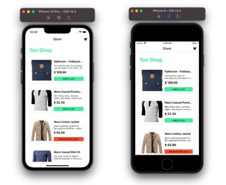
- isSupportLandscape props will be support device landscape mode from scaling because when device orientation change then change height and width(Default false).
- Custom hook for applying the current theme in our style object.
- Custom hook for update the current app theme in our application(used for setting preference or other you have specify option in our application).
- This is the type of theme and value is dark or light
npm
npm install rn-custom-style-sheet react-native-mmkv
Yarn
yarn add install rn-custom-style-sheet react-native-mmkv
Usage
Define styles using CustomStyleSheet.create<Theme|Scaled|ScaledTheme>() instead of StyleSheet.create()
import React from 'react';
import { Text, View } from 'react-native';

import { CustomStyleSheet } from 'rn-custom-style-sheet';

const Example = () => {
  return (
    <View style={styles.container}>
      <Text style={styles.text}>Example</Text>
    </View>
  );
};

const styles = CustomStyleSheet.createScaled({
  text: {
    fontSize: '2@ms',
    marginVertical: '20@s'
  },
  container: {
    alignItems: 'center',
    flex: 1,
    justifyContent: 'center'
  }
});
Styling Options
Size with custom units
| Unit | Description | Example |
|---|---|---|
<size>@s<sar><r> |
scales size in a linear manner relative to screen width |
5.5@s |
<size>@vs<sar><r> |
scales size in a linear manner relative to screen height |
7@vs |
<size>@ms<factor><sar><r> |
scales size in a linear manner relative to screen width. factor is resize factor. Default is 0.5 |
5@ms or [email protected] |
<size>@mvs<factor><sar><r> |
scales size in a linear manner relative to screen height. factor is resize factor. Default is 0.5 |
5@mvs or [email protected] |
<size>@hp<sar><r> |
size percentage relative to the window height | 1@hp |
<size>@wp<sar><r> |
size percentage to the window width | 1@wp |
<size>@vw<sar><r> |
size relative to the window width | 1.02@vw |
<size>@vh<sar><r> |
size relative to the window height | 10@vh |
<size>@vmin<sar><r> |
size relative to the shortest dimension compared between window width and height | 10@vmin |
<size>@vmax<sar><r> |
size relative to the largest dimension compared between window width and height | 10@vmax |
<size>@sdp<sar><r> |
size relative to the window width, More detail of sdp | 10@sdp |
<size>@ssp<sar><r> |
size relative to the window width and device font size , More detail of ssp | 10@ssp |
Note:
API
config
A function which apply custom styles config.
CustomStyleSheet.config(
  {
    width: 375,
    height: 812
  },
  (size: number) => {
    const aspectRatio = screenHeight / screenWidth;
    let newSize = 0;
    if (aspectRatio > 1.77) {
      newSize = size;
    } else if (aspectRatio > 1.6) {
      newSize = size * 0.97;
    } else if (aspectRatio > 1.4) {
      newSize = size * 0.89;
    } else if (aspectRatio > 1.35) {
      newSize = size * 0.87;
    } else {
      newSize = size * 0.6;
    }
    return newSize;
  }
);
create (styles)
A function which returns computed styles on the basis of media queries specified or theming.
Arguments
Return
ThemeProvider
useMyTheme
useUpdateMyTheme
const handleAppTheme = useUpdateMyTheme();

<Button onPress={() => handleAppTheme('dark')}>
	Dark Theme
</Button>

<Button onPress={() => handleAppTheme('light')}>
	Light Theme
</Button>
ThemeType
Example
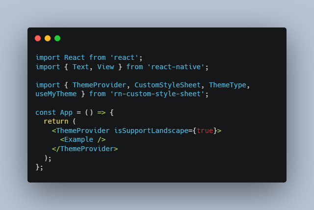
import React from 'react';
import { Text, View } from 'react-native';

import { ThemeProvider, CustomStyleSheet, ThemeType, useMyTheme } from 'rn-custom-style-sheet';

const App = () => {
  return (
    <ThemeProvider isSupportLandscape={true}>
      <Example />
    </ThemeProvider>
  );
};

const Example = () => {
  const styles = useMyTheme(styleSheet);
  return (
    <View style={styles.container}>
      <Text style={styles.text}>Example</Text>
    </View>
  );
};

const styleSheet = (themeType: ThemeType) =>
  CustomStyleSheet.createScaledTheme(
    {
      text: {
        fontSize: '2@ms',
        marginVertical: '20@s',
        color: 'red',
        colorDark: 'green'
      },
      container: {
        alignItems: 'center',
        flex: 1,
        justifyContent: 'center'
      }
    },
    themeType
  );