? Styled-RN
Styled Components for React Native the way they should have been.
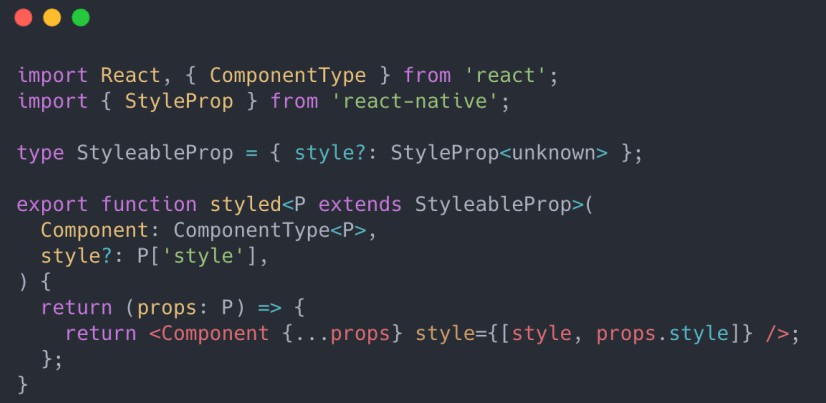
Inspired by this article
Intro
Why ? styled-rn it better than ?? styled-components/native ?
Well, first of all, using styled components should be fun, but using css to style a React Native app is cumbersome and often ends up to be very messy.
Also:
styled-rngives you access to ALL React Native style propsstyled-rnis faster because it does not do tedious string template processingstyled-rnis easier to use (again, no messy string templates)styled-rnis fully typed and has a nice APIstyled-rnsupports custom props, theme viaThemeProvider, multiple style objects and more..styled-rnhas a shorter name ?
Usage:
npm i styled-rn
import { styled } from "styled-rn";

// Basic usage
export const Container = styled.View({
  flexDirection: "row",
  backgroundColor: "cyan",
});

// Use with any component
export const CoolAndBoldComponent = styled(CoolComponent, {
  fontWeight: "bold",
});
Theming:
You will need to do a few things in order to propagate the theme prop into all of your styled components:
- Define your theme object and the type for it
- Augment the
Themetype - Wrap your app in
ThemeProvider
First, define your theme:
// mytheme.ts

export const theme = {
    primary: "blue",
    background: "white",
    ...
} as const;

export type MyAppTheme = typeof theme;
TODO: add example on how to use multiple themes
Now you need to augment the default Theme type with your own type. In order to do that, create a definitions file at the root of your source tree (e.g. global.d.ts) and add the following to it:
import { MyAppTheme } from './mytheme.ts'

declare module 'styled-rn' {
  // eslint-disable-next-line @typescript-eslint/no-empty-interface
  interface Theme extends MyAppTheme {}
}
And finally, the wrapping, as usual:
// App.tsx

import { ThemeProvider } from 'styled-rn';
import { theme } from './mytheme.ts';

export default function App() {
    return (
        <ThemeProvider theme={theme}>
            { /* your app components */}
        </ThemeProvider>
    )
}
And that’s it! You can now access your theme in any styled component:
export const Button = styled.TouchableOpacity(
  ({ theme }) => ({
    backgroundColor: theme.background,
  })
);
If you want to use custom props in your styled component, make sure that your custom props interface extends ThemedProps. E.g.
// Important:         ?
interface ButtonProps extends ThemedProps {
  disabled?: boolean;
}

export const Button = styled.TouchableOpacity(
  ({ disabled, theme }: ButtonProps) => ({
    opacity: disabled ? 0.3 : 1,
    backgroundColor: theme.background,
  })
);

// Using conditional styles with custom props
interface SmartComponentProps extends ThemedProps {
  active?: boolean;
}
export const SmartComponent = styled.TouchableOpacity(
  ({ active, theme }: SmartComponentProps) => [
    {
      fontSize: 16,
    },
    active && {
      fontWeight: theme.activeFontWeight,
      color: theme.activeColor,
    },
  ]
);
You can also use theme in your components by calling the useTheme() hook or by wrapping your component with withTheme() HOC.
import { useTheme } from 'styled-rn';

export const MyComponent = () => {
    const theme = useTheme();
}
Advanced Topics
TODO:
- useDebugStyles: per component and globally
- theme: rootStyles, rootFont, rootBackgroundColor, etc..
Issues
- BUG: When component returns the style from inline function sometimes the style object has to be type casted to ViewStyle, TextStyle, etc… Otherwise, you’ll get a weird TS error. It looks like a TS bug.
If you don’t want to cast your styles, make sure that you pass props to the function and USE THE PROPS in your styles.
TODO:
- Feature Compare with:
- https://github.com/MrLoh/styled-native-components
- https://jacobp100.github.io/cssta/
- https://styled-system.com/
- Take ideas for features and theming
- Add shorthands? (mt, mx, pb, …)
- Add typescript tests
- Add react tests (expect componets with specific styles), test theme nesting, etc…
- Add more examples: Button (View with Text), using functions to generate styles.
- Add support for presets? I.e. platform independant styles? E.g.:
elevation: (value) => ({
      shadowColor: 'black',
      shadowOffset: { width: 0, height: value },
      shadowRadius: value * 2.5,
      shadowOpacity: 0.3,
      elevation: value,
      zIndex: value,
    }),
Presets can use Platform, Dimensions, etc..
E.g.: ...Platform.select({ ios { width: 100 }, android: { width: 75 } })
See example here


