react-native-calendar-strip
Easy to use and visually stunning calendar component for React Native.
Install
$ npm install react-native-calendar-strip
# OR
$ yarn add react-native-calendar-strip
Usage
Simple "out of the box" Example
You can use this component without any styling or customization. Just import it in your project and render it:
import { View, StyleSheet } from 'react-native';
import CalendarStrip from 'react-native-calendar-strip';

const Example = () => (
  <View style={styles.container}>
    <CalendarStrip />
  </View>
);

const styles = StyleSheet.create({
  container: { flex: 1 }
});
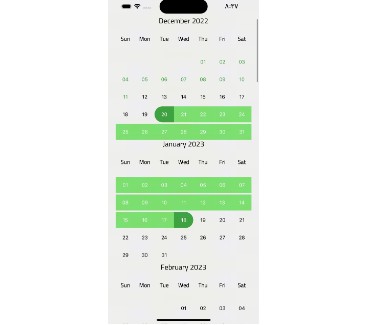
This will result in:
Styling and animations Example
Even though this component works withouth any customization, it is possible to customize almost everything, so you can make it as beautiful as you want:
import React, {Component} from 'react';
import {
    AppRegistry,
    View
} from 'react-native';
import moment from 'moment';

import CalendarStrip from 'react-native-calendar-strip';

class Example extends Component {
    let datesWhitelist = [{
      start: moment(),
      end: moment().add(3, 'days')  // total 4 days enabled
    }];
    let datesBlacklist = [ moment().add(1, 'days') ]; // 1 day disabled

    render() {
        return (
            <View>
                <CalendarStrip
                    calendarAnimation={{type: 'sequence', duration: 30}}
                    daySelectionAnimation={{type: 'border', duration: 200, borderWidth: 1, borderHighlightColor: 'white'}}
                    style={{height: 100, paddingTop: 20, paddingBottom: 10}}
                    calendarHeaderStyle={{color: 'white'}}
                    calendarColor={'#7743CE'}
                    dateNumberStyle={{color: 'white'}}
                    dateNameStyle={{color: 'white'}}
                    highlightDateNumberStyle={{color: 'yellow'}}
                    highlightDateNameStyle={{color: 'yellow'}}
                    disabledDateNameStyle={{color: 'grey'}}
                    disabledDateNumberStyle={{color: 'grey'}}
                    datesWhitelist={datesWhitelist}
                    datesBlacklist={datesBlacklist}
                    iconLeft={require('./img/left-arrow.png')}
                    iconRight={require('./img/right-arrow.png')}
                    iconContainer={{flex: 0.1}}
                />
            </View>
        );
    }
}

AppRegistry.registerComponent('Example', () => Example);
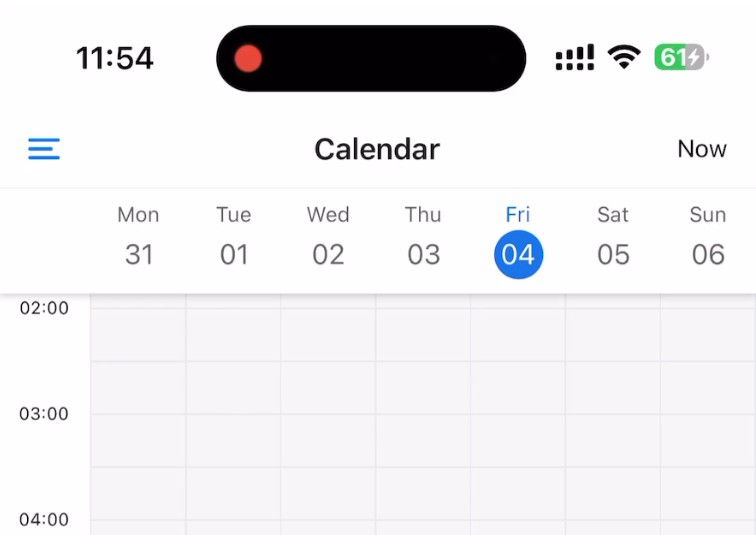
This will result in:
Props
Methods
Methods may be accessed through the instantiated component's ref.
| Prop |
Description |
getSelectedDate() |
Returns the currently selected date. If no date is selected, returns undefined. |
setSelectedDate(date) |
Sets the selected date. date may be a Moment object, ISO8601 date string, or any format that Moment is able to parse. It is the responsibility of the caller to select a date that makes sense (e.g. within the current week view). Passing in a value of 0 effectively clears the selected date. |
getNextWeek() |
Advance to the next week. |
getPreviousWeek() |
Rewind to the previous week. |
updateWeekView(date, startDate) |
Show the week that includes the date param. If startDate is provided, the first day of the week resets to it as long as useIsoWeekday is false. |
Initial data and onDateSelected handler
| Prop |
Description |
Type |
Default |
startingDate |
Date to be used for centering the calendar/showing the week based on that date. It is internaly wrapped by moment so it accepts both Date and moment Date. |
Any |
|
selectedDate |
Date to be used as pre selected Date. It is internaly wrapped by moment so it accepts both Date and moment Date. |
Any |
|
onDateSelected |
Function to be used as a callback when a date is selected. It returns moment Date |
Function |
|
onWeekChanged |
Function to be used as a callback when a week is changed. It returns moment Date |
Number |
|
updateWeek |
Update the week view if other props change. If false, the week view won't change when other props change, but will still respond to left/right selectors. |
Bool |
True |
useIsoWeekday |
start week on ISO day of week (default true). If false, starts week on startingDate parameter. |
Bool |
True |
minDate |
minimum date that the calendar may navigate to. A week is allowed if minDate falls within the current week. |
Any |
|
maxDate |
maximum date that the calendar may navigate to. A week is allowed if maxDate falls within the current week. |
Any |
|
datesWhitelist |
Dates that are enabled (accepts both Date and moment Date). Ranges may be specified with an object entry in the array. Check example Below |
Array |
|
datesBlacklist |
Dates that are disabled. Same format as datesWhitelist. This overrides dates in datesWhitelist. |
Array |
|
datesWhitelist Array Example
   // Date range format
  {
      start: (Date or moment Date)
      end: (Date or moment Date)
  }
Hiding Components
| Prop |
Description |
Type |
Default |
showMonth |
Show or hide the month label. |
Bool |
True |
showDate |
Show or hide all the dates. |
Bool |
True |
showDayName |
Show or hide the day name label |
Bool |
True |
showDayNumber |
Show or hide the day number label |
Bool |
True |
Styling
| Prop |
Description |
Type |
Default |
style |
Style for the top level CalendarStrip component. |
Any |
|
innerStyle |
Sh Style for the responsively sized inner view. This is necessary to account for padding/margin from the top level view. The inner view has style flex:1 by default. If this component is nested within another dynamically sized container, remove the flex style by passing in []. |
Any |
|
calendarHeaderStyle |
Style for the header text of the calendar |
Any |
|
calendarHeaderFormat |
Format for the header text of the calendar. For options, refere to moments documentation |
String |
|
dateNameStyle |
Style for the name of the day on work days in dates strip |
Any |
|
dateNumberStyle |
Style for the number of the day on work days in dates strip. |
Any |
|
weekendDateNameStyle |
Style for the name of the day on weekend days in dates strip. |
Any |
|
weekendDateNumberStyle |
Style for the number of the day on weekend days in dates strip. |
Any |
|
styleWeekend |
Whether to style weekend dates separately. |
Bool |
True |
highlightDateNameStyle |
Style for the selected name of the day in dates strip. |
Any |
|
highlightDateNumberStyle |
Style for the selected number of the day in dates strip. |
Any |
|
disabledDateNameStyle |
Style for disabled name of the day in dates strip (controlled by datesWhitelist & datesBlacklist). |
Any |
|
disabledDateNumberStyle |
Style for disabled number of the day in dates strip (controlled by datesWhitelist & datesBlacklist). |
Any |
|
disabledDateOpacity |
Opacity of disabled dates strip. |
Number |
0.3 |
customDatesStyles |
Custom per-date styling, overriding the styles above. Check Table Below |
Array |
|
shouldAllowFontScaling |
Override the underlying Text element scaling to respect font settings |
Bool |
True |
Responsive Sizing
| Prop |
Description |
Type |
Default |
maxDayComponentSize |
Maximum size that CalendarDay will responsively size up to. |
Number |
80 |
minDayComponentSize |
Minimum size that CalendarDay will responsively size down to. |
Number |
10 |
responsiveSizingOffset |
Adjust the responsive sizing. May be positive (increase size) or negative (decrease size). This value is added to the calculated day component width |
Number |
0 |
Icon Sizing
| Prop |
Description |
Type |
Default |
iconLeft |
Icon to be used for the left icon. It accepts require statement with url to the image (require('./img/icon.png')), or object with remote uri {uri: 'http://example.com/image.png'} |
Any |
|
iconRight |
Icon to be used for the right icon. It accepts require statement with url to the image (require('./img/icon.png')), or object with remote uri {uri: 'http://example.com/image.png'} |
Any |
|
iconStyle |
Style that is applied to both left and right icons. It is applied before iconLeftStyle or iconRightStyle. |
Any |
|
iconLeftStyle |
Style for left icon. It will override all of the other styles applied to icons. |
Any |
|
iconRightStyle |
Style for right icon. It will override all of the other styles applied to icons. |
Any |
|
iconStyle |
Style for the container of icons. (Example usage is to add flex property to it so in the portrait mode, it will shrink the dates strip) |
Any |
|
leftSelector |
Component for the left selector control. May be an instance of any React component. This overrides the icon* props above. Passing in an empty array [] hides this control. |
Any |
|
rightSelector |
Component for the right selector control. May be an instance of any React component. This overrides the icon* props above. Passing in an empty array [] hides this control. |
Any |
|
customDatesStyles
| Prop |
Description |
Type |
optional |
startDate |
anything parseable by Moment. |
Any |
False |
endDate |
specify a range. If no endDate is supplied, startDate is treated as a single date. |
Any |
True |
dateNameStyle |
Style for the name of the day on work days in dates strip |
Any |
True |
dateNumberStyle |
Style for the number of the day on work days in dates strip. |
Any |
True |
dateContainerStyle |
Style for the date Container. |
Any |
True |
Usage Example:
  let customDatesStyles = [];
  let startDate = moment();
  for (let i=0; i<6; i++) {
    customDatesStyles.push({
        startDate: startDate.clone().add(i, 'days'), // Single date since no endDate provided
        dateNameStyle: {styles.someDateNameStyle},
        dateNumberStyle: {styles.someDateNumberStyle},
        // Random color...
        dateContainerStyle: {{backgroundColor: '#'+('#00000'+(Math.random()*(1<<24)|0).toString(16)).slice(-6)}},
    });
  }

  render() {
    return (
      <CalendarStrip
        customDatesStyles={customDatesStyles}
        ...
      />
    );
  }
Animations
Week Strip Animation
| Sequence example (dates shown one by one) |
Parallel example (dates shown all at once) |
 |
 |
Week Strip Animation Options
| Props |
Description |
Types |
Type |
Pick which type of animation you would like to show |
sequence or parallel |
duration |
duration of animation in milliseconds |
Number (ms) |
Day Selection Animation
| Border example |
Background example |
 |
 |
Day Selection Animation Options
| Props |
Description |
Type |
Type |
Pick which type of animation you would like to show |
border or background |
duration |
duration of animation in milliseconds |
Number (ms) |
borderWidth |
Selected day's border width. Required if the type is set to border. |
Number |
borderHighlightColor |
Selected day's border color. Required if the type is set to border. |
String |
highlightColor |
Highlighted color of selected date. Required if the type is set to background. |
String |
animType |
optional config options passed to LayoutAnimation |
any |
animUpdateType |
optional config options passed to LayoutAnimation |
any |
animProperty |
optional config options passed to LayoutAnimation |
any |
animSpringDamping |
optional config options passed to LayoutAnimation |
any |
Localization
| Props |
Description |
Type |
locale |
Locale for dates |
Object |
This prop is used for adding localization to react-native-calendar-strip component. The localization rules are the same as moments and can be found in moments documentation
locale Props |
Description |
Type |
name |
The name of the locale (ex. 'fr') |
String |
config |
The config object holding all of the localization strings.. |
Object |
Example of one locale object is:
const locale = {
  name: 'fr',
  config: {
    months: 'Janvier_Février_Mars_Avril_Mai_Juin_Juillet_Août_Septembre_Octobre_Novembre_Décembre'.split(
      '_'
    ),
    monthsShort: 'Janv_Févr_Mars_Avr_Mai_Juin_Juil_Août_Sept_Oct_Nov_Déc'.split(
      '_'
    ),
    weekdays: 'Dimanche_Lundi_Mardi_Mercredi_Jeudi_Vendredi_Samedi'.split('_'),
    weekdaysShort: 'Dim_Lun_Mar_Mer_Jeu_Ven_Sam'.split('_'),
    weekdaysMin: 'Di_Lu_Ma_Me_Je_Ve_Sa'.split('_'),
    longDateFormat: {
      LT: 'HH:mm',
      LTS: 'HH:mm:ss',
      L: 'DD/MM/YYYY',
      LL: 'D MMMM YYYY',
      LLL: 'D MMMM YYYY LT',
      LLLL: 'dddd D MMMM YYYY LT'
    },
    calendar: {
      sameDay: "[Aujourd'hui à] LT",
      nextDay: '[Demain à] LT',
      nextWeek: 'dddd [à] LT',
      lastDay: '[Hier à] LT',
      lastWeek: 'dddd [dernier à] LT',
      sameElse: 'L'
    },
    relativeTime: {
      future: 'dans %s',
      past: 'il y a %s',
      s: 'quelques secondes',
      m: 'une minute',
      mm: '%d minutes',
      h: 'une heure',
      hh: '%d heures',
      d: 'un jour',
      dd: '%d jours',
      M: 'un mois',
      MM: '%d mois',
      y: 'une année',
      yy: '%d années'
    },
    ordinalParse: /\d{1,2}(er|ème)/,
    ordinal: function(number) {
      return number + (number === 1 ? 'er' : 'ème');
    },
    meridiemParse: /PD|MD/,
    isPM: function(input) {
      return input.charAt(0) === 'M';
    },
    // in case the meridiem units are not separated around 12, then implement
    // this function (look at locale/id.js for an example)
    // meridiemHour : function (hour, meridiem) {
    //     return /* 0-23 hour, given meridiem token and hour 1-12 */
    // },
    meridiem: function(hours, minutes, isLower) {
      return hours < 12 ? 'PD' : 'MD';
    },
    week: {
      dow: 1, // Monday is the first day of the week.
      doy: 4 // The week that contains Jan 4th is the first week of the year.
    }
  }
};
GitHub
