
React Native Expo simple starter with full light dark theme control using async storage and context api.
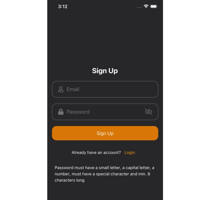
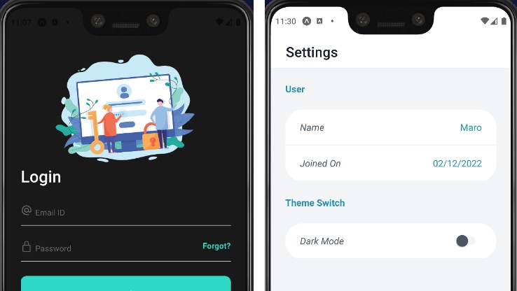
Screenshots
| Dark | Light |
|---|---|
 |
 |
Features
- Light/dark mode toggle
- Copying System appearance
- Login and Register Screens
- Settings Screen
- Bottom Tab Navigator
- Cross platform
Demo
https://clipchamp.com/watch/jykPf8Umcj4
Setting Up
To use this project, you can download it as a zip or clone this repo, then run
  npm i
  npx expo start
If you have an emulator you can run the app on it, or you can download the Expo Go app on your phone, make sure you’re connected to the same network as your computer, and scan the code from the camera app. It might take a while to load initially.
Documentation
1. Light/Dark Mode:
In this template, we make use of the Appearance module provided by react native to set the initial app theme to the system’s theme.
const [theme, setTheme] = useState({ mode: Appearance.getColorScheme() });
We also create a theme context using the context api provided by React, so that other components can use access it.
We also make use of React AsyncStorage so that the app remembers the last theme that the user chose.
Finally, we make use of the addChangeListener() method provided by the Appearance module in order to update the theme of the app whenever the system’s theme is changed.
2. Colors:
Inside the config folder is a file named Theme.js which exports the function “colors”. This is the color palette for the app. You can change the colors however you prefer.
Here is a nice guide explaining how to create a nice color palette for your app
3. How to use Light/Dark Mode in your components:
In order to make use of the light/dark mode functionality in every component we create, we need to follow a few steps.
First, we import the following:
import { colors } from "../config/theme";
import { ThemeContext } from "../context/ThemeContext";
Then we add the following two lines inside the main function of our component:
const { theme } = useContext(ThemeContext);
let activeColors = colors[theme.mode];
Then we style our component using “activeColors”. For example, let’s say you want to set the background color of a screen to the dark/light (according to what the user chooses). First, in Theme.js, you can set the different colors for each mode, for example:
...
light: {
    primary: "#f3f4f6"
    ...
},

dark: {
    primary: "#121212"
    ...
}
...
And in our component we do something like this:
<ScrollView
  style={[
    {
      backgroundColor: activeColors.primary,
    },
    styles.Container,
  ]}
>
  <StyledText style={styles.sectionTitle} big>
    Home
  </StyledText>
</ScrollView>
Notice how we use the activeColors to style the ScrollView.
This will result in the background color of the page being #121212 when dark theme is on, and #f3f4f6 when light theme is on.
Likely, you can call the different colors you set in Theme.js. For example:
<Text style={activeColors.tint}>
    Hello World!
</Text>
and so on.
Contributing
Contributions are always welcome!