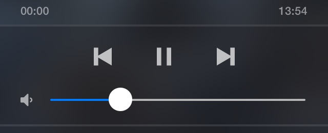
React Native VolumeSlider component
MPVolumeView bridge to React Native (NOTE: MPVolumeView works only on physical devices)

Installation
- Install package via npm:
npm install react-native-volume-slider
- Link your library: either by using
rnpm linkor like it's described here. - Inside your code include JS part by adding
import VolumeSlider from 'react-native-volume-slider';
- Connect your device and run application! (NOTE: MPVolumeView works only on physical devices)
Volume Slider
import React, { Component } from 'react';
import { View, StyleSheet } from 'react-native';
import VolumeSlider from 'react-native-volume-slider';

class PlayerVolume extends React.Component {

  volumeChange(value) {
    // body
  }

  render() {
    return (
      <View>
        <VolumeSlider
          style={styles.slider}
          thumbSize={{
            width: 8,
            height: 8
          }}
          thumbTintColor="rgb(146,146,157)"
          minimumTrackTintColor="rgb(146,146,157)"
          maximumTrackTintColor="rgba(255,255,255, 0.1)"
          showsRouteButton={true}
          onValueChange={this.volumeChange.bind(this)} />
      </View>
    );
  }
};

const styles = StyleSheet.create({
  slider: {
    height: 30,
    marginLeft: 7,
  }
});
Props
style
minimumTrackTintColor
The color used for the track to the left of the button. Overrides the default blue gradient image.
maximumTrackTintColor
The color used for the track to the right of the button. Overrides the default blue gradient image.
onValueChange
Callback continuously called while the user is dragging the slider or user hits volume buttons.
thumbSize
The size of the thumb area that allows moving the thumb.
thumbTintColor
The color used for the thumb.
thumbImage
Specify an image here to use as thumb. This will be drawn to the round
showsRouteButton
Indicates whether or not to show the routeButton where the user can select the output target (airplay, headphones)
