React Native Rounded Slider
A customisable circular slider component using react native.
Installation
npm:
npm install react-native-rounded-slider
yarn:
yarn add react-native-rounded-slider
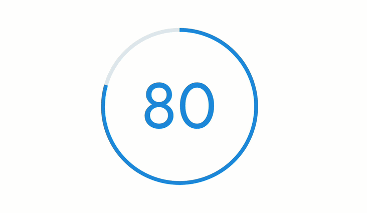
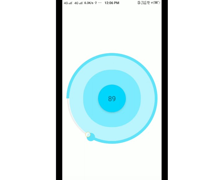
Prototype
circular.slider.1.mp4
circular.slider.2.mp4
Example:
import { useState } from 'react';
import { StyleSheet, Text, View, } from 'react-native';
import CircularSlider from "react-native-rounded-slide";

export default function App() {
  const [value, setValue] = useState(0);
  return(
    <View style={styles.container}>
      <CircularSlider
        onChange={setValue}
        size={300}
        min={0}
        max={100}
        trackWidth={7}
        trackColor={"green"}
        thumbColor={"blue"}
        thumbWidth={15}
        steps={1}
        element={<Text style={{position: "absolute", alignSelf:"center"}}>{value}</Text>}
      />
    </View>
  );
}

const styles = StyleSheet.create({
  container: {
    flex: 1,
    backgroundColor: '#fff',
    alignItems: 'center',
    justifyContent: 'center',
  },
});
Props
| Property | Type | Default Value | Description |
|---|---|---|---|
| min | number | 0 | Lower bound of circular slider |
| max | number | 100 | Upper bound of circular slider |
| thumbWidth | number | 15 | thumbwidth of circular slider |
| thumbColor | string | “black” | thumb color of circular slider |
| trackWidth | number | 10 | Width of circular track |
| trackColor | string | “black” | track color of circular slider |
| steps | number | 1 | Steps of value taken by slider |
| size | number | 300 | Size of circular slider component |
| onChange (required) | function | ()=>{} | Operation to perform on value change in slider |
| element | React Component | <></> | React component to show on middle of slider |