React Native Animated Charts
Set of components and helpers for building complex and beautifully animated charts.
 |
 |
|---|
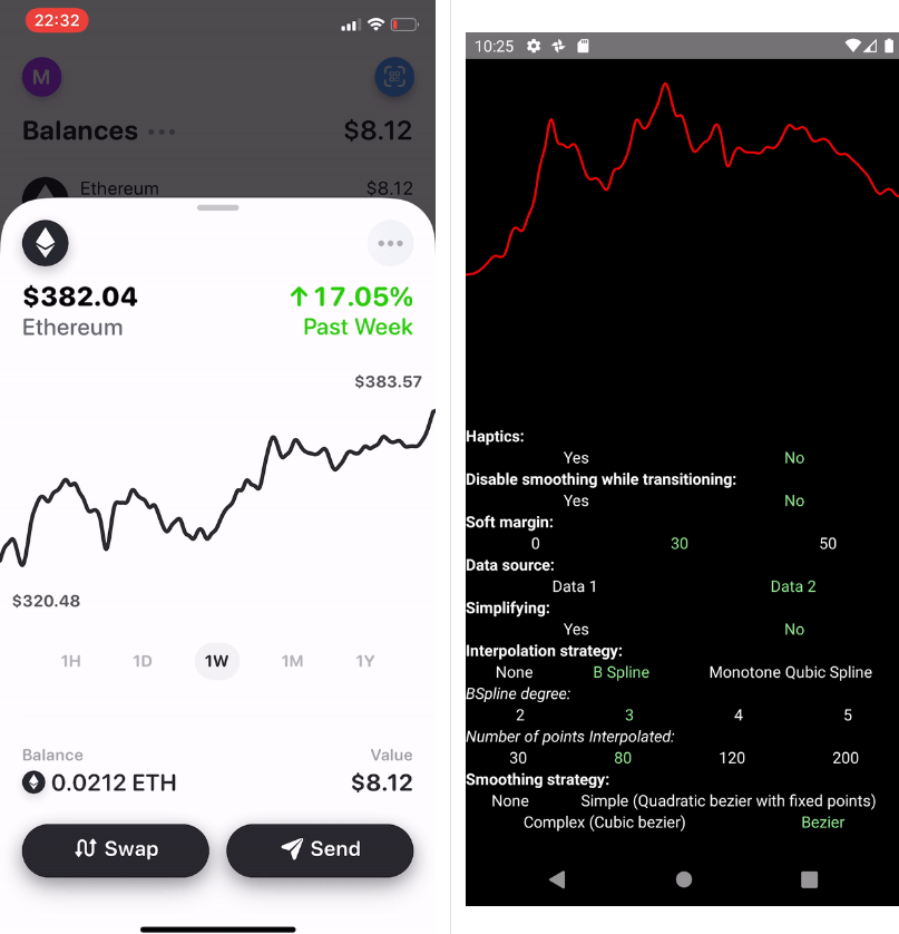
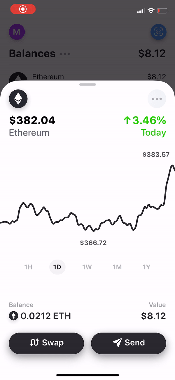
The library was designed to create aesthetic, animated (so far only linear) charts based on a given input.
The main assumptions of the library were to create smooth transitions between subsequent data sets. For this reason,
we have discovered a shortage of existing libraries related to the charts.
The current package was created as part of the Rainbow.me project and for this reason it was not designed as a complete and comprehensive solution for displaying various types of charts. However, we will be now using more charts in the whole application, so we believe that the number of functionalities in the application will gradually grow.
Additionally, we are open to new Pull Requests. We want this library to become popular and complete thanks to community activity.
TODO
The library has been released in a production-ready version.
We use it inside the Rainbow.me project so it's verified for use in production.
However, it relies on React Native Reanimated 2.0 in the alpha version thus it might not work perfectly.
Test it deeply before using it. Until the stable release of Reanimated, I think it's worth not marking this library as stable.
Although the library works with Reanimated without any changes, we faced a few issues related to our (quite advanced) usage of the library.
Thus we made some hacks we're not very proud of and it's for 99% something you should not do. However, if you see some crashes, you may try one of our hacks.
There're a few things left to make it polished regarding linear charts:
- [ ] cleanup API.
ChartProviderandChartPathhave been split for two components to separated responsibilities of providing data and displaying charts.
I'm still not sure if it's a good move so we can decide to move some props from one to another or connect them inside one component. - [ ] Support for gestures - pinching, swiping, etc.
- [ ] more parameters regarding interpolation, smoothing, and animations (i.e. allow to override
springConfigandtimingConfig)
Installation
- Install react-native-reanimated in the newest version.
yarn add @rainbow-me/animated-charts
npm i @rainbow-me/animated-charts
- If you want to use haptic feedback on the press in / out, install
yarn add react-native-haptic-feedback
npm i react-native-haptic-feedback
The library is verified on 2.0.0-alpha.6 version of reanimated.
Reanimated
Using TurboModules might have an impact on your current development flow and most likely
you don't want to decrease your DX. Since we're not using reanimated in other places in the app, we
made some tweaks to disable charts in development mode with compilation macros on iOS.
You can find it here
Also, because we're using libraries which currently do not support reanimated 2,
we patched exports in reanimated
Furthermore, we found few differences in how the Animated module works with and without TurboModules support, so
we made a trick to fallback to the not-TM version of Animated.
Most likely, you don't need any of those patches.
Example app
We made a generic example to show briefly what's possible to achieve with this library.
A Real-life example is available inside Rainbow!
In order to run an example clone this repo and navigate to Example then:
yarn && cd ios && pod install && cd ..
react-native run-android
react-native run-ios
API
The library has been designed to provide as much flexibility as possible with the component-based API for easy integration with existing applications.
Basic API Example
import React from 'react';
import {Dimensions, View} from 'react-native';
import {ChartDot, ChartPath, ChartPathProvider, monotoneCubicInterpolation} from '@rainbow-me/animated-charts';
export const {width: SIZE} = Dimensions.get('window');
export const data = [
{x: 1453075200, y: 1.47}, {x: 1453161600, y: 1.37},
{x: 1453248000, y: 1.53}, {x: 1453334400, y: 1.54},
{x: 1453420800, y: 1.52}, {x: 1453507200, y: 2.03},
{x: 1453593600, y: 2.10}, {x: 1453680000, y: 2.50},
{x: 1453766400, y: 2.30}, {x: 1453852800, y: 2.42},
{x: 1453939200, y: 2.55}, {x: 1454025600, y: 2.41},
{x: 1454112000, y: 2.43}, {x: 1454198400, y: 2.20},
];
const points = monotoneCubicInterpolation(data)(40);
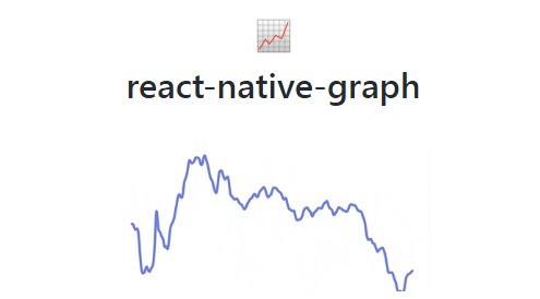
const BasicExample = () => (
<View style={{ backgroundColor: 'black' }}>
<ChartPathProvider data={{ points, smoothingStrategy: 'bezier' }}>
<ChartPath height={SIZE / 2} stroke="yellow" width={SIZE} />
<ChartDot style={{ backgroundColor: 'blue' }} />
</ChartPathProvider>
</View>
);
The code above generates the chart below:

Linear charts
ChartPathProvider
The whole chart's structure has to be wrapped with ChartProvider. It's responsible for data managing and itself does not have a visual impact on the layout. Under the hood, it uses context API to simplify manipulation with other components. The rule is to use one data series for each wrapper.
| Prop name | type | default / obligatory | description |
|---|---|---|---|
softMargin |
number |
0 |
While scrubbing the chart touching edges of the screen you may want make points on the edges more accessible. With softMargin it's possible to access points on edges doubling the speed of scrubbing beyond this margin. |
enableHaptics |
boolean |
false |
On pressing in/out on the chart it might be expected to make haptic feedback. It will happen with enableHaptics set to true and react-native-haptic-feedback installed |
data |
{ points: [Point], nativePoints: [Point], smoothingStrategy?: 'bezier'|'simple'|'complex', smoothingFactor } |
obligatory | Object containing data structure and way to display them. Each of the properties is explained below. |
springConfig |
object | {damping: 15, mass: 1, stiffness: 600} |
Object defining the spring animation. This spring is used for a dot's scale. |
timingFeedbackConfig |
object | {duration: 80} |
Object defining the timing animation. timingFeedbackConfig is used for a path's opacity and width. |
timingAnimationConfig |
object | {duration: 300} |
Object defining the timing animation. timingAnimationConfig is used for the transition between chart's data. |
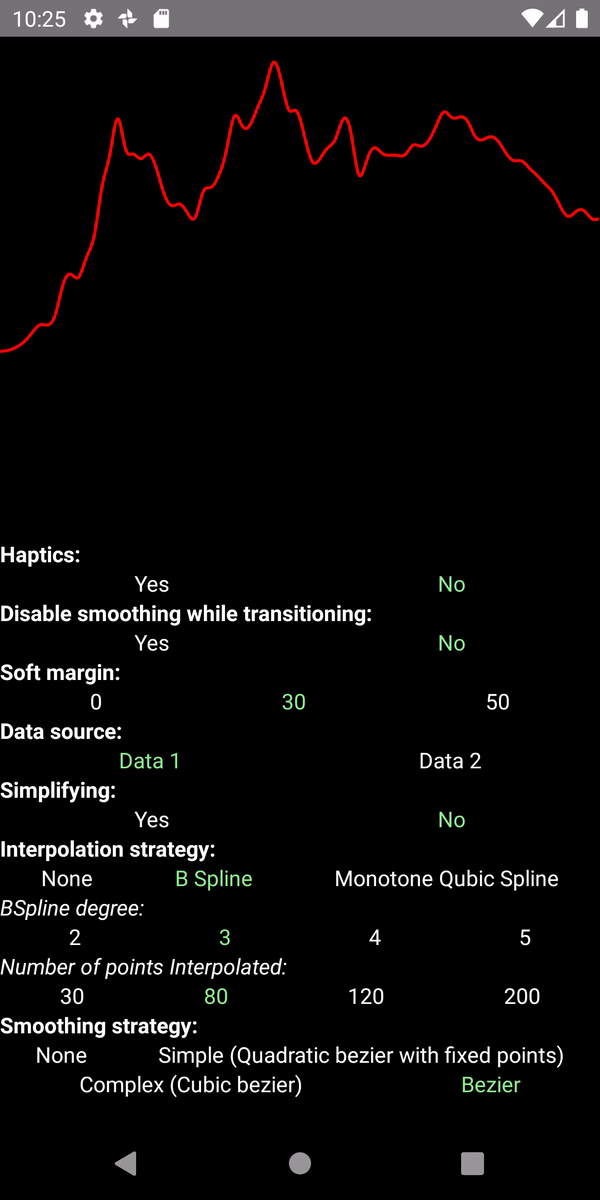
datais an array containing points to be displayed. APointis an object containingxandyas a number.nativeDatais an array of points that will not be drawn. However, if you used some strategy of interpolating data or simplifying you might want to present data slightly different from the real one. Then if you'd like labels to be fully correct you may want to provide real data before adjusting them.smoothingStrategy. While presenting points path can be drawn with different approaches.- If
smoothingStrategyis not provided (or set to any other value but for listed here), connects points using linear interpolation. - The
bezierstrategy connects points with a bezier path inspired by d3 shape. It's not parametrized bysmoothingFactor. - The
complexstrategy uses approach explained here using cubic splines. It's parametrized bysmoothingFactor. - The
simplestrategy is a bit simplifiedcomplexstrategy using quadratic splines. It's parametrized bysmoothingFactor.
- If
smoothingFactor. Is a value from0to1defining how smooth a presentation should be.0means no smoothing, and it's the default.smoothingFactorhas an impact ifsmoothingStrategyissimpleorcomplex.
ChartPath
This component is used for showing the path itself.
| Prop name | type | default / obligatory | description |
|---|---|---|---|
disableSmoothingWhileTransitioning |
number |
false |
Although smoothing is not complex computing, it might impact performance in some low-end devices so while having a big set of data it might be worth disable smoothing while transitioning. |
height |
number |
obligatory | Height od the SVG canvas |
width |
number |
obligatory | Width od the SVG canvas |
strokeWidth |
number |
1 |
Width of the path. |
strokeWidthSelected |
number |
1 |
Width of the path selected. |
gestureEnabled |
boolean |
true |
Defines if interaction with the chart should be allowed or not |
longPressGestureHandlerProps |
object |
{maxDist: 100000, minDurationMs: 0, shouldCancelWhenOutside: false} |
Under the hood we're using LongPressGestureHandler for handling interactions. It's recommended to not override its props. However, it might be useful while interacting with another GH. |
selectedOpacity |
number |
0.7 |
Target opacity of the path while touching the chart. |
| ...rest | object |
{} |
Props applied to SVG Path. |
ChartDot
Component for displaying the dot for scrubbing on the chart.
| Prop name | type | default | description |
|---|---|---|---|
size |
number |
10 |
Size of the dot. |
| ...props | object |
{} |
Rest of the props applied to Reanimated.View including style |
ChartYLabel & ChartXLabel
Labels are useful while moving finger through the chart to show the exact value in given point.
| Prop name | type | default | description |
|---|---|---|---|
format |
reanimated worklet | a => a |
Worklet for formatting data from the chart. It can be useful when your data is a timestamp or currency. |
| ...props | object |
{} |
Rest of the props applied to TextInput including style |
Candle Charts
TODO
Pie charts
TODO
Helpers
It's not essential in the library, but we have decided to include a lot of helpers we are (or we were) using for displaying charts.
Interpolations
We have two interpolators which share the most of the API: bSplineInterpolation and monotoneCubicInterpolation.
import { bSplineInterpolation as interpolator } from '@rainbow-me/animated-charts';
// import { monotoneCubicInterpolation as interpolator } from '@rainbow-me/animated-charts';

const interpolatedData = interpolator(data)(80, true, false);
Code above generates 80 equidistant points from given dataset.
Interpolator (monotoneCubicInterpolation or bSplineInterpolation) returns generator.
Generator accepts 3 arguments: range, includeExtremes, removePointsSurroundingExtremes.
-
rangeis the number of points of the output. -
includeExtremes. If it's vital to include extremes in the output, set to true. However, the data might not be fully equidistant. -
removePointsSurroundingExtremes. Makes sense only ifincludeExtremesset totrue. When disabled, it might be possible that extremes look very "pointy". To get rid of this, you can remove points surrounding extremes.
E.g.-
removePointsSurroundingExtremes = falseo---------o----Min--o---------o---------o---------o---------o -
removePointsSurroundingExtremes = trueo--------------Min------------o---------o---------o---------o
-
bSplineInterpolation(data, degree = 3)
bSplineInterpolation is inspired by victorian lib
and uses B-spline interpolation of a given degree.
monotoneCubicInterpolation(data, degree = 3)
This curve is inspired by d3 shape.
"Produces a cubic spline that preserves monotonicity in y, assuming monotonicity in x, as proposed by Steffen in A simple method for monotonic interpolation in one dimension: “a smooth curve with continuous first-order derivatives that passes through any given set of data points without spurious oscillations. Local extrema can occur only at grid points where they are given by the data, but not in between two adjacent grid points.”
simplifyData(data, pickRange = 10, includeExtremes = true)
This helper takes only one point per pickRange. Might be useful for very dense data. If it's important, it's possible to include extremes with the includeExtremes flag.
E.g.
pickRange = 3, includeExtremes = true
X are equidistant in this case

Y:0          1          7          2         -3          0          1          2
  S----------o----------E----------X----------E----------o----------X----------o----------S
X - points picked because index%3=0
S – the first and the last points are always included.
E – extremes.