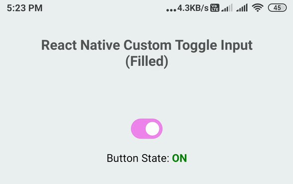
react-native-switch-toggle
Simple switch toggle component for react-native. This component supports horizontal switch toggle with animation with several options like start/end background colors, start/end circle colors, and duration for animation.
Npm repo
https://www.npmjs.com/package/react-native-switch-toggle
Git repo
https://github.com/dooboolab/react-native-switch-toggle
Props
| necessary | types | default | |
|---|---|---|---|
| switchOn | ✓ | boolean | false |
| onPress | ✓ | func | () => {} |
| containerStyle | styles | { width: 72, height: 36, borderRadius: 18 ... } | |
| circleStyle | styles | { width: 30, height: 30, borderRadius: 15 ... } | |
| backgroundColorOn | string | 'rgb(227,227,227)' | |
| backgroundColorOff | string | 'rgb(215,215,215)' | |
| circleColorOn | string | 'white' | |
| circleColorOff | string | 'rgb(102,134,205)' | |
| duration | number | 300 | |
| type | number | 0 - Normal switch, 1 - Switch with a text | |
| buttonText | string | Text on-top of the button | |
| backTextRight | string | Text to appear in right side when button toggled to left | |
| backTextLeft | string | Text to appear in left side when button toggled to right | |
| buttonTextStyle | styles | Styles for text on the button | |
| textRightStyle | styles | Styles for text in right | |
| textLeftStyle | styles | Styles for text in left | |
| buttonStyle | styles | Styles for the button | |
| buttonContainerStyle | styles | Styles for button container | |
| rightContainerStyle | styles | Styles for right text container | |
| leftContainerStyle | styles | Styles for left text container |
Getting started
$ npm install react-native-switch-toggle --save
import React, { Component } from 'react';
import {
  Platform,
  StyleSheet,
  Text,
  View
} from 'react-native';

import SwitchToggle from 'react-native-switch-toggle';

export default class App extends Component<{}> {
  constructor(props) {
    super(props);
    this.state = {
      switchOn1: false,
      switchOn2: false,
      switchOn4: false
    };
  }

  getButtonText() {
    return this.state.switchOn4 ? 'Hour' : 'Day';
  }

  getRightText() {
    return this.state.switchOn4 ? '' : 'Hour';
  }

  getLeftText() {
    return this.state.switchOn4 ? 'Day' : '';
  }

  render() {
    return (
      <View style={styles.container}>
        <SwitchToggle
          switchOn={this.state.switchOn1}
          onPress={this.onPress1}
        />
        <SwitchToggle
          containerStyle={{
            marginTop: 16,
            width: 108,
            height: 48,
            borderRadius: 25,
            backgroundColor: '#ccc',
            padding: 5,
          }}
          circleStyle={{
            width: 38,
            height: 38,
            borderRadius: 19,
            backgroundColor: 'white', // rgb(102,134,205)
          }}
          switchOn={this.state.switchOn2}
          onPress={this.onPress2}
          circleColorOff='white'
          circleColorOn='red'
          duration={500}
        />
        <SwitchToggle
          containerStyle={{
            marginTop: 16,
            width: 160,
            height: 65,
            borderRadius: 30,
            padding: 5,
          }}
          backgroundColorOn='#a0e1e5'
          backgroundColorOff='#e5e1e0'
          circleStyle={{
            width: 55,
            height: 55,
            borderRadius: 27.5,
            backgroundColor: 'blue', // rgb(102,134,205)
          }}
          switchOn={this.state.switchOn3}
          onPress={this.onPress3}
          circleColorOff='#ff11ff'
          circleColorOn='green'
          duration={500}
        />
        <SwitchToggle
          buttonText={this.getButtonText()}
          backTextRight={this.getRightText()}
          backTextLeft={this.getLeftText()}

          type={1}
          buttonStyle={{
            alignItems: 'center',
            justifyContent: 'center',
            position: 'absolute'
          }}

          rightContainerStyle={{flex: 1, alignItems: 'center', justifyContent: 'center'}}
          leftContainerStyle={{flex: 1, alignItems: 'center', justifyContent: 'flex-start'}}

          buttonTextStyle={{fontSize: 20}}
          textRightStyle={{fontSize: 20}}
          textLeftStyle={{fontSize: 20}}

          containerStyle={{
            marginTop: 16,
            width: 160,
            height: 65,
            borderRadius: 30,
            padding: 5,
          }}
          backgroundColorOn='#fff'
          backgroundColorOff='#fff'
          circleStyle={{
            width: 80,
            height: 55,
            borderRadius: 27.5,
            backgroundColor: 'blue', // rgb(102,134,205)
          }}
          switchOn={this.state.switchOn4}
          onPress={this.onPress4}
          circleColorOff='#e5e1e0'
          circleColorOn='#e5e1e0'
          duration={500}
        />
      </View>
    );
  }
  onPress1 = () => {
    this.setState({ switchOn1: !this.state.switchOn1 });
  }
  onPress2 = () => {
    this.setState({ switchOn2: !this.state.switchOn2 });
  }
  onPress3 = () => {
    this.setState({ switchOn3: !this.state.switchOn3 });
  }
  onPress4 = () => {
    this.setState({switchOn4: !this.state.switchOn4});
  };
}

const styles = StyleSheet.create({
  container: {
    flex: 1,
    justifyContent: 'center',
    alignItems: 'center',
    backgroundColor: '#F5FCFF',
  },
});