react-native-auto-stylesheet
Drop-in replacement for React Native's StyleSheet that performs automatic scaling of sizes, including margins, paddings, borders and font sizes.
The library's main features are:
- Scale dimensions based on height ratio, width ratio or their average dependending on the style property.
- No need to manually call functions or use new units of measurement (though you can if you want to).
- Use absolute values when creating layouts. No more need to calculate percentages or flex ratios from the design.
- TypeScript support.
Installation instructions
$ yarn add react-native-auto-stylesheet
Example usage
import { StyleSheet } from 'react-native-auto-stylesheet';

export const styles = StyleSheet.create({
  scaledView: {
    height: 50, // scaled automatically to the device height
    width: 100 // scaled automatically to the device width
  },
  scaledText: {
    fontSize: 18 // scaled automatically to the average of height and width ratios
  }
);
The library assumes that the dimensions are relative to a 375 x 667 design (the logical resolution of an iPhone 6-8). That means that scaledView.width will be 100 on an iPhone 8 and 85.5 on an iPhone SE (PixelRatio.roundToNearestPixel(100 * 320 / 375)).
In practice
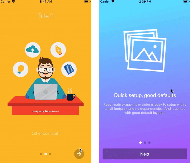
Replacing React Native's StyleSheet with react-native-auto-stylesheet in one of our screens (without any other changes) yields immediate results.
Before:

After:

With almost no effort the results are much better. There are still problems with the navigation header and some icons, but they are easy to fix.
Overall this feels like a big win.
Advanced usage
React Native's StyleSheet pass-through
All the calls to existing StyleSheet functionality are passed as they are to the React Native implementation:
import { StyleSheet } from 'react-native-auto-stylesheet';

// these all work as expected
StyleSheet.flatten;
StyleSheet.hairlineWidth;
StyleSheet.absoluteFill;
StyleSheet.absoluteFillObject;
What if I have different design dimensions?
If needed, different values can be set for the relative design dimensions:
// the designs are based on iPad Air dimensions
// make sure to call this as soon as possible, before any styles are calculated
StyleSheet.setGuidelineBaseDimensions(768, 1024);
What if I need to scale using a different factor?
The following example shows how setting a different factor can be achieved for devices with a wide screen.
import { Dimensions } from 'react-native';
const { width } = Dimensions.get('window');

if (width >= 1024) {
  StyleSheet.setFactor(0.5);
  // technically equivalent to:
  // StyleSheet.setGuidelineBaseDimensions(750, 1334);
  // 375 / 0.5 = 750, 667 / 0.5 = 1334
}
What if I need to keep the aspect ratio?
Use the aspectRatio layout property:
export const styles = StyleSheet.create({
  fixedAspectRatio: {
    width: 100, // will get scaled
    aspectRatio: 1 // will set height to the same value as width
  }
);
What if I need to disable scaling for a specific value?
const scaledStyles = StyleSheet.create({
  scaledStyle: {
    width: 100 // will get scaled
  }
});

// equivalent to using `StyleSheet.create` from the RN object
const unscaledStyles = StyleSheet.createUnscaled({
  unscaledStyle: {
    width: 100 // will be fixed to 100
  }
});

export const styles = { ...scaledStyles, ...unscaledStyles };
What if I want to scale manually?
The scaling functions are exposed on the StyleSheet object:
StyleSheet.scaleHorizontally(size: number): number;
StyleSheet.scaleVertically(size: number): number;
StyleSheet.scaleWithAverageRatio(size: number): number;
Limitations
-
Not all properties are scaled. For now, only these properties are scaled, though the list can easily be extended:
- Based on height:
height,marginTop,marginBottom,marginVertical,paddingTop,paddingBottom,paddingVertical,borderLeftWidth,borderRightWidth,top,bottom. - Based on width:
width,marginLeft,marginRight,marginHorizontal,paddingLeft,paddingRight,paddingHorizontal,borderTopWidth,borderBottomWidth,left,right. - Based on average of height and width ratios:
fontSize,margin,padding,borderWidth.
- Based on height:
-
Object or array properties are not scaled recursively. One property that could be useful to be scaled is
transform.translateX/Y. -
The library does not listen to dimensions change (orientation change or split screen). While it is relatively easy to implement, we did not have the need for this functionality yet.
TSLint rule and automatic code refactoring
You can ignore this section if you are not using TypeScript.
If you decide to use react-native-auto-stylesheet in your app, it is probably a good idea to use it everywhere so inconsistencies are eliminated (the situation when some screens or components are scaled, some are not).
In order to help with establishing this as a best practice, we include a TSLint rule that will signal any use of React Native's StyleSheet. It can be activated by making the following changes in tslint.json:
{
  ...
  "rulesDirectory": ["node_modules/react-native-auto-stylesheet/tslint"],
  "rules": {
    ...
    "no-rn-stylesheet-import": true
  }
}
After this, TSLint should emit a warning any time it encounters import { StyleSheet } from 'react-native';.
Also, importing our library in favor of React Native's implementation can be refactored automatically by simply running ./node_modules/.bin/tslint --fix './src/**/*.ts*'.