React Quick Style Components
Quickly style for react-native/reactjs components via props.
- Quickly style react-native (and reactjs) components via props.
- Support hover and responsive style for web and different screen sizes.
- Responsive layout handling made easy.
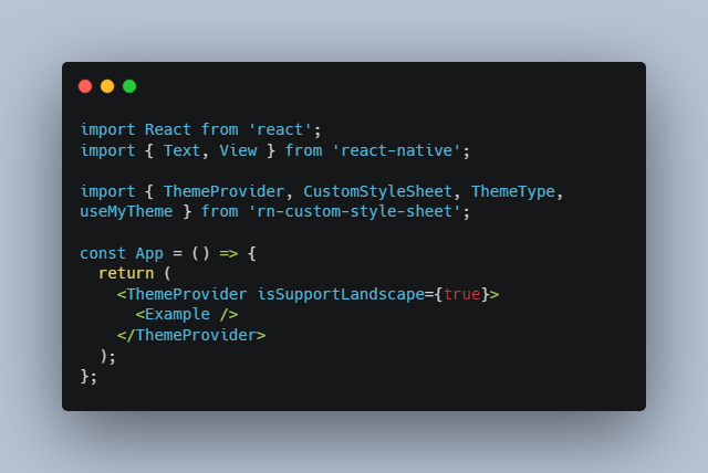
Example
 23
23
Installation
React Native
yarn add react-quick-style-components
No linking required
React JS
Assuming you use create-react-app or expo web:
yarn add react-native-web react-quick-style-components
Main Idea
We usually style our component like this (inline or StyleSheet)
{
  width: 50,
  height: 50,
  margin: 10,
  backgroundColor: 'green',
  justifyContent: 'center',
  alignItems: 'center',
}
What if we can have a really quick way of styling by using prop. Like:
<Col
  width={50}
  height={50}
  margin={10}
  backgroundColor="green"
  justifyContent="center"
  alignItems="center"
/>
And with the advantage of boolean prop, we could get it even quicker (in terms of Coding convenience), like:
<Col
  width50
  height50
  margin10
  backgroundColor="green"
  middle // common global styleset, equal { justifyContent: 'center', alignItems: 'center'  }
/>
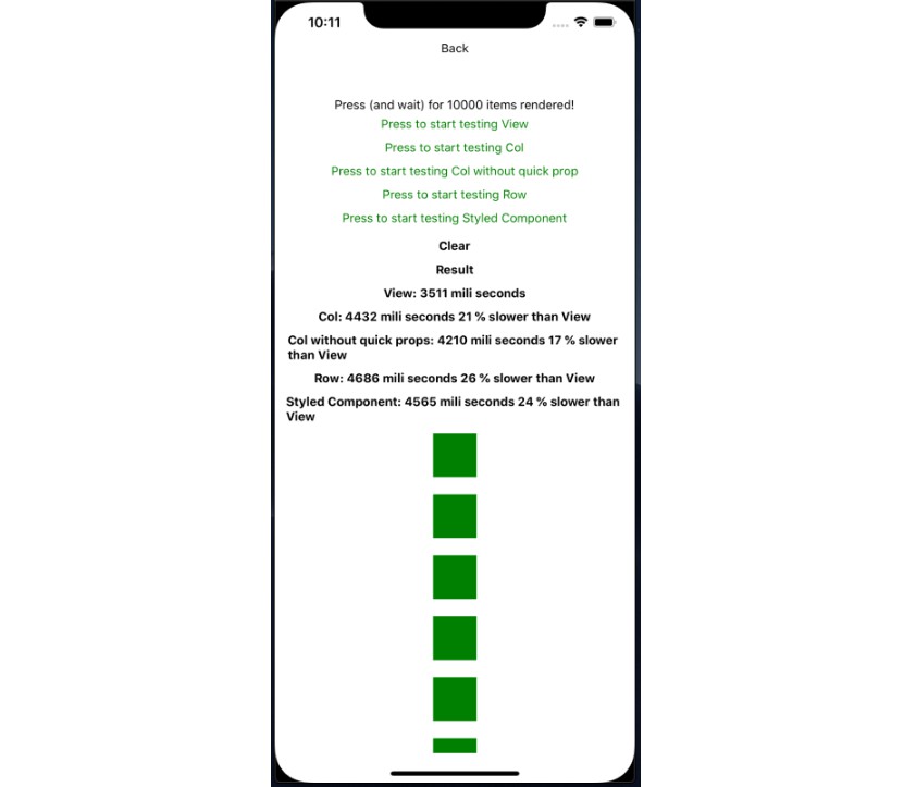
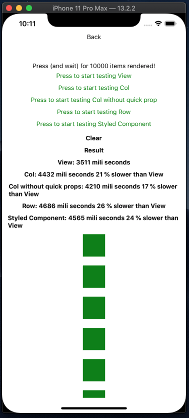
Performance Concern
- In the speed test, we compared it with normal
Viewcomponent, andstyled-components. The test code is really simple, PR is welcome.
Best Practice
- If you have more than 3 styled props, put it in StyleSheet. Too many styled props will not be convenient anymore.
- Create your own common style objects to avoid repeating your self
- Organize the components and keep them small and simple
Usage
Initial setup
import { StyleSheet } from 'react-native';
import { initQuickStyle, Text } from 'react-quick-style-components';
import { FONT, COLOR } from './some-where/in/your/project'

// Use for quick prop like: colorMain, bgMain.

initQuickStyle.setMainColor(COLOR.MAIN);

// Use for default text style

Text.setFontStyle({
  fontFamily: 'NunitoSans_400Regular',
  color: '#CCCCCC',
});

// Use for quick style, e.g: if you pass Style.create({ white: { color: 'white' } }). You will be able to use <Text white>Hello World!</Text>

const additionStyles = StyleSheet.create({
  shadow: {
    shadowColor: "#000",
    shadowOffset: {
      width: 0,
      height: 1,
    },
    shadowOpacity: 0.20,
    shadowRadius: 1.41,
    elevation: 2,
  },
});

initQuickStyle.setAdditionStyles(additionStyles);
Usage
Text
  import { Text } from 'react-quick-style-components';

  const App = () => (
    <Text colorMain bold fontsize20>Hello World!</Text>
  )
Col
  import { Col } from 'react-quick-style-components';

  const handlePress = () => alert('Hello World!');

  const App = () => (
    <Col flex1 bgMain onPress={handlePress}></Col>
  )
Row
  import { Col } from 'react-quick-style-components';

  const handlePress = () => alert('Hello World!');

  const App = () => (
    <Row flex1 bgMain onPress={handlePress}></Row>
  )
Styled Props
- Pretty much all the styled properties (take a look at
./utils/globalProps.tsline 22) - Auto split number value from Boolean props
<Col
  width100
  zIndex1
  flex1
/>
Equal to
<Col
  width={100}
  zIndex={1}
  flex={1}
/>
- Common style sets (take a look at
./utils/commonStyle.ts)
| Prop | Description |
|---|---|
middle |
Align items center (vertically and horizontally) |
flex1 |
Flex 1 |
absolute |
Position absolute |
absoluteFill |
Position absolute and full parent width, height |
bgWhite |
White background |
colorWhite |
White color text |
colorMain |
Main color text, (after run initQuickStyle.setMainColor) |
bgMain |
Main background color, (after run initQuickStyle.setMainColor) |
bold |
bold fontweight text |
width100p |
width 100% |
height100p |
height 100% |
overflowH |
overflow hidden |
Style Hooks
Style Hooks is in easy way to transform value of styled props. For example when you want to normalize your font size
initQuickStyle.setStyleHooks({
  fontSize: (value) => {
    return normalize(value)
  },
});
After that, all of your <Text fontSize={xyz} /> will go thourgh that function and converted to a new value.
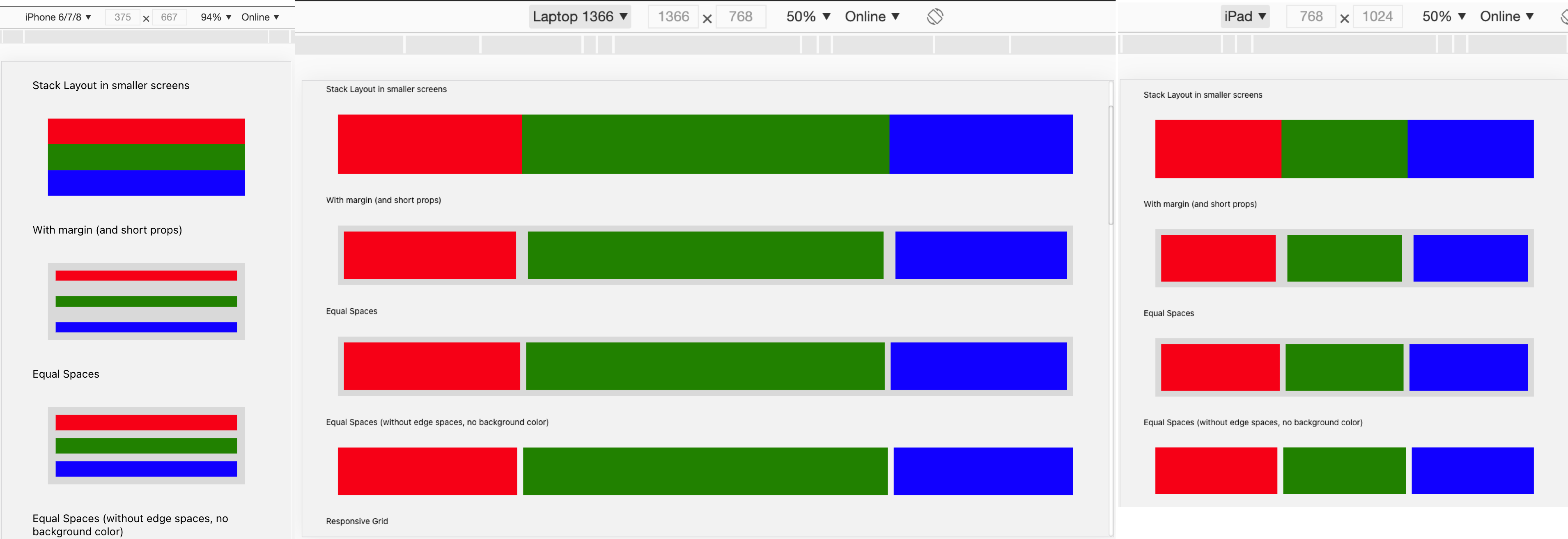
Responsive Styled Props
Components Col, Row, Text, Img, Scroll, Input all come with responsive style support via prop onResponsiveStyle.
<Col
  width100
  height100
  backgroundColor="black"
  onResponsiveStyle={{
    md: {
      width: 200,
      height: 200,
    },
    lg: {
      backgroundColor: 'pink',
    }
  }}

/>
Col Component
- Flex direction
column - If
onPressprop is given, it will operate like aTouchableOpacity(activeOpacity0.9) onHoverStyle: it's a web prop: Pass a object style here and it will apply when user hover over the component.useHoverNativeProps: apply the hover style without rerendering the component. credit to the guys here https://github.com/necolas/react-native-web/issues/205 , let me know if you have trouble using this prop
Example:
<Col
  middle
  style={styles.previewBox}
  useHoverNativeProps
  onHoverStyle={{ borderColor: COLOR.MAIN, borderWidth: 1, borderRadius: 4 }}
>
  {child}
</Col>
Row Component
onPresswork exactly likeCol, infact it'sColunder the hood, so every props ofColcan be used here.- Flex direction
row - Align items
centerby default. Ifstretchprops is specific (true), the children will have 100% height - This component has responsive settings.
export interface Props {
  onRef?(): void,
  stretch?: boolean,
  responsive?: {
    sm?: string,
    md?: string,
    lg?: string,
    xl?: string,
    [breakpoint: string]: string,
  },
  [key: string]: any,
}
For example
<Row responsive={{ xs: '100%', sm: '1:1:2', md: '1:2:1' }}>
  <Col width100p height100>
    <Col margin10 flex1 backgroundColor="black" />
  </Col>
  <Col width100p height100>
    <Col margin10 flex1 backgroundColor="red" />
  </Col>
  <Col width100p height100>
    <Col margin10 flex1 backgroundColor="pink" />
  </Col>
</Row>
-
width breakpoints follow Bootstrap CSS Web framework
xs,sm,md,lgandxl -
<Row responsive={{ md: '1:.' }} />- every child will have flex 1 in md breakpoint
-
<Row responsive={{ md: '1:2' }} />- only render two first child, with flex 1 and flex 2 in md breakpoint
-
<Row responsive={{ md: '1:2', sm: '100%' }} />- same with the above, and in sm breakpoint all will have 100% width, and flex wrap style
Text Component
- define default font family and color with
Text.setFontStyle
import { Text, Col } from 'react-quick-style-components';

Text.setFontStyle({
  fontFamily: 'NunitoSans_400Regular',
  color: '#CCCCCC',
});
If you use @expo-google-fonts, there will be a lot of font weights as seperate fonts. We can use setAdditionStyles to quickly assign font:
initQuickStyle.setAdditionStyles({
  light: {
    fontFamily: 'NunitoSans_300Light'
  },
  semiBold: {
    fontFamily: 'NunitoSans_600SemiBold'
  },
  bold: {
    fontFamily: 'NunitoSans_700Bold'
  },
});
Example <Text light />
Advanced Usage
With the help of react-native-web, we can use this library on both web and mobile app. Soon we will want to write once, run anywhere. But truly cross-platform is hard to achieve. While some UIs can look the same, some layouts can be responsive, there are still many things to cover like navigation, flow, user behaviour. If you use too many ifs for platform check, and the structrure of web and mobile app are different, then it's not write once anymore. It's just write in the same place
In attempt to make cross-platform coding more convenient, this library introduce some concept like Banks - Allocation pattern, Header Navigation. Read more about it here.
UI Builder Support
For now it supports render UI from json. The roadmap for this part is to build a UI Builder to around that json parser. Check example in the link at the begining of this readme.
import { Parser } from 'react-quick-style-components';

<Parser
  {...({
    id: 'Heading',
    from: 'Text',
    style: {
      fontSize: 25,
    },
    props: {
      text: 'Render react component from JSON'
    }
  })}
/>