RangeSlider
A fully customizable high quality react native Slider component backed by custom native iOS and Android views with ability to select range of values.
Installation
-
Add
- npm:
npm install --save rn-range-slider - yarn:
yarn add rn-range-slider
- npm:
-
Link
- Run
react-native link rn-range-slider - If linking fails, follow the
manual linking steps
- Run
Usage
RangeSlider should have fixed width and height.
import RangeSlider from 'rn-range-slider';

...

<RangeSlider
    style={{width: 160, height: 80}}
    gravity={'center'}
    min={200}
    max={1000}
    step={20}
    selectionColor="#3df"
    blankColor="#f618"
    onValueChanged={(low, high, fromUser) => {
        this.setState({rangeLow: low, rangeHigh: high})
    }}/>
/>

...
Properties
Supported color formats are: #RGB, #RGBA, #RRGGBB, #RRGGBBAA
| Name | Description | Type | Default Value |
|---|---|---|---|
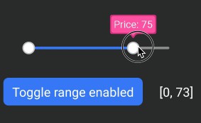
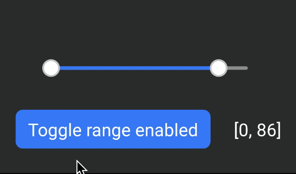
| rangeEnabled | Slider works as an ordinary slider with 1 control if false | Boolean | true |
| lineWidth | Width of slider's line | Number | 4 |
| thumbRadius | Radius of thumb (including border) | Number | 10 |
| thumbBorderWidth | Border width of thumb | Number | 2 |
| textSize | Size of label text | Number | 16 |
| labelBorderWidth | Border width of label | Number | 2 |
| labelPadding | Padding of label (distance between border and text) | Number | 4 |
| labelBorderRadius | Border radius of label bubble | Number | 4 |
| labelTailHeight | Height of label bubble's tail | Number | 8 |
| labelGapHeight | Gap between label and slider | Number | 4 |
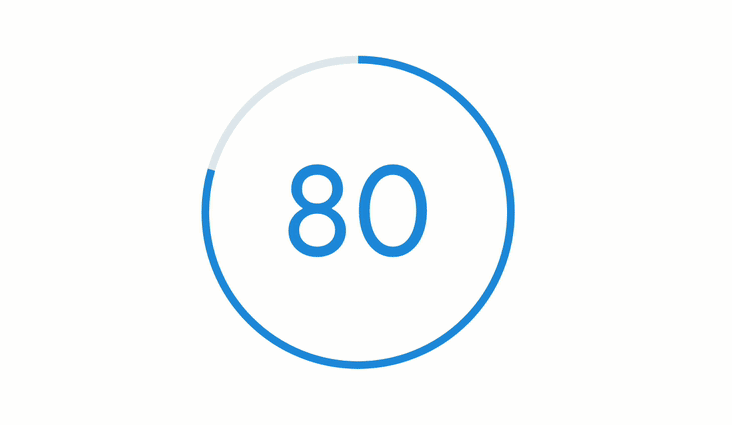
| textFormat | This string will be formatted with active value and shown in thumb | String "Price: %d" => "Price: 75" if the current value is 75 |
%d (just the number) |
| labelStyle | Style of the label. Label is not shown if none |
String Currently supported values: - none - bubble |
bubble |
| gravity | Vertical gravity of drawn content | String Currently supported values: - top - bottom - center |
top |
| selectionColor | Color of selected part | String | #4286f4 |
| blankColor | Color of unselected part | String | #ffffff7f |
| thumbColor | Color of thumb | String | #ffffff |
| thumbBorderColor | Color of thumb's border | String | #cccccc |
| labelBackgroundColor | Color label's background | String | #ff60ad |
| labelBorderColor | Color label's border | String | #d13e85 |
| labelTextColor | Color label's text | String | #ffffff |
| min | Minimum value of slider | Number (integer) | 0 |
| max | Maximum value of slider | Number (integer) | 100 |
| step | Step of slider | Number (integer) | 1 |
| initialLowValue | Initial value of lower thumb | Number (integer) | 0 |
| initialHighValue | Initial value of higher thumb | Number (integer) | 100 |
If initialLowValue ( or initialHighValue) is not provided, it's set to min (or max).
Methods
To call methods of RangeSlider you need to have a reference to it's instance.
React native provides 2 ways to do it:
...
<RangeSlider ref="_rangeSlider" />
...
this.refs._rangeSlider.setLowValue(42);
...
or
...
<RangeSlider ref={ component => this._rangeSlider = component } />
...
this._rangeSlider.setLowValue(42);
...
Available methos
| Name | Description | Params |
|---|---|---|
| setLowValue | Set low value of slider | value: number |
| setHighValue | Set high value of slider | value: number |
Callbacks
| Name | Description | Params |
|---|---|---|
| onValueChanged | A callback to be called when value was changed. fromUser parameter is true if the value was changed because of user's interaction (not by calling setLowValue or setHighValue methods). Just like android's OnSeekbarChangeListener. |
lowValue: number highValue: number fromUser: boolean |
Known issues
- Label's corner radius is not working on iOS